
Channel 39
Rebrand & Strategy
Brand Design South Florida _ 2023
We breathe life into brands, and WSFL is no exception.
As the creative minds behind the rebranding and marketing strategy for this iconic South Florida network, we immersed ourselves in the vibrant culture and pulsating energy that defines the region.
From conceptualization to execution, we crafted a brand identity that resonates with the spirit of South Florida — bold, dynamic and full of promise — carrying WSFL into the hearts and homes of viewers across the state.
One symbol, every section.
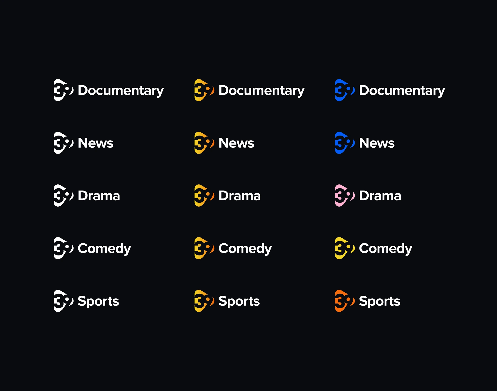
Each content section within 39 has its own logo ID, always accompanied by the main symbol and differentiated by a colour range chosen to reflect its essence.
Dynamic sunlight.
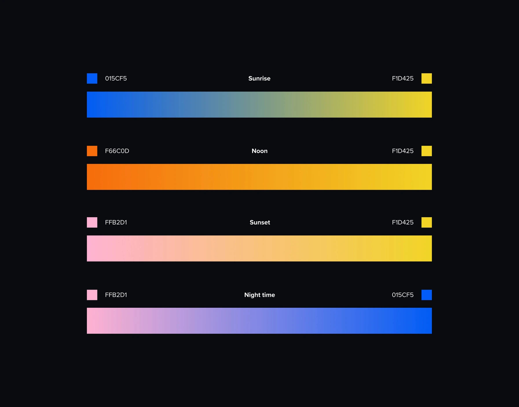
Inspired by the colours of the sky — the gradients sunlight produces at different times of the day. Each gradient represents a time slot, positioning 39 as the network that accompanies its audience at any hour.
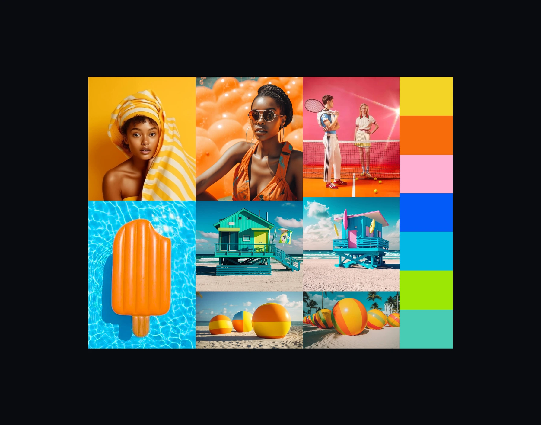
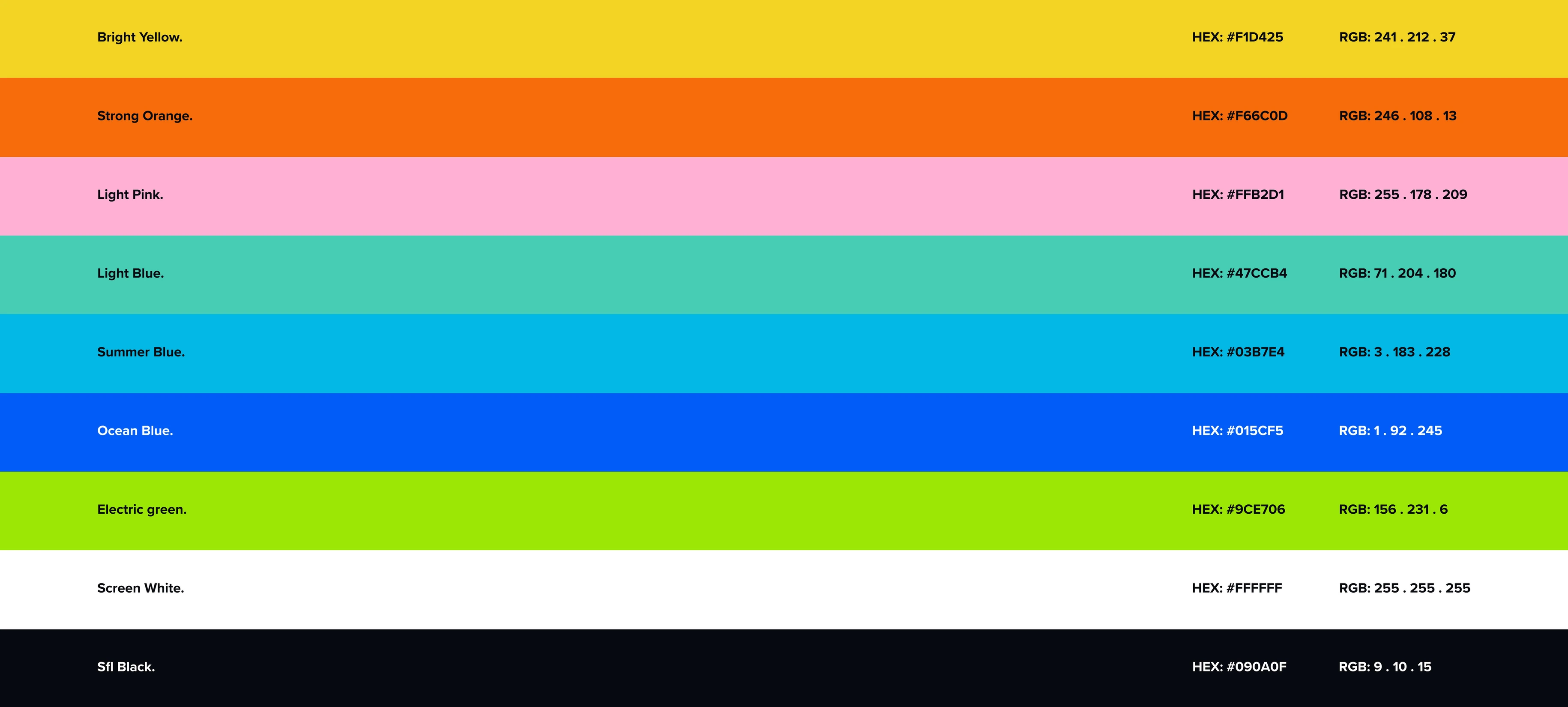
WSFL is colour in a gray world: high-impact, vibrant and bright, essential for differentiation and hierarchy.
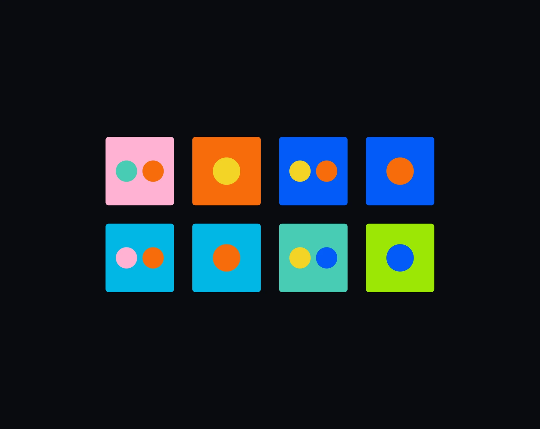 Solids pairing
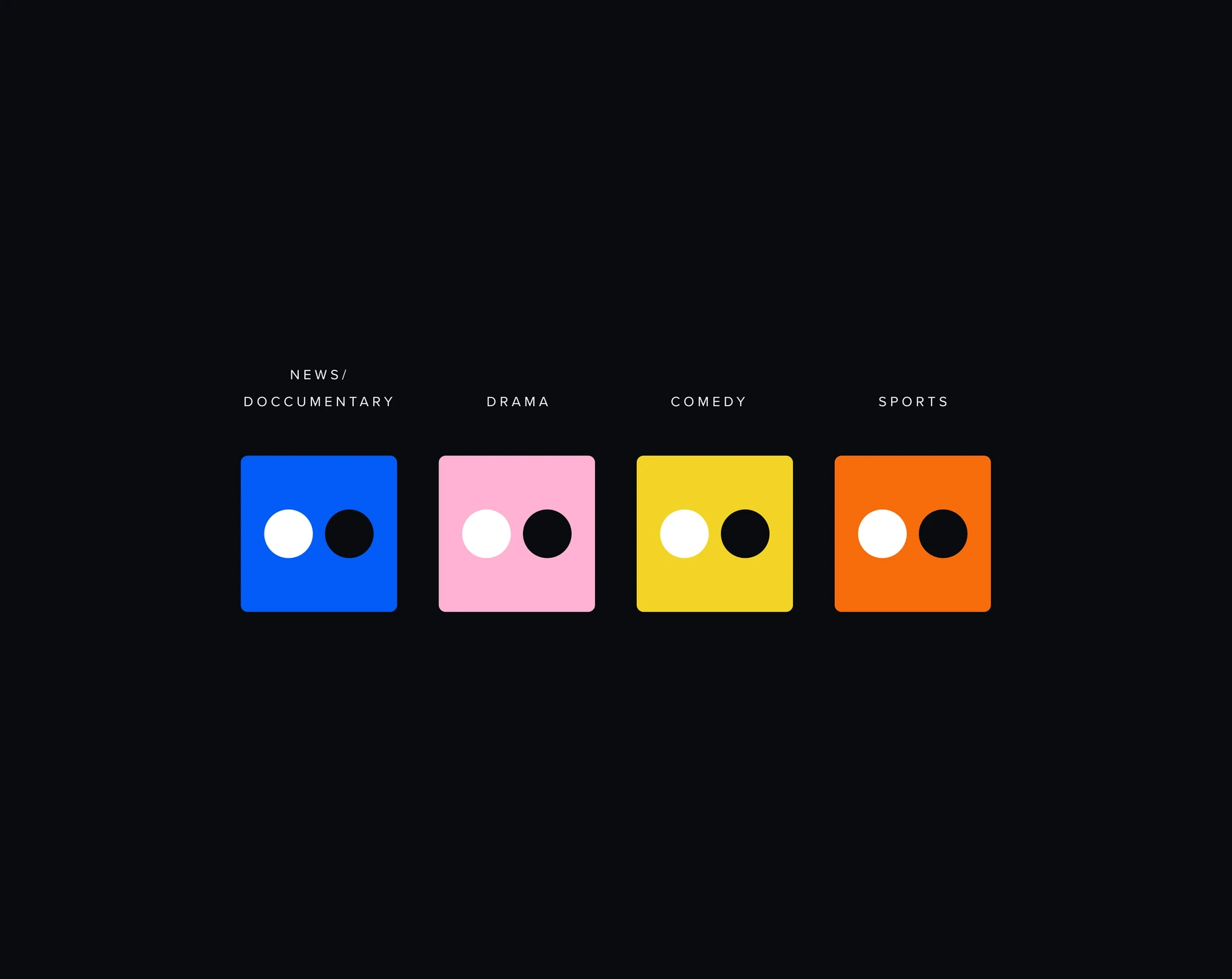 Sections pairing
Logo in motion
The main mark, the affiliate template and the legacy horizontal and vertical versions — all animated for on-air.
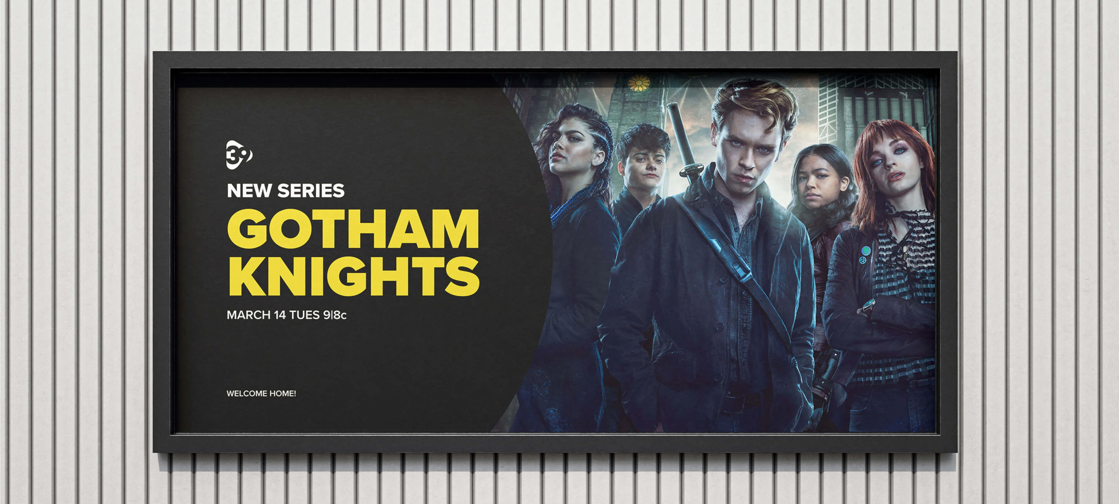
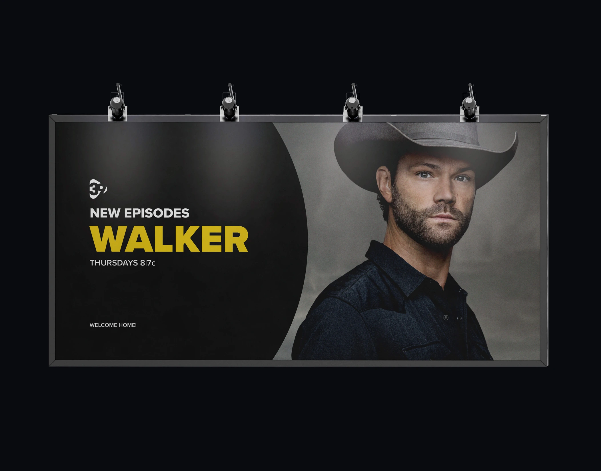
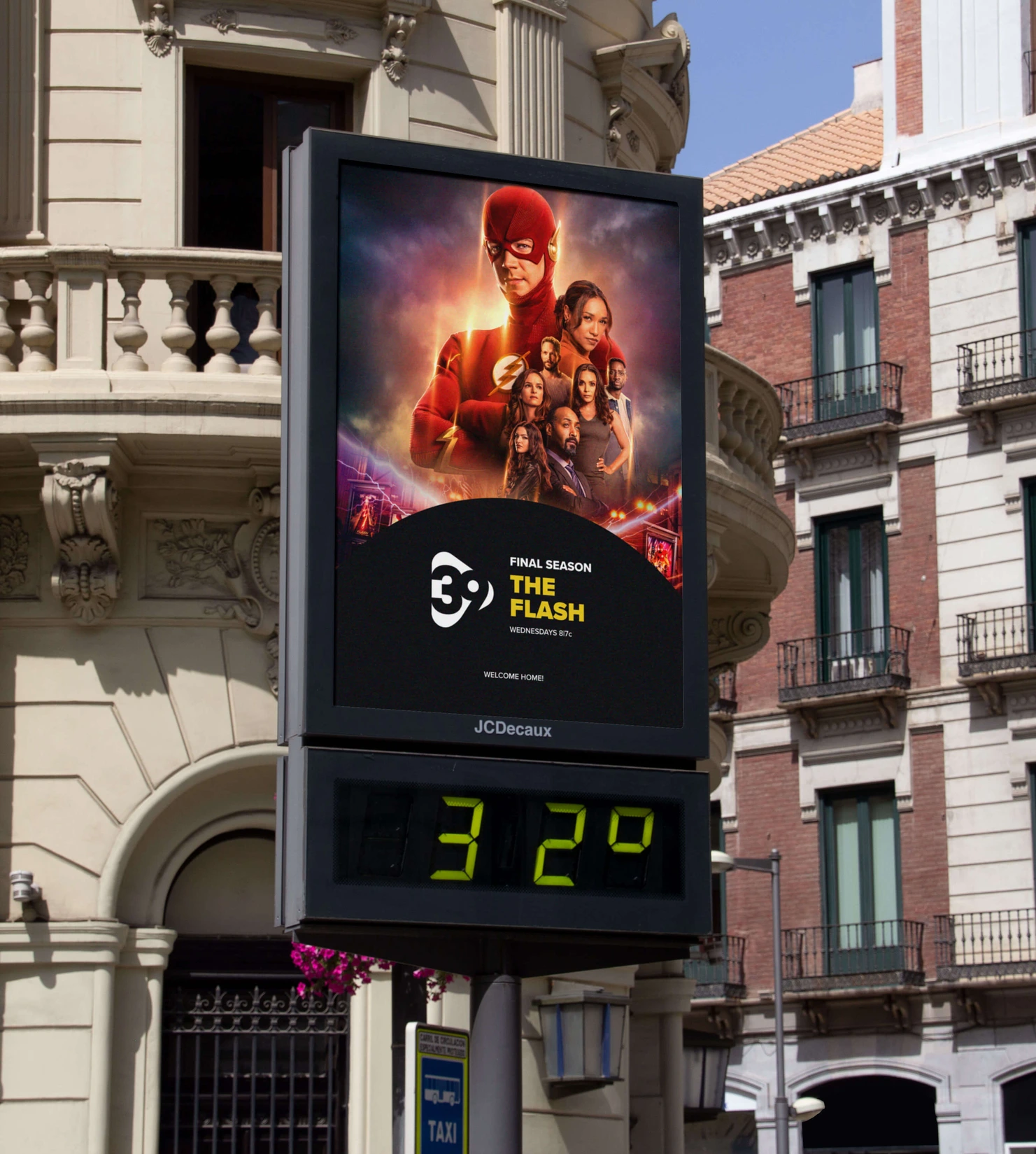
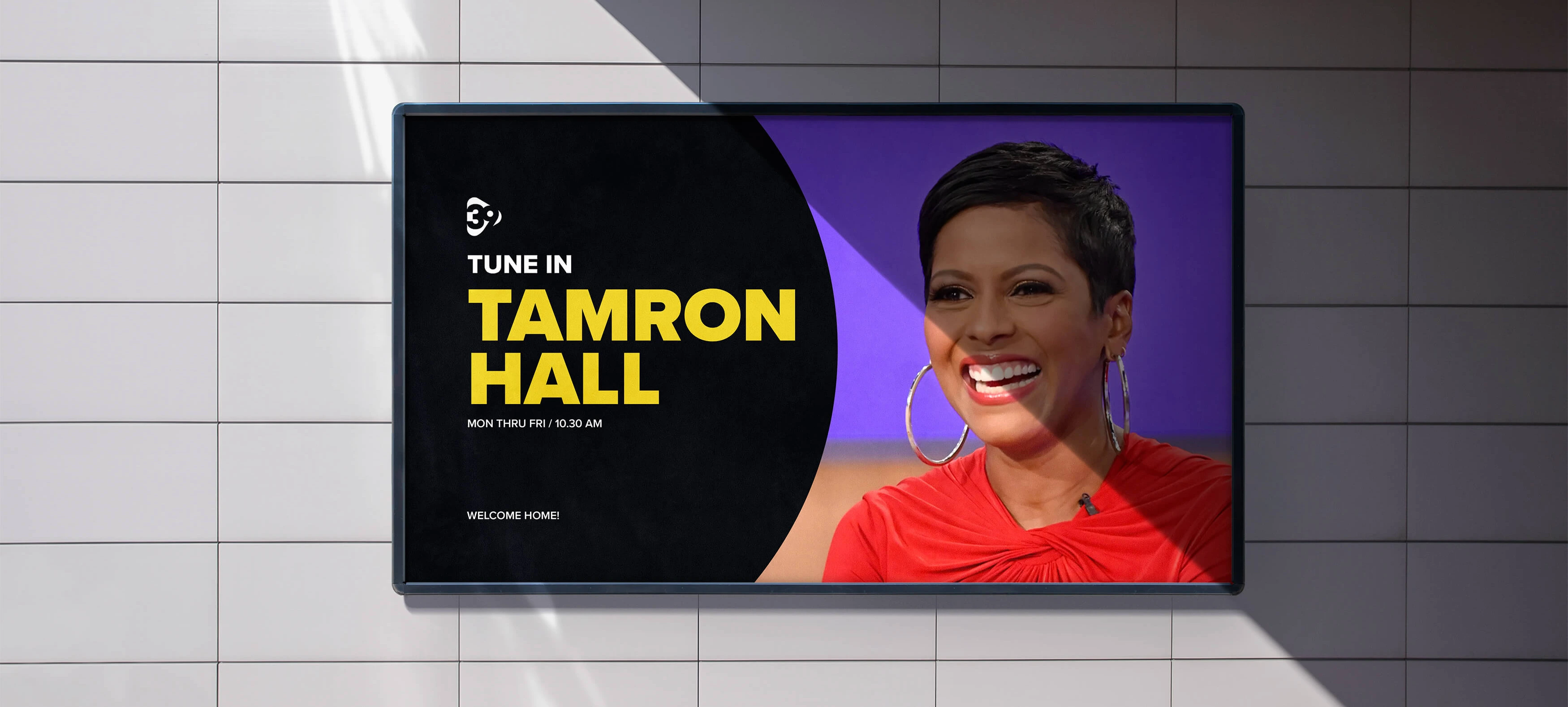
The symbol as a system.
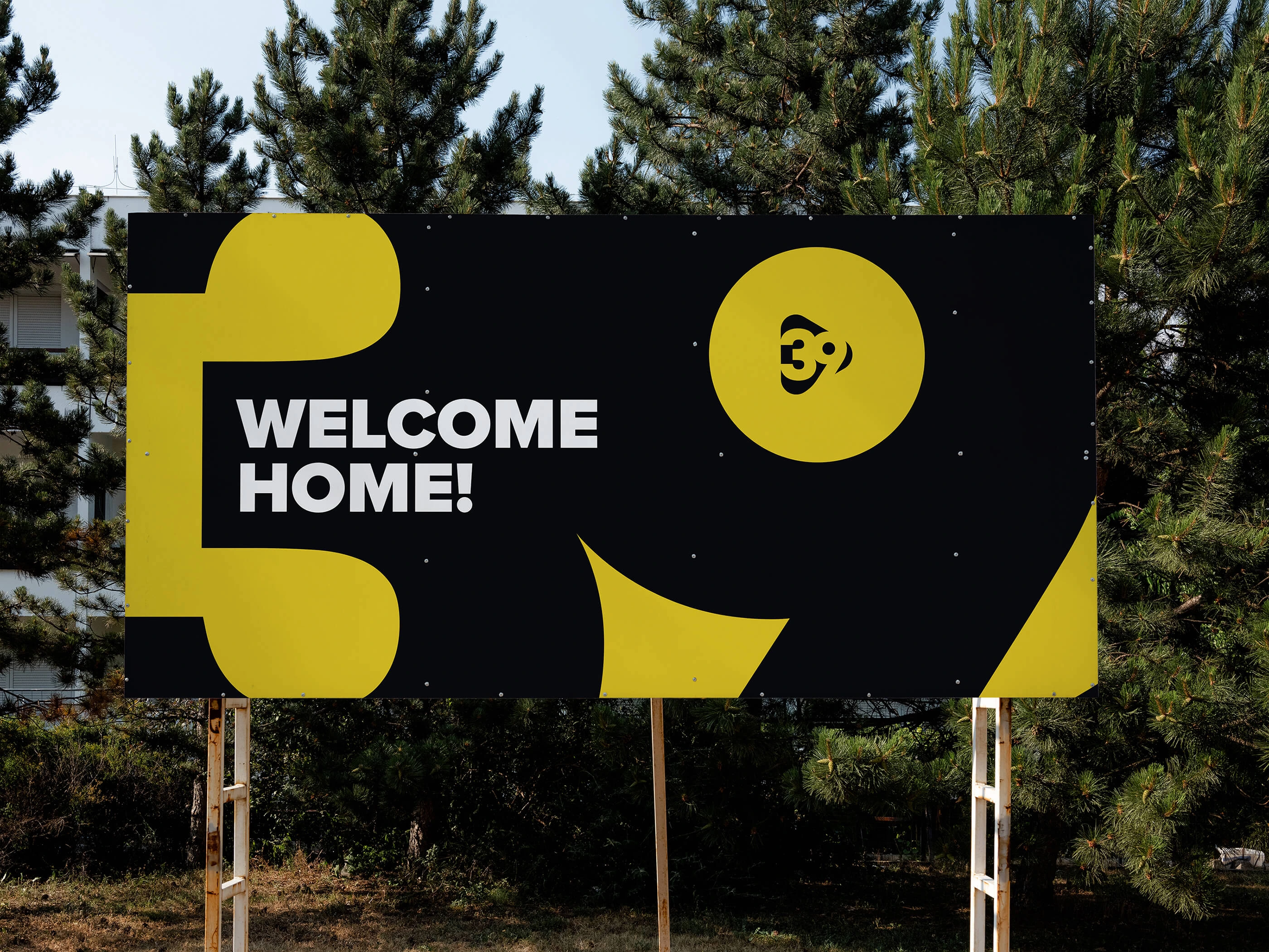
From 3D shapes for title frames and end cards to 2D shapes that structure every vertical's layout — the round ends of the symbol build new geometric forms, the visual representation of the content.