Inside South Florida
Show Rebrand
Brand Design South Florida _ 2023
A show that encapsulates the essence of eternal summer and the vibrant culture it represents.
From capturing the purest form of sunlight to embracing the unique moments that define the region, we crafted a brand identity that resonates with audiences on a profound level.
Through marketing strategy and creative vision, every aspect carries the warmth, energy and spirit of South Florida — illuminating the airwaves with a radiance that reflects the heart and soul of the region.

Three visual concepts, one sun.
A symmetric composition builds the structure of the brand.
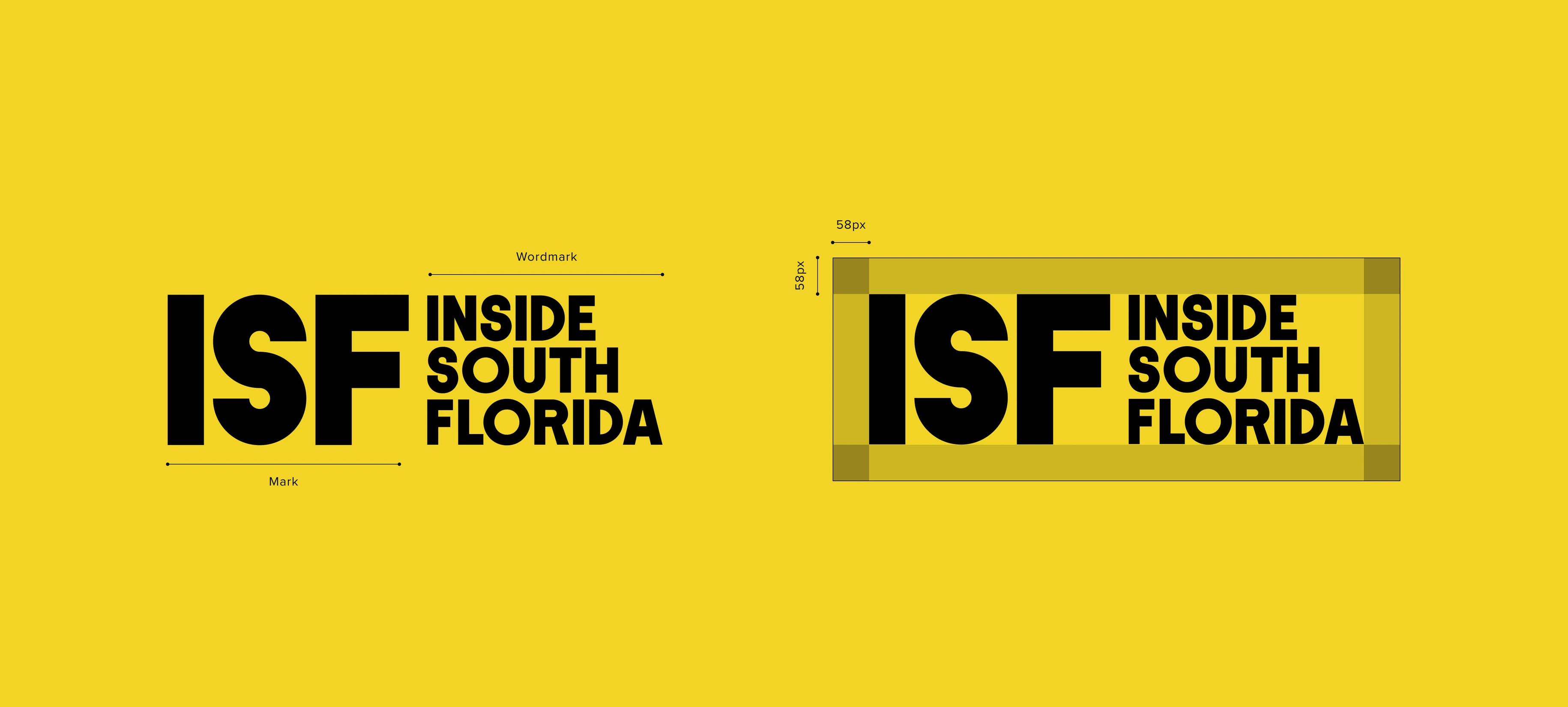
Simple figures come together to give visual meaning to the acronym.
The angle of the sun during the brightest hour of the day.


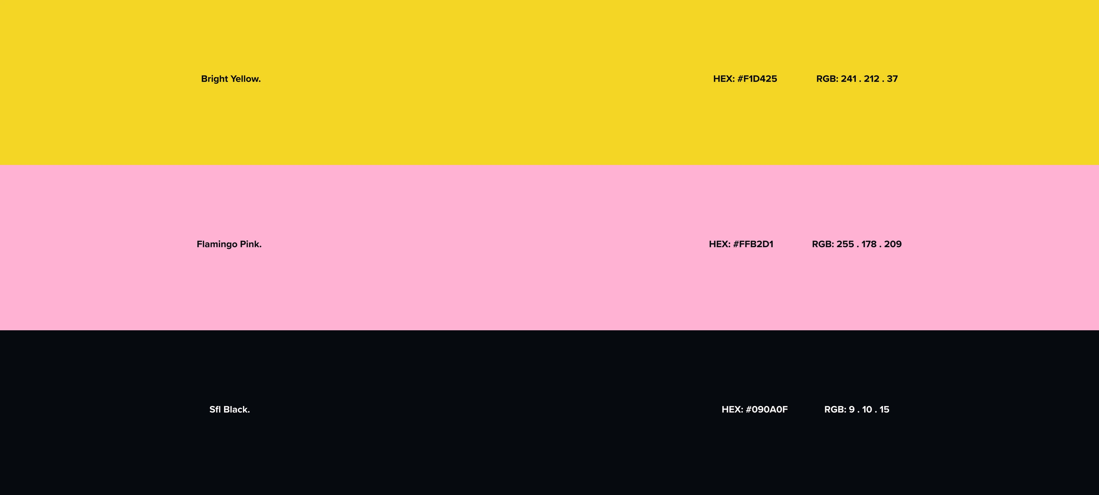
Bright yellow, summer orange, flamingo pink.
Each colour has an important role in the identity. The primary palette — bright yellow, summer orange, flamingo pink and the legacy ISF black — comes from the WSFL colour scheme, completed by white and black.
CMYK values are used across all print platforms, RGB across all digital mediums.



Type as a fundamental axis.
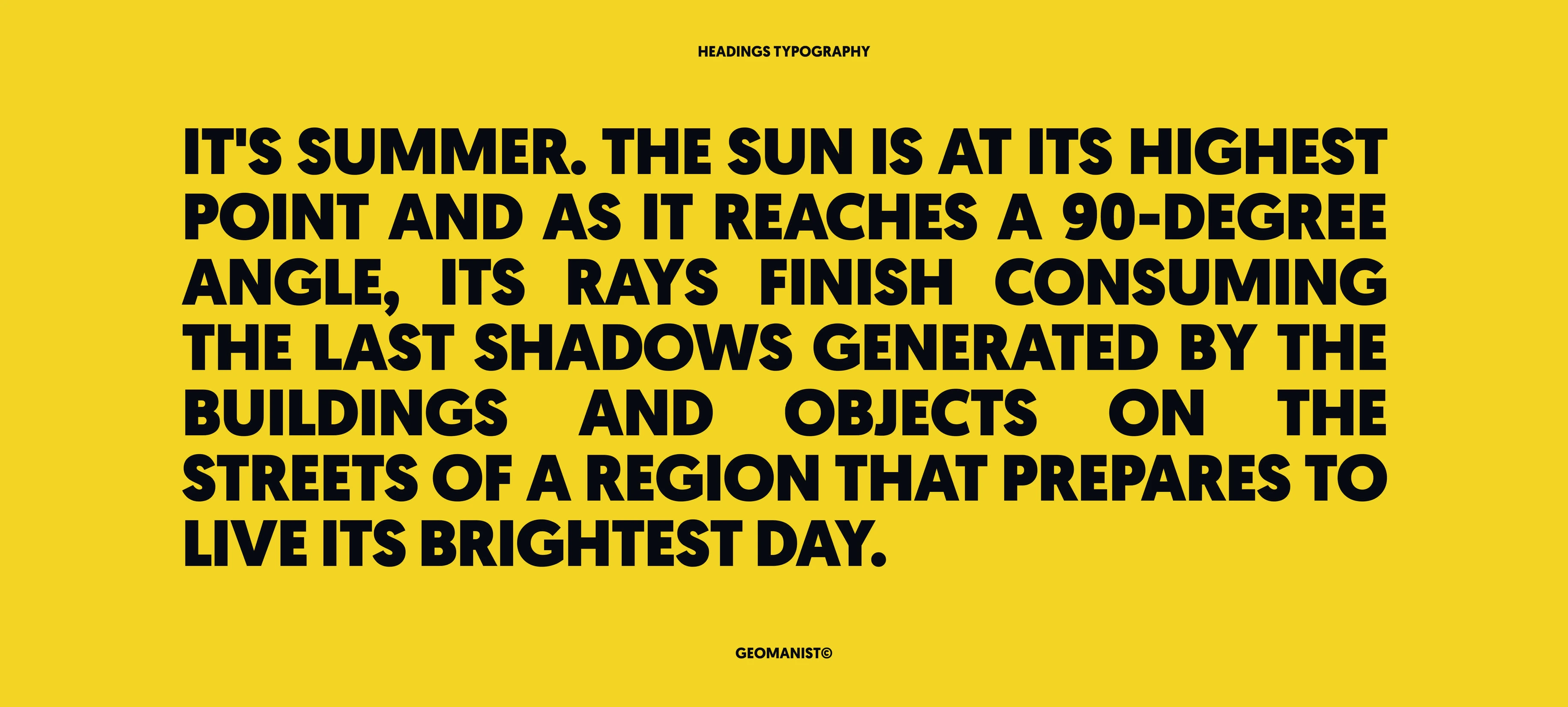
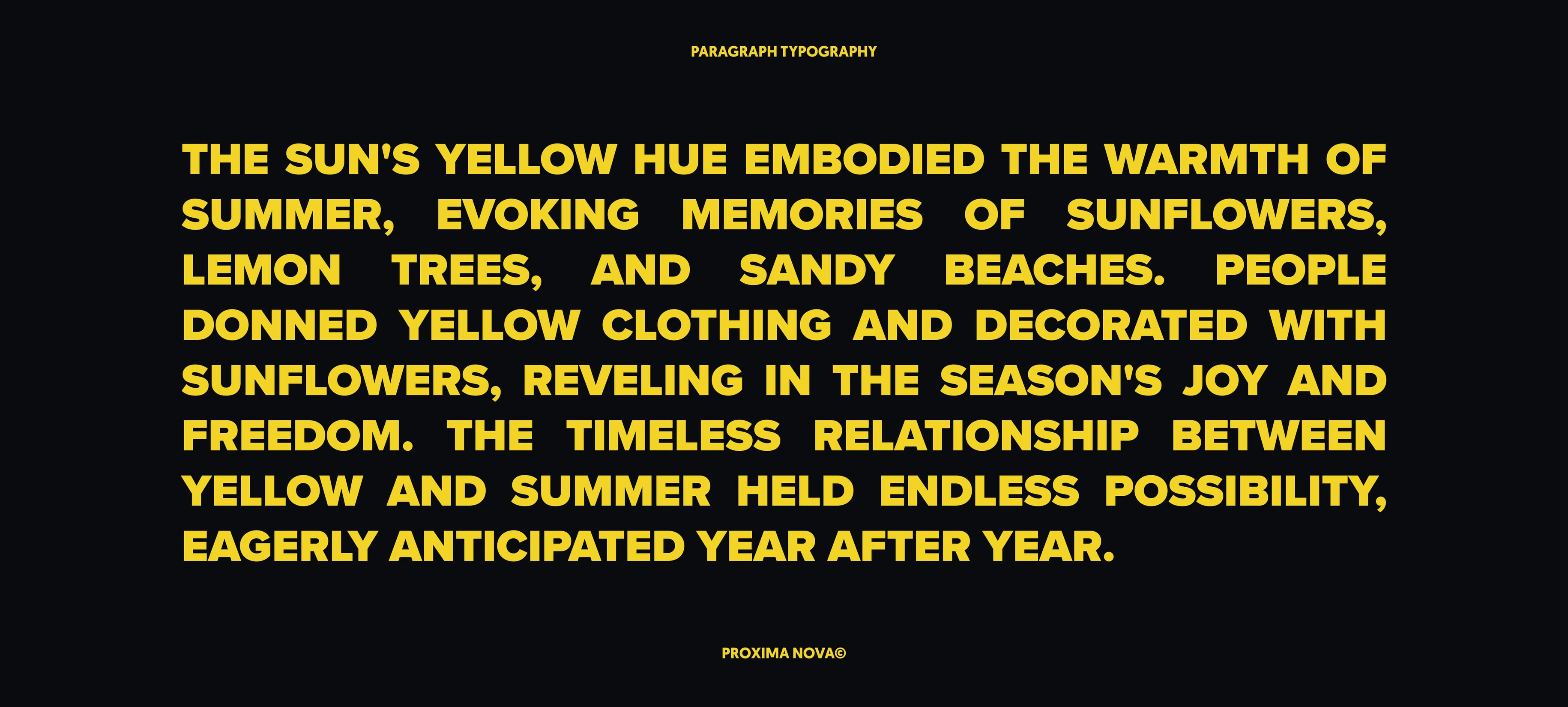
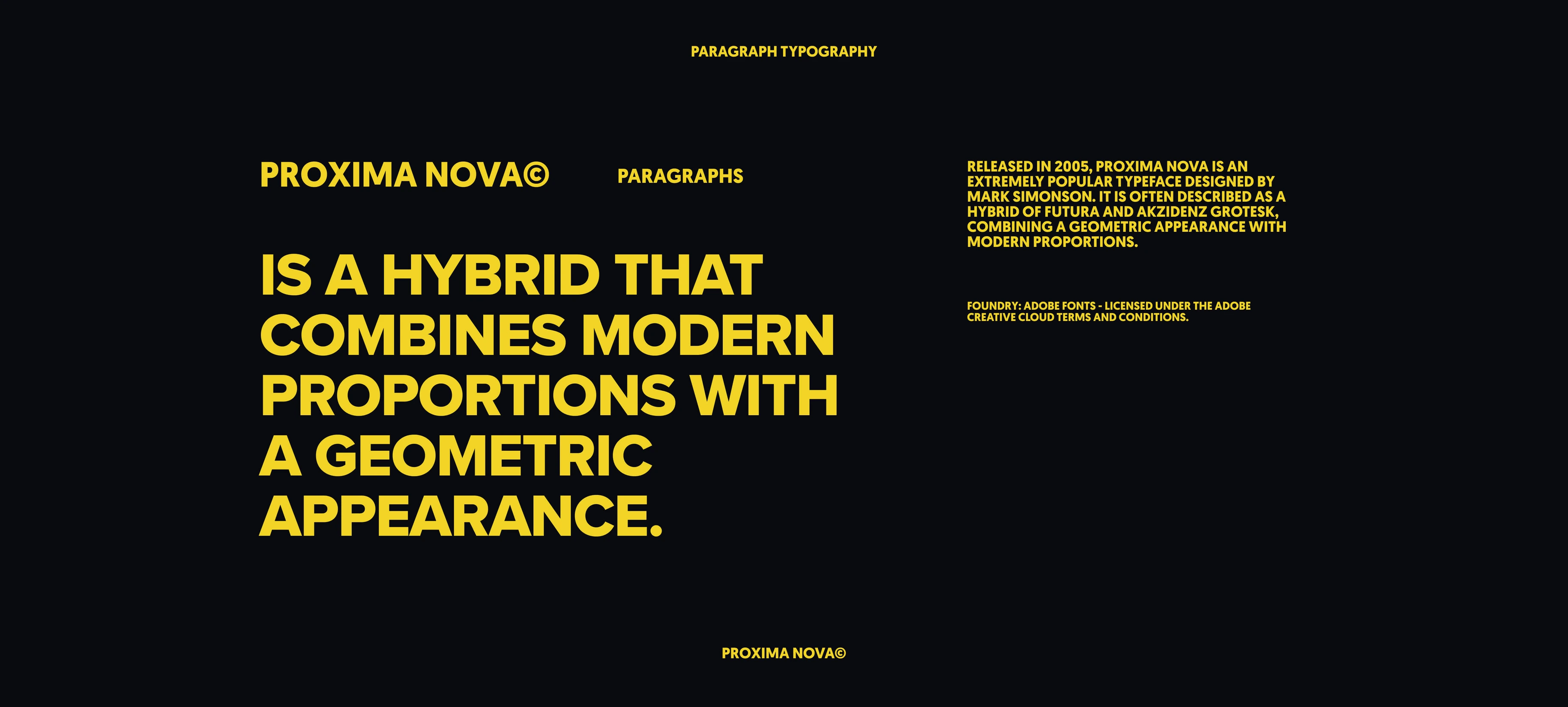
The fonts defined for the brand are a fundamental axis of the visual style, contributing to an original appearance across every material.

Golden hour, always.
Guidelines for future photographers and art directors to capture the same vibe.
{{ r.d }}
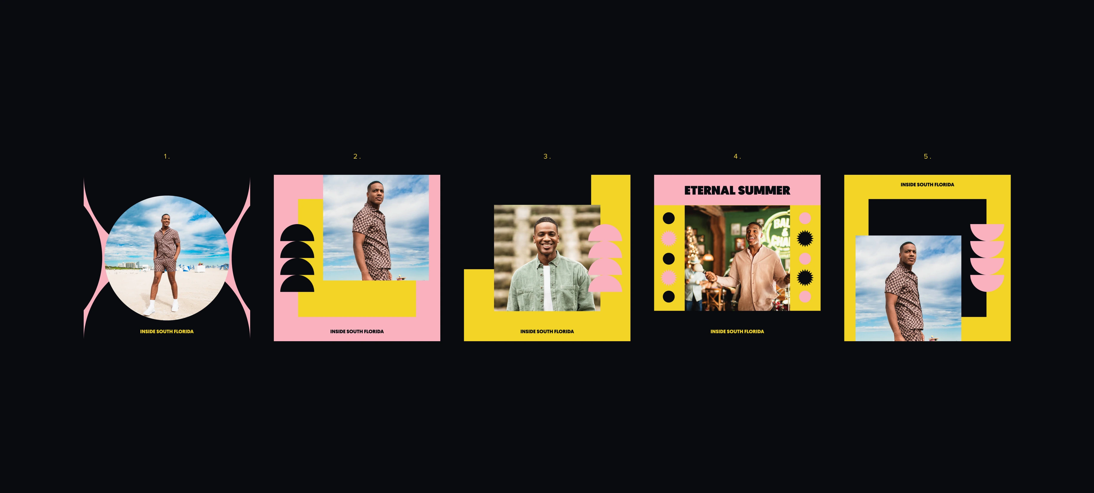
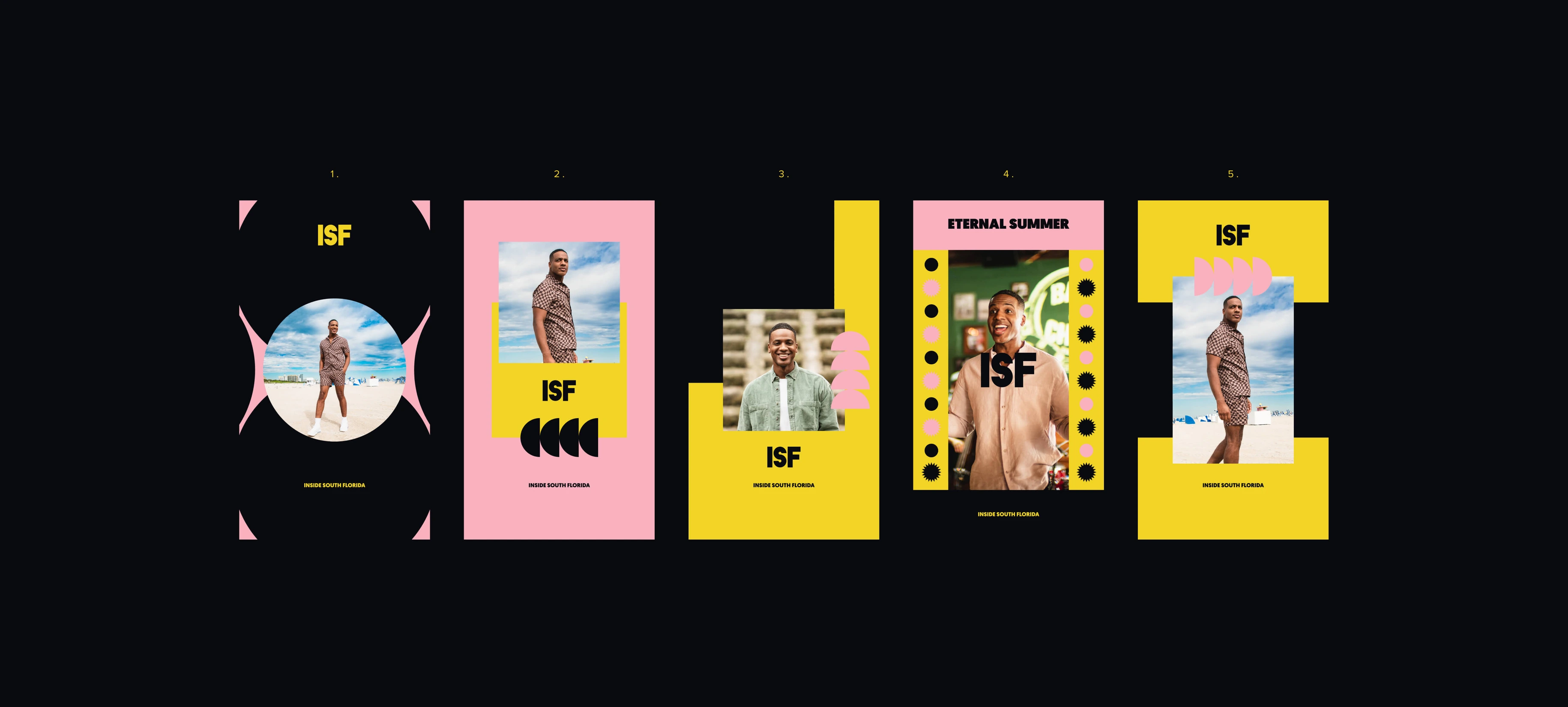
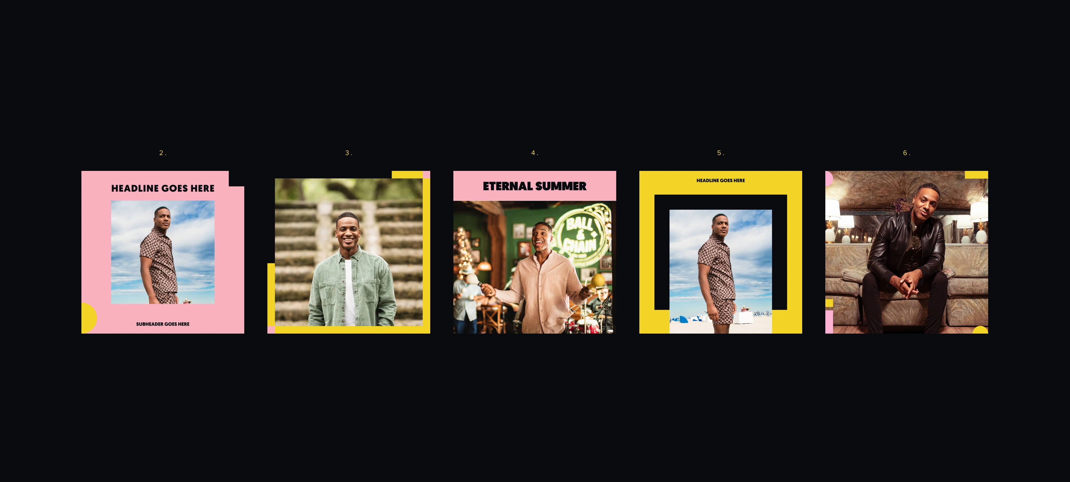
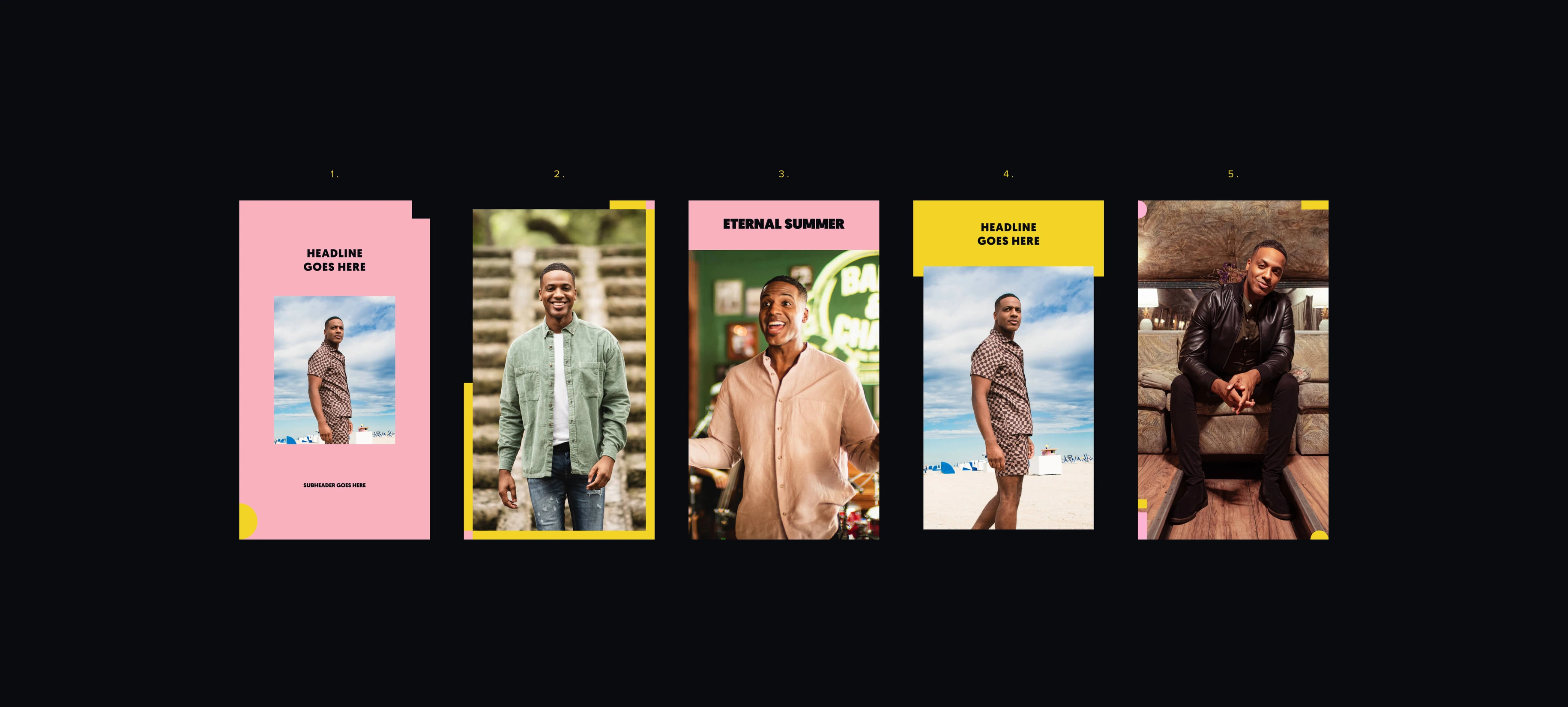
Every element, combined.
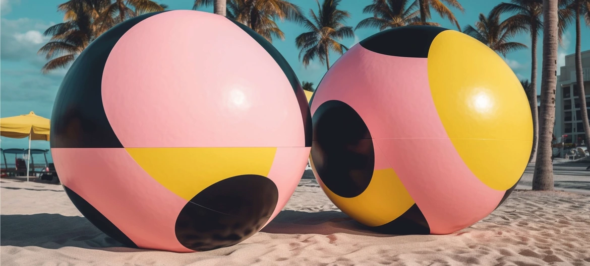
All the brand elements combined to create the assets around the digital world.
The sun, on air.
Horizontal, vertical and affiliate marks, show intro and outro, teasers and transitions — a full on-air package.