Rustic
Pines
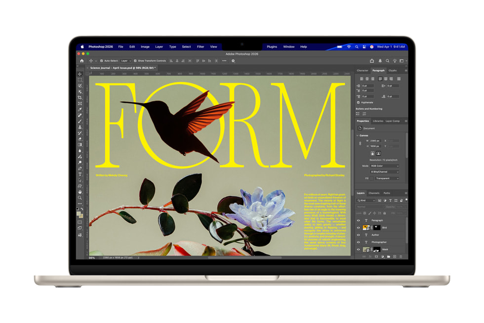
Website
Social media
Email marketing 2026
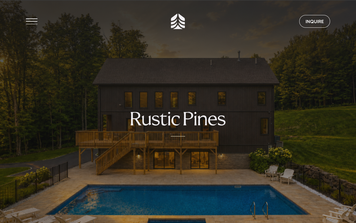
A limited collection of nineteen custom homes on protected woodland in Ulster County, two hours from New York City — built in twelve months or less.
We shaped the whole presence: an identity grounded in the forest, a website that sells homes before they're built, an Instagram program approved post by post, and an email series that walks buyers from a first letter to move-in. One calm, precise voice across all of it.
Nature and architecture, together.
The symbol joins a pine and an A-frame roofline into one mark — the forest and the home it shelters. It anchors a family of lockups built for every scale, from a site header to a signpost at the end of a gravel road.
Symbol above wordmark. The first choice for most applications and the brand’s main signature.
Symbol beside wordmark, for headers, email and any horizontal space.
The R·P initials, for small formats and details where the full name would crowd.
The pine and roofline alone. Used as a mark, a frame and a recurring graphic device.
Warm earth, one bright accent.
Natural neutrals taken from bark, stone and dry grass, cut by a single vibrant yellow that is used very sparingly — a lit window at dusk.
#1E1A1E
#786C52
#ACA086
#FAF2E0
#FDFD34
A geometric sans for statements and headlines. Set light, large and airy, often in Bark on cream.
A rounded sans for labels, body copy and interface. Uppercase eyebrows with generous tracking.
Sentence case for headlines and body. No exclamation points, no emoji. Concrete numbers signal craft: 2.7 to 21 acres, 12 months or less.
The roofline as a window.
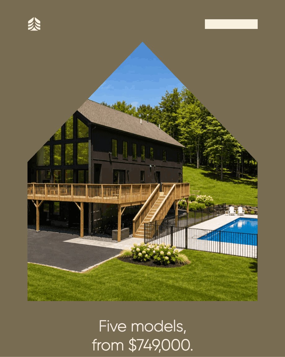
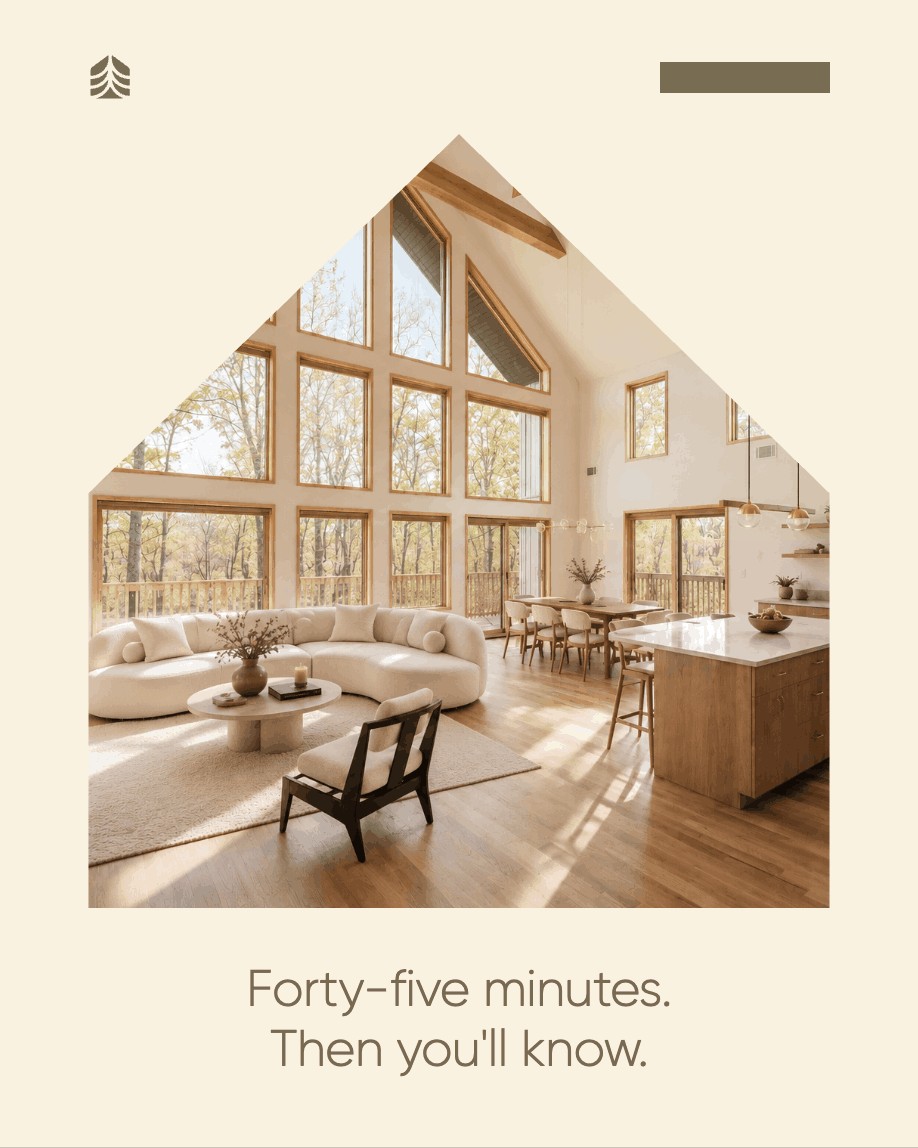
The angular roofline from the symbol becomes a frame for photography — every image seen through the shape of a home.
The pine mark itself works as a mask, letting the forest show through the logo.
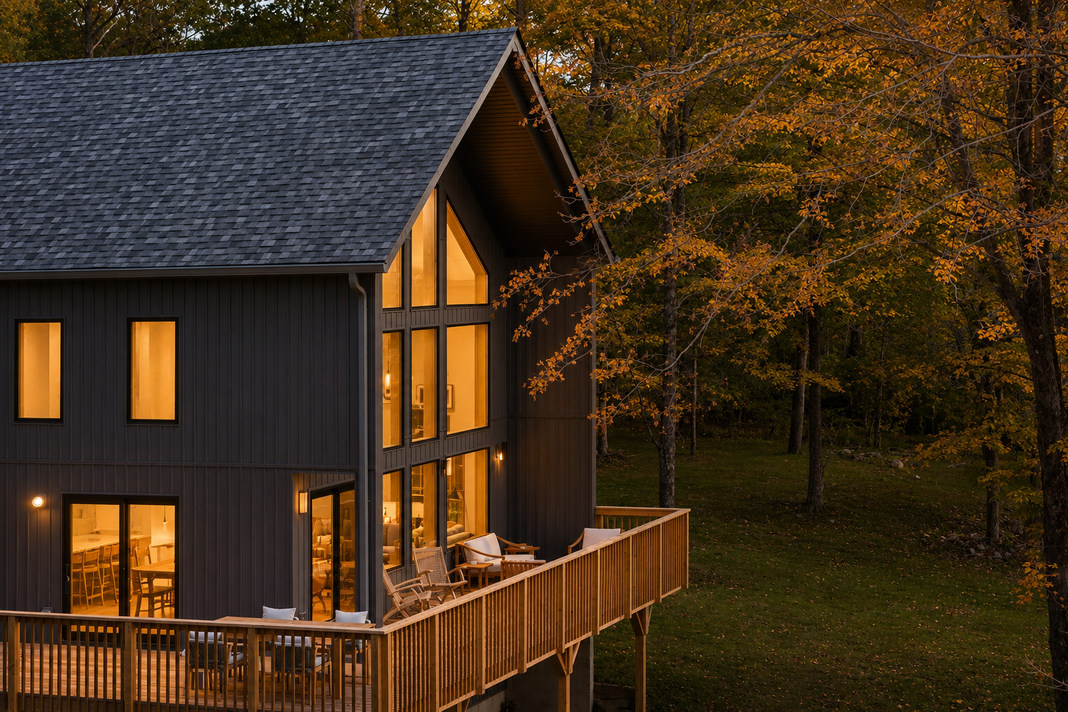
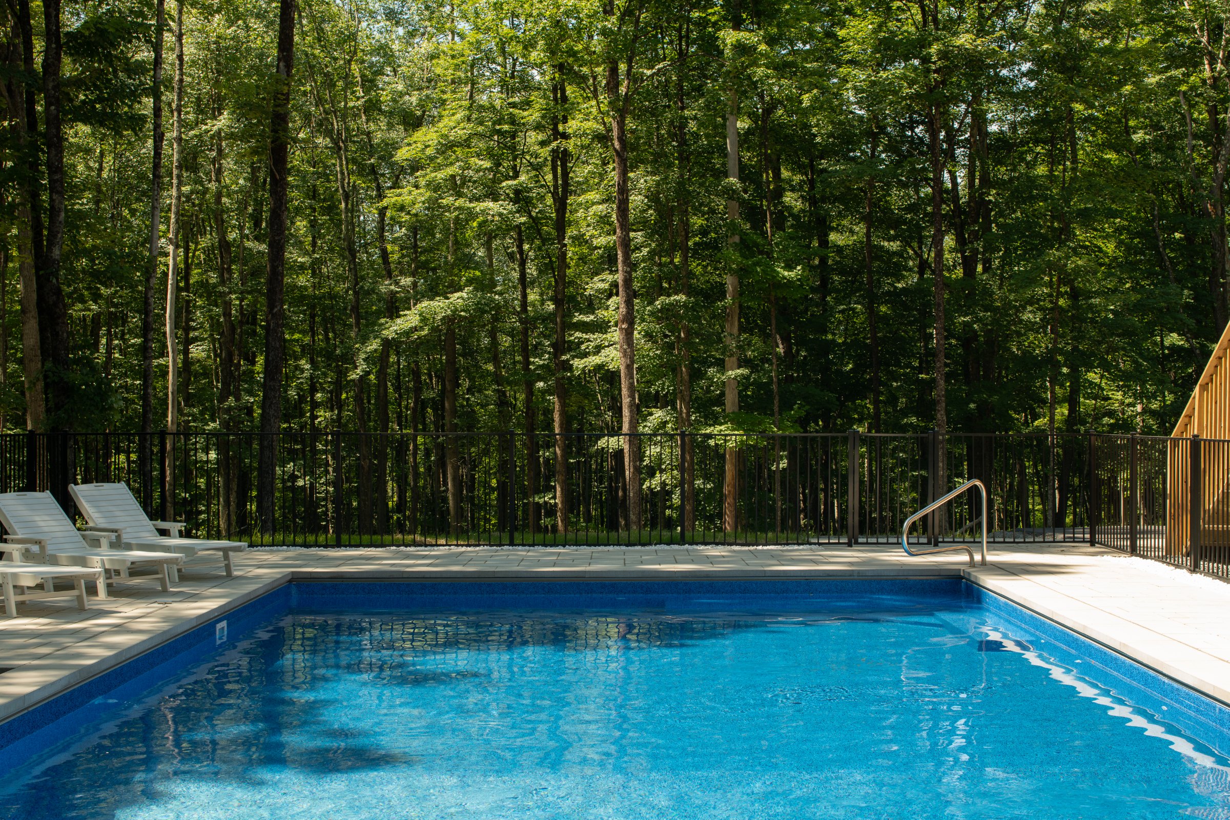
Real light, honest materials.
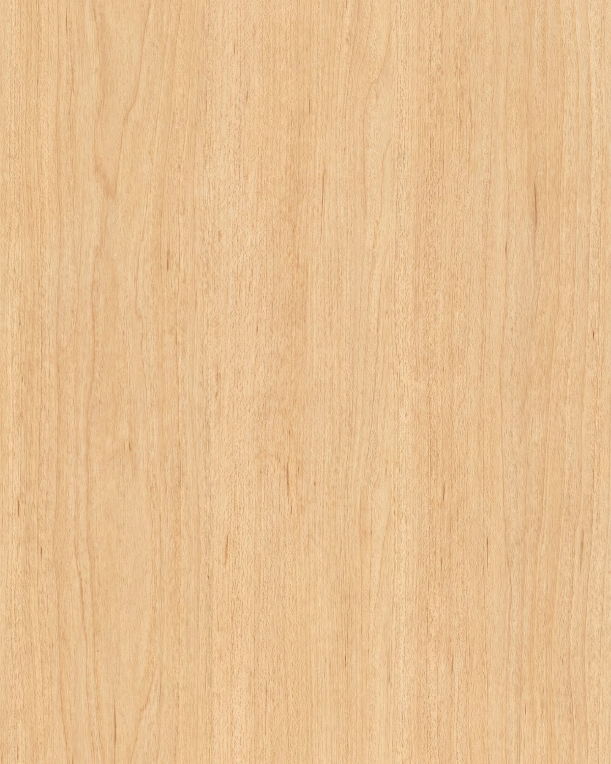
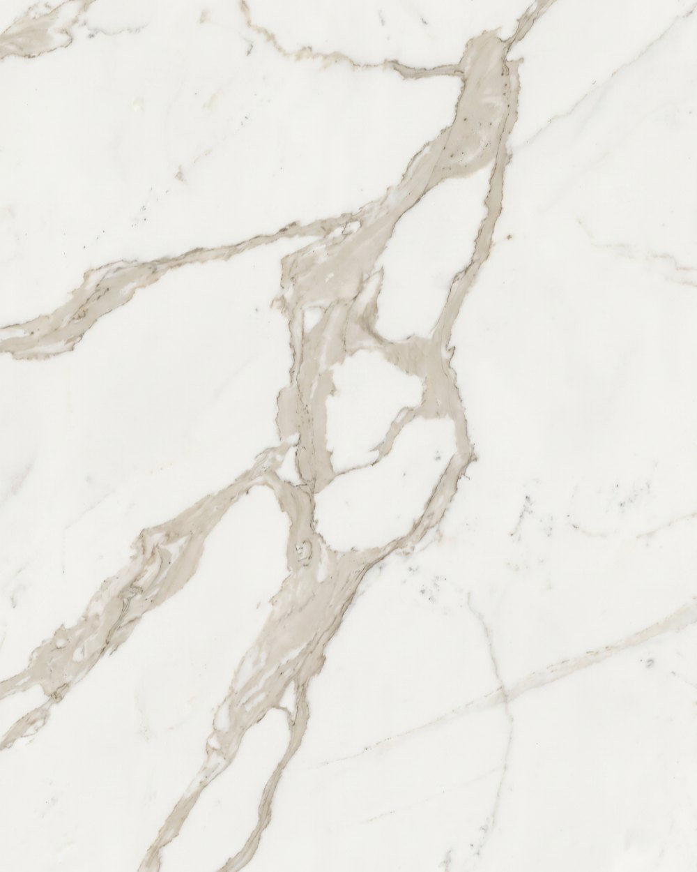
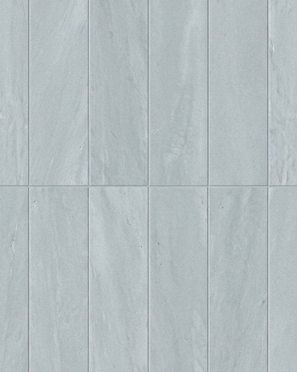
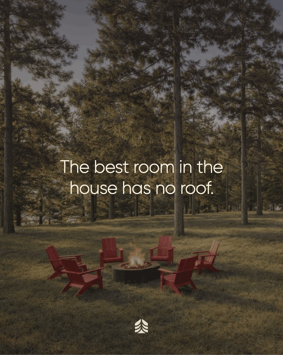
Architectural exteriors at golden hour, warm timber interiors and close-ups of oak, marble and stone. Warm and natural, never heavily filtered.
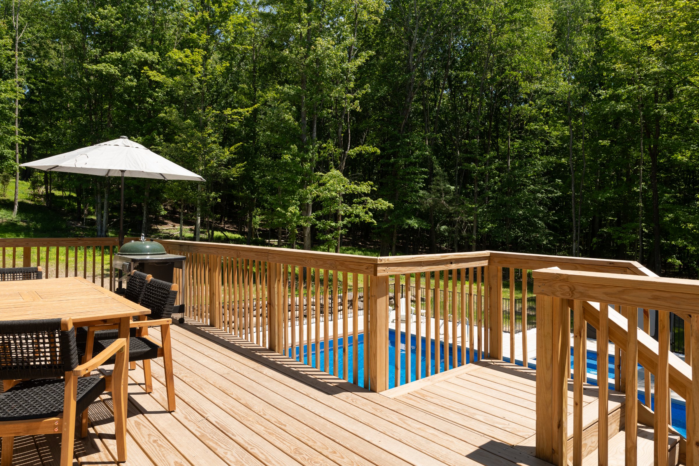
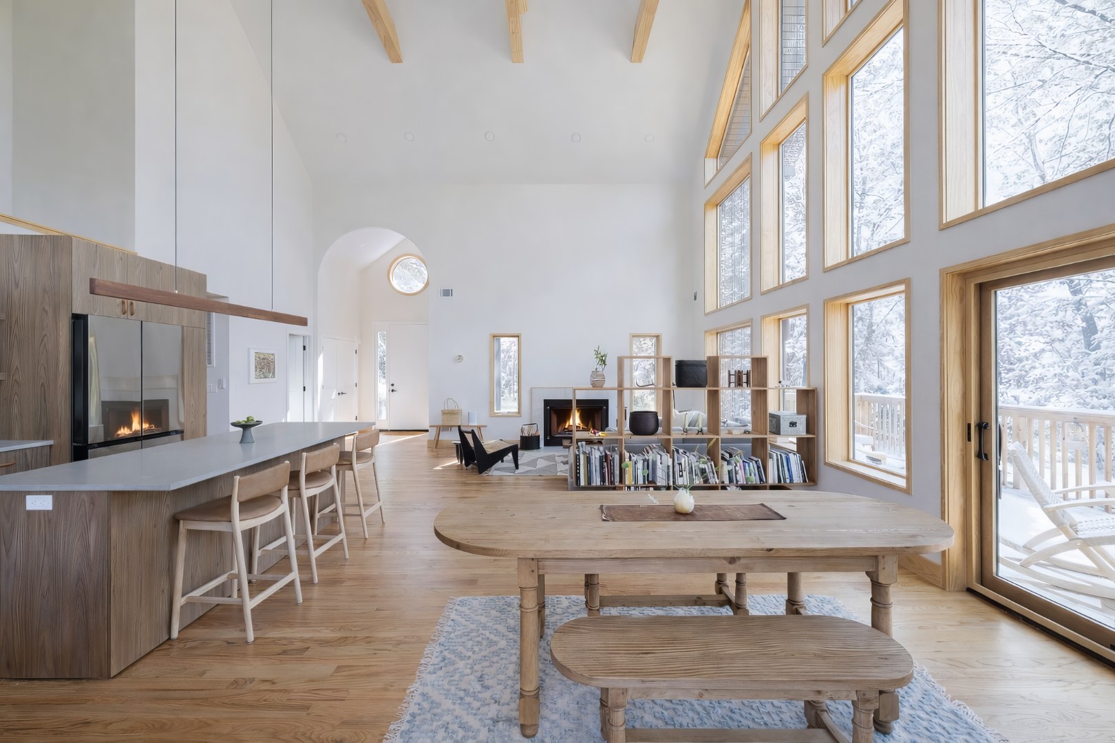
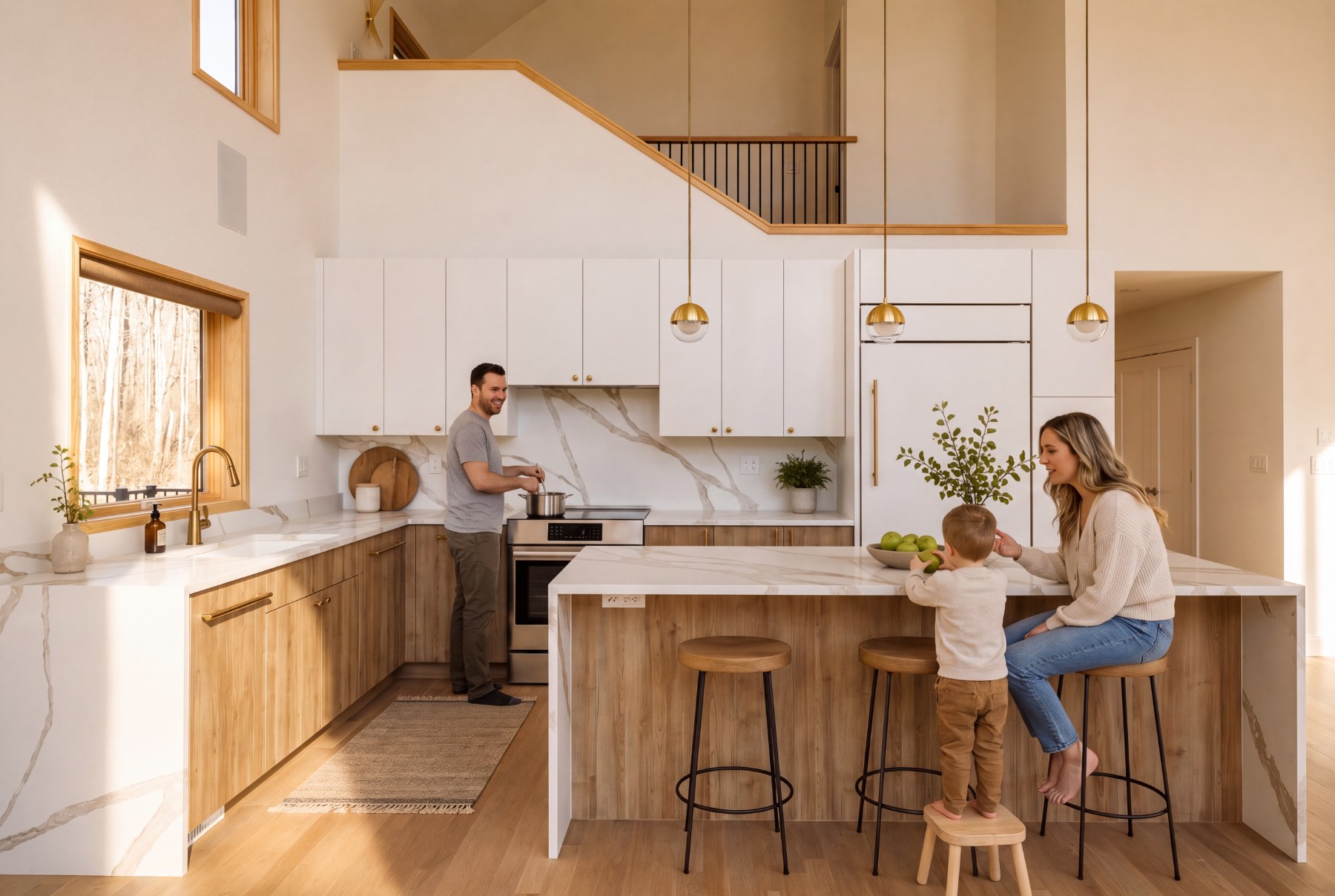
A site that sells the woods first.
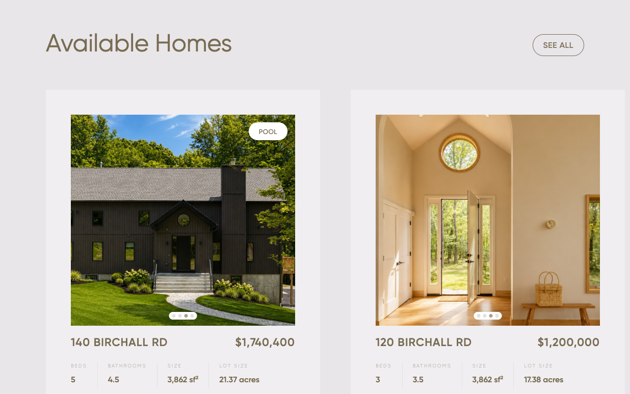
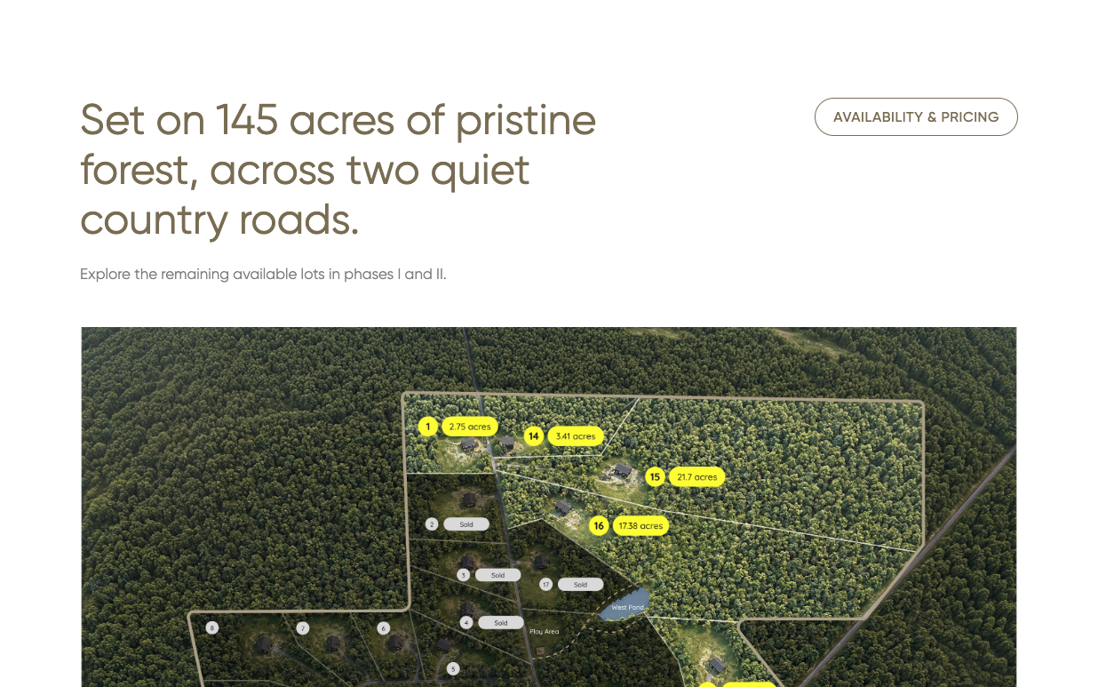
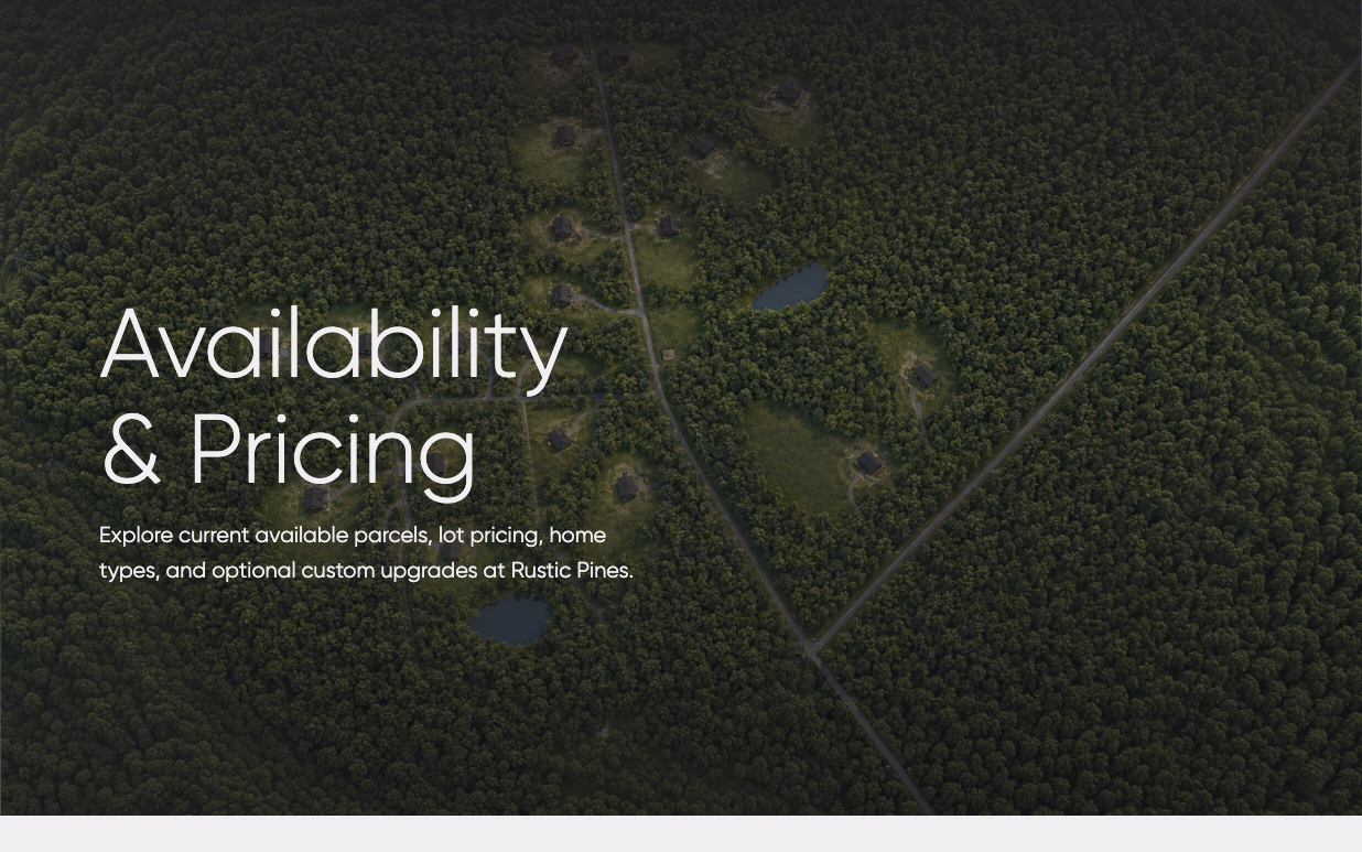
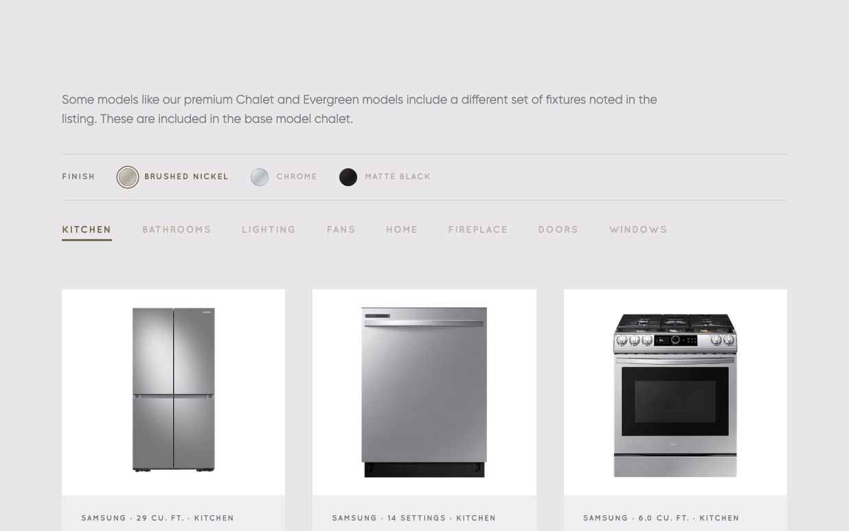
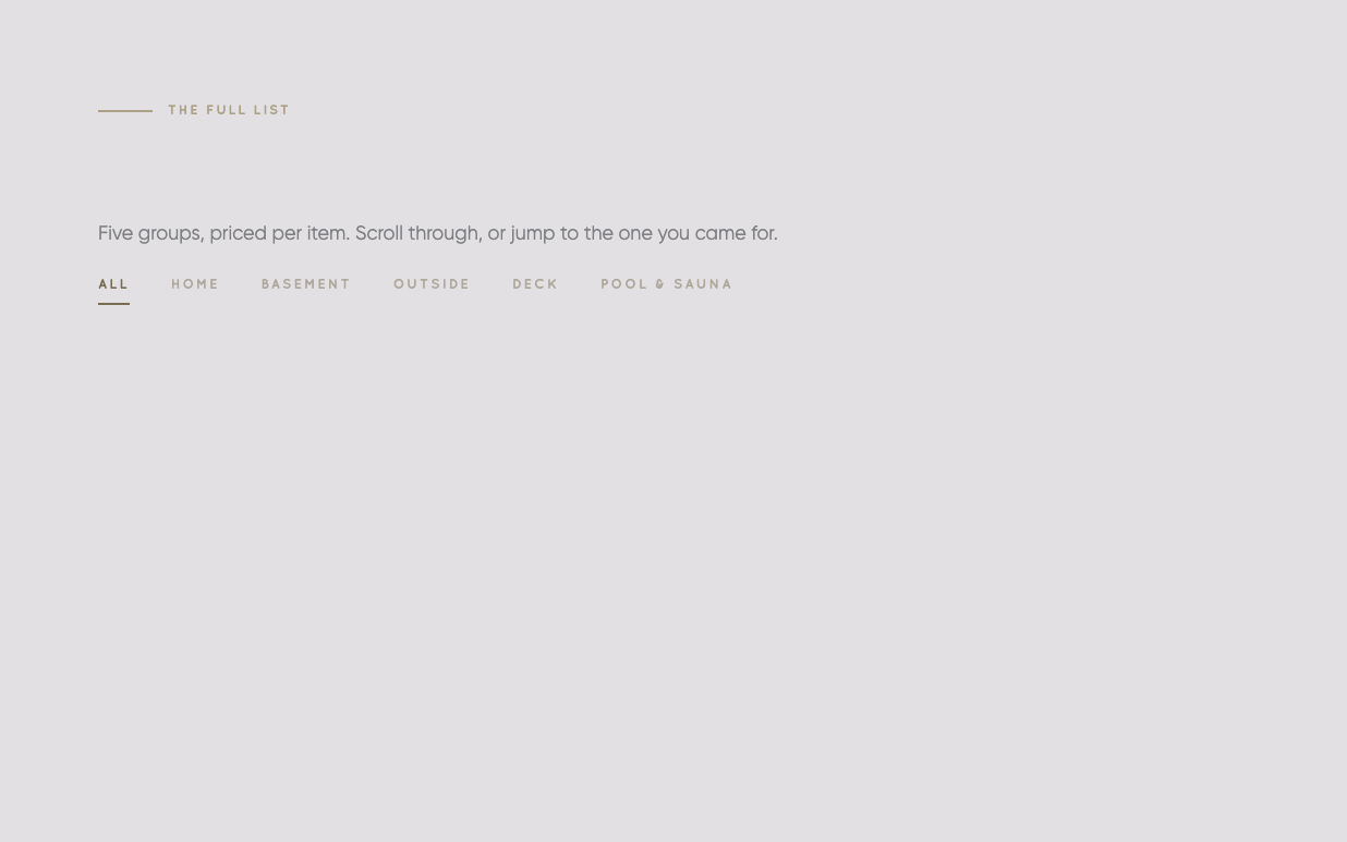
Listings, lots, fixtures, upgrades and a month-by-month build timeline, each written in the brand’s calm, specific voice. Every number is real — acres, square feet, months to move-in.
The woods are the view from every window.
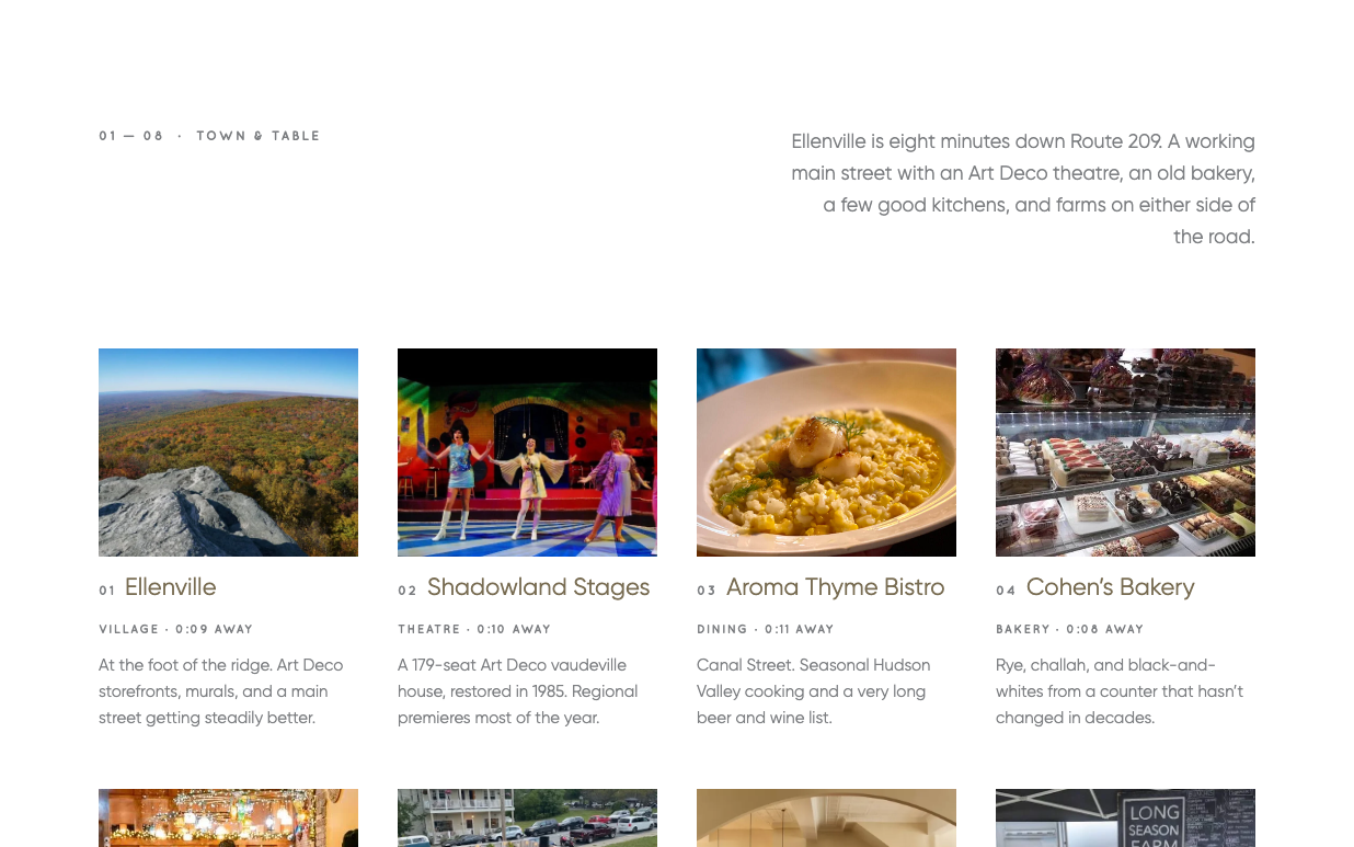
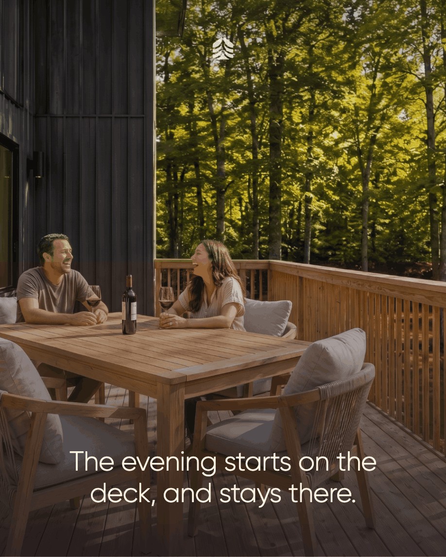
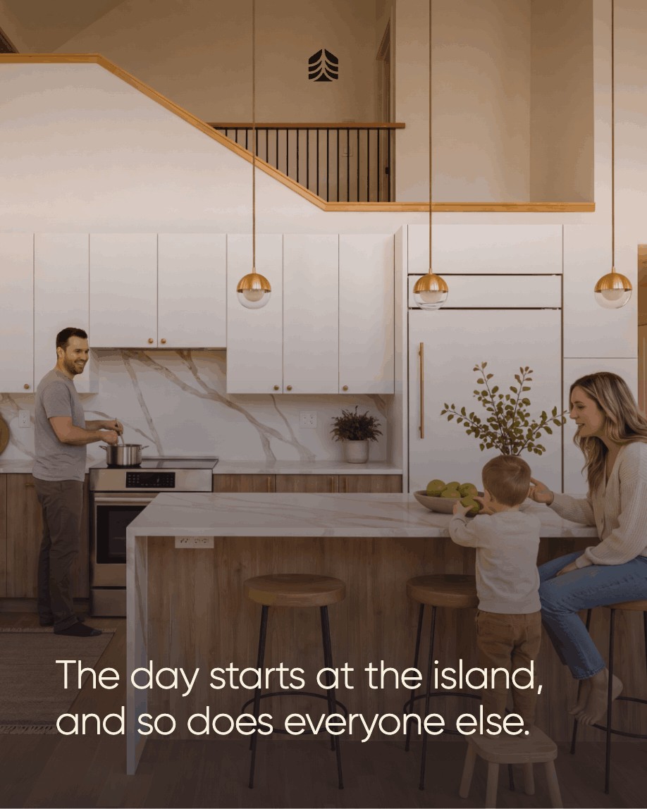
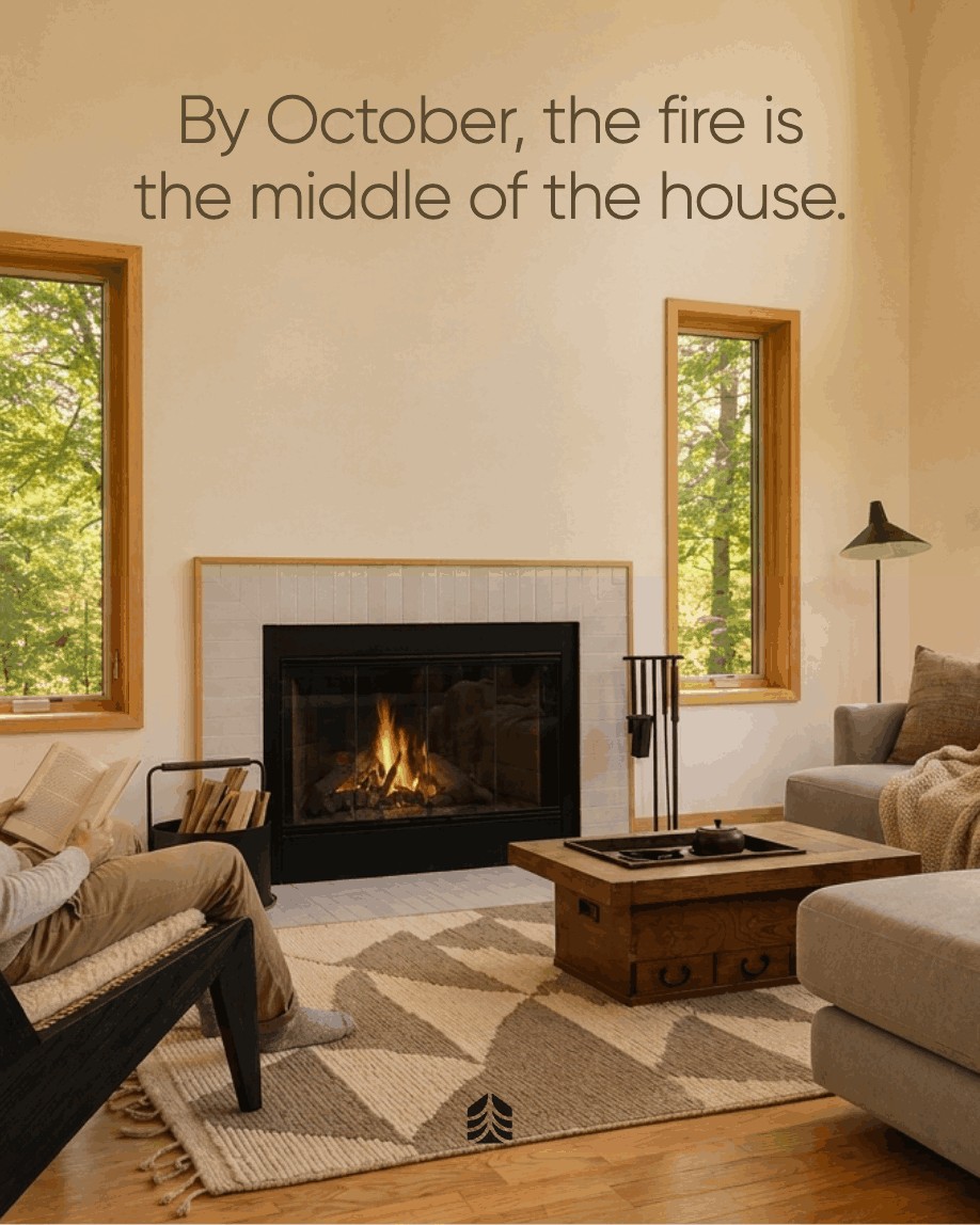
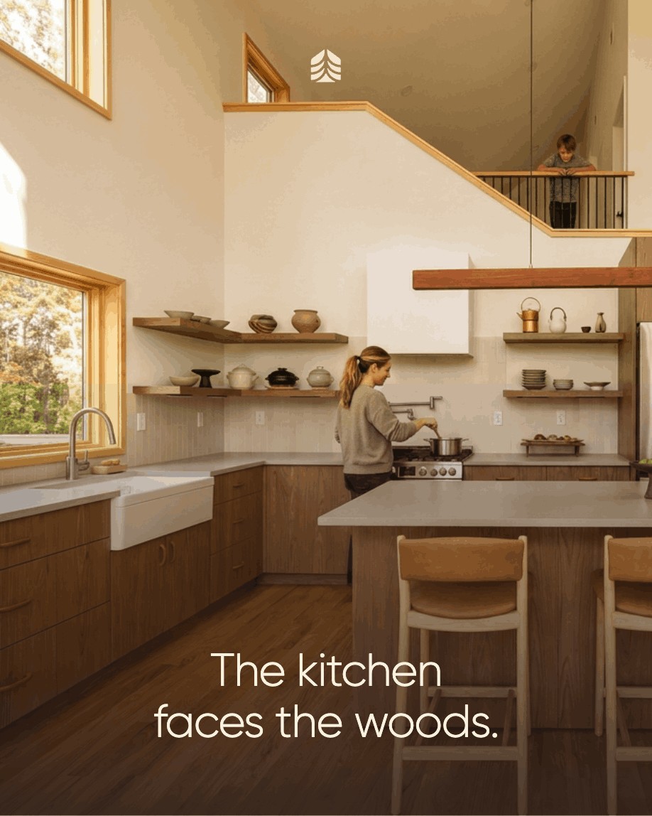
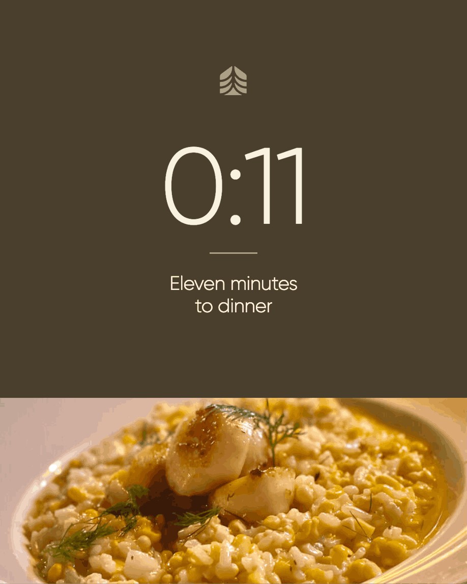
An Instagram program in the same quiet register: lifestyle moments, drive times to the region’s best stops, and the homes themselves, framed by the roofline of the symbol. Every post was approved by the creative director before it went live.
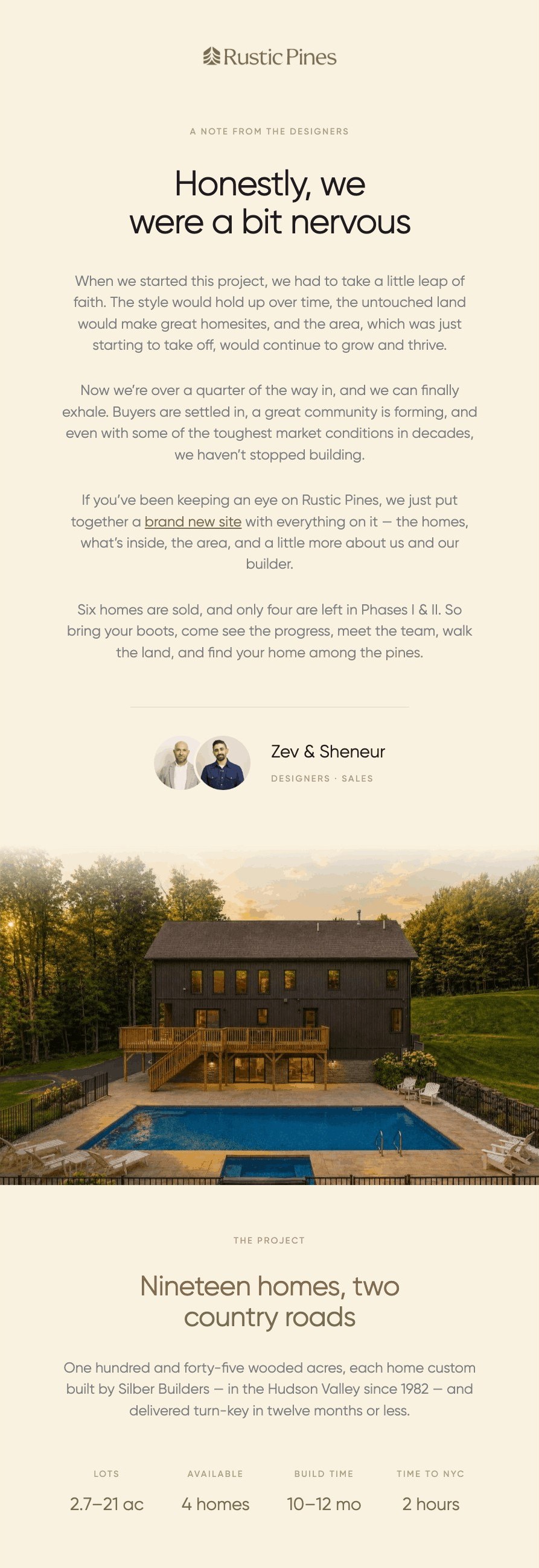
Honestly, we were a bit nervous.
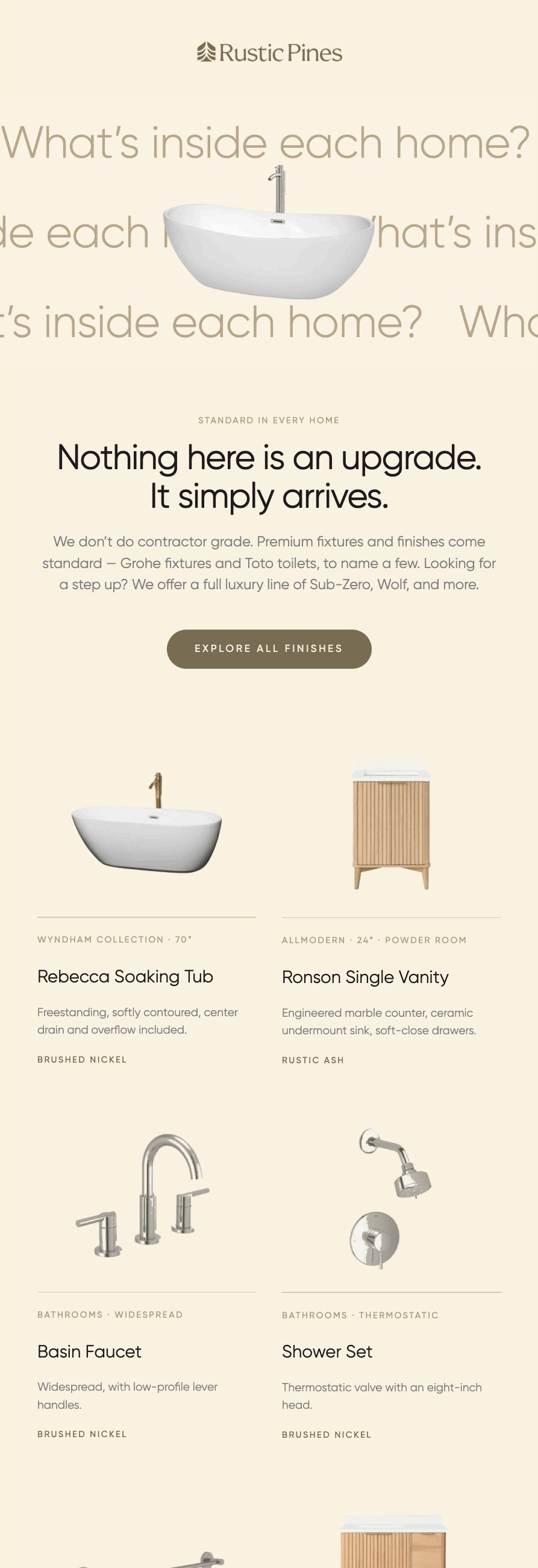
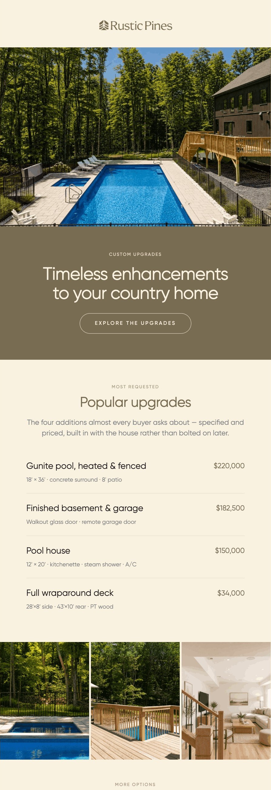
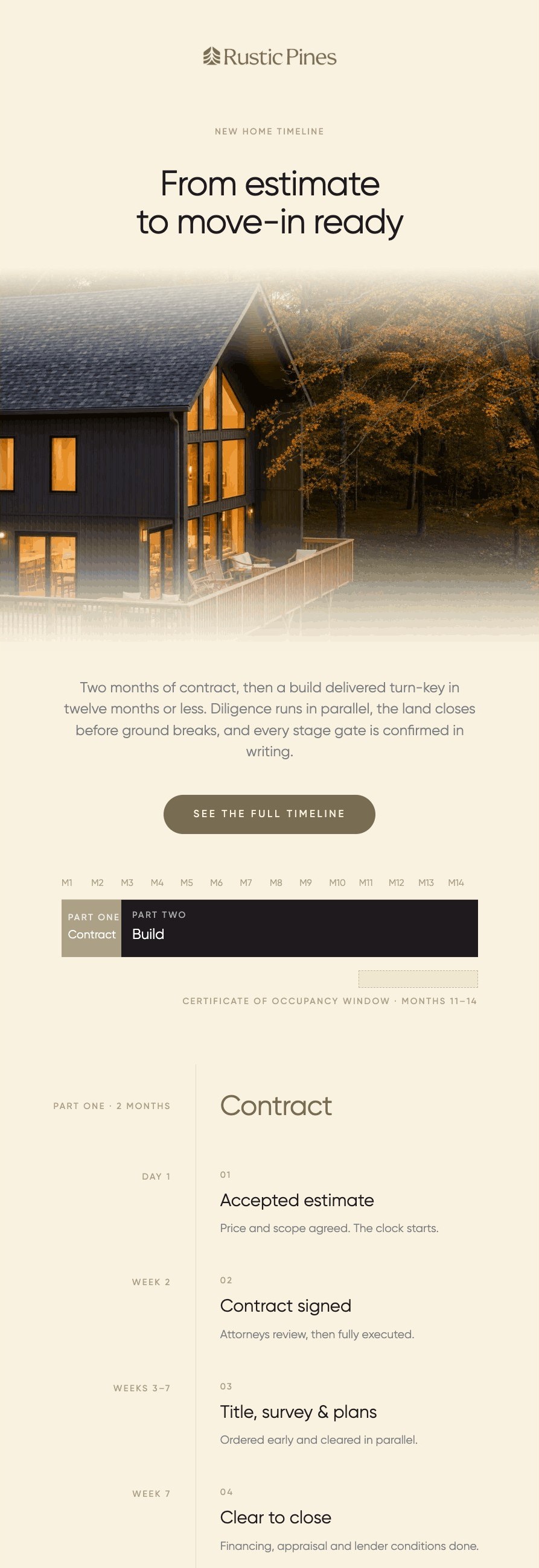
A series for buyers on the list: a letter from the designers, what’s inside each home, custom upgrades, and the timeline from accepted estimate to move-in.