Freight Horse®
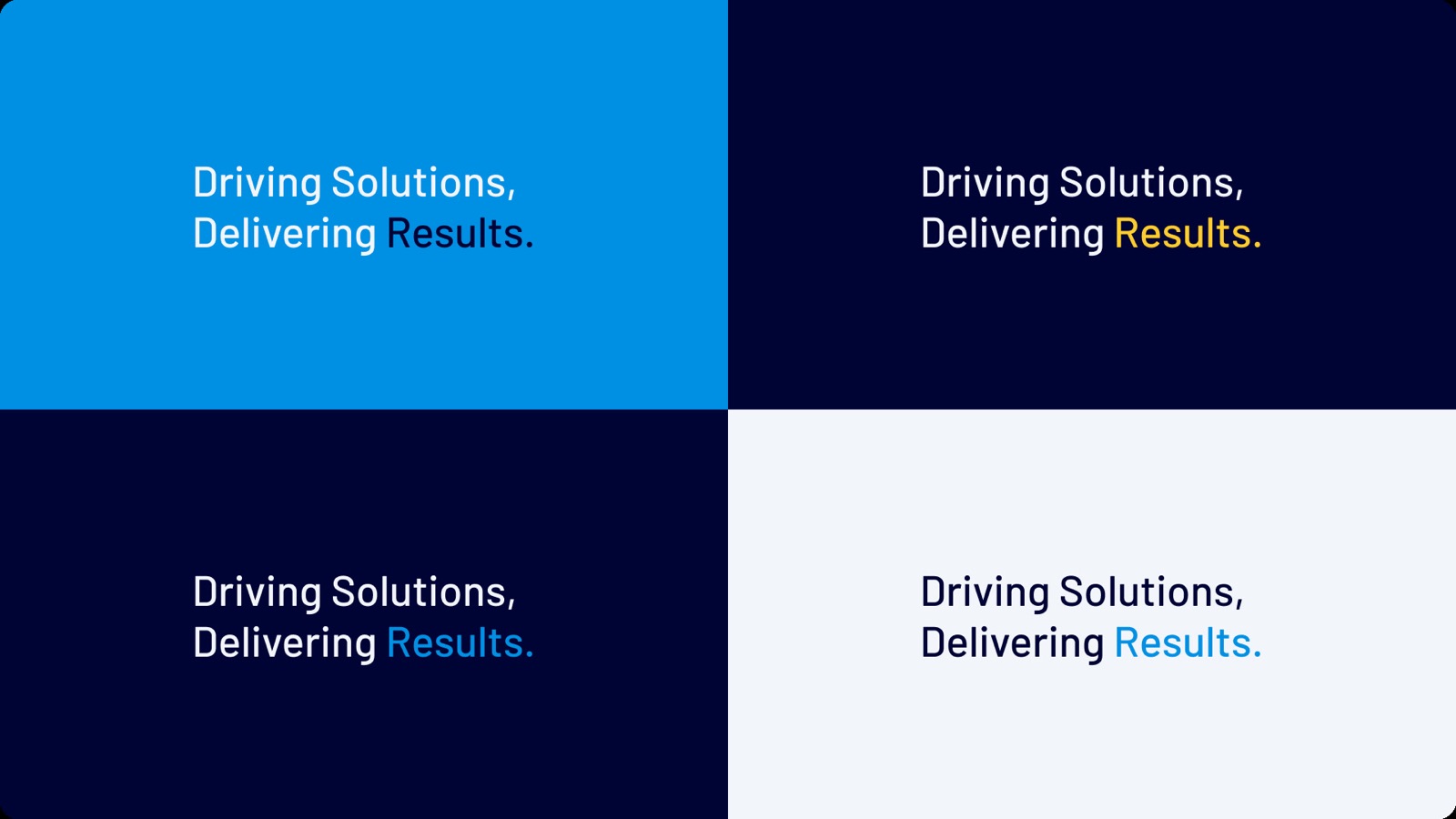
This says… we’re problem solvers that you can count on. Every solution we deliver, and every shipment we deliver, drives tangible results for businesses.
Freight Horse® was built on the belief that logistics shouldn’t be a burden, but a catalyst for growth. Since 2011, we’ve been on a mission to take the stress out of logistics, transforming how our clients manage their supply chains. What started as a small operation has grown into a trusted partner for businesses across the United States.
We manage everything from warehousing to timely deliveries, offering complete logistics solutions through our 3PL, LTL, and FTL services. As a one-stop shop, Freight Horse does the heavy lifting so our clients can focus on moving their businesses forward. But we know that this is only possible with the dedication and hard work of our drivers. They are the heart of Freight Horse, driving not just our trucks but the success of every client we serve.
Reliability, Delivered.
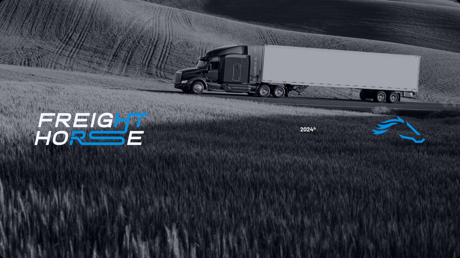
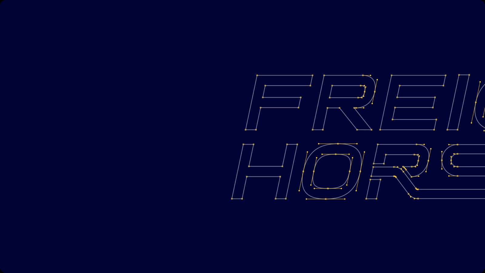
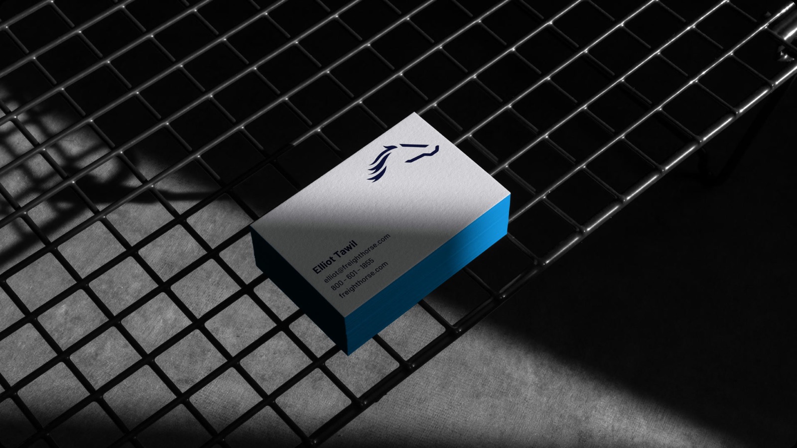
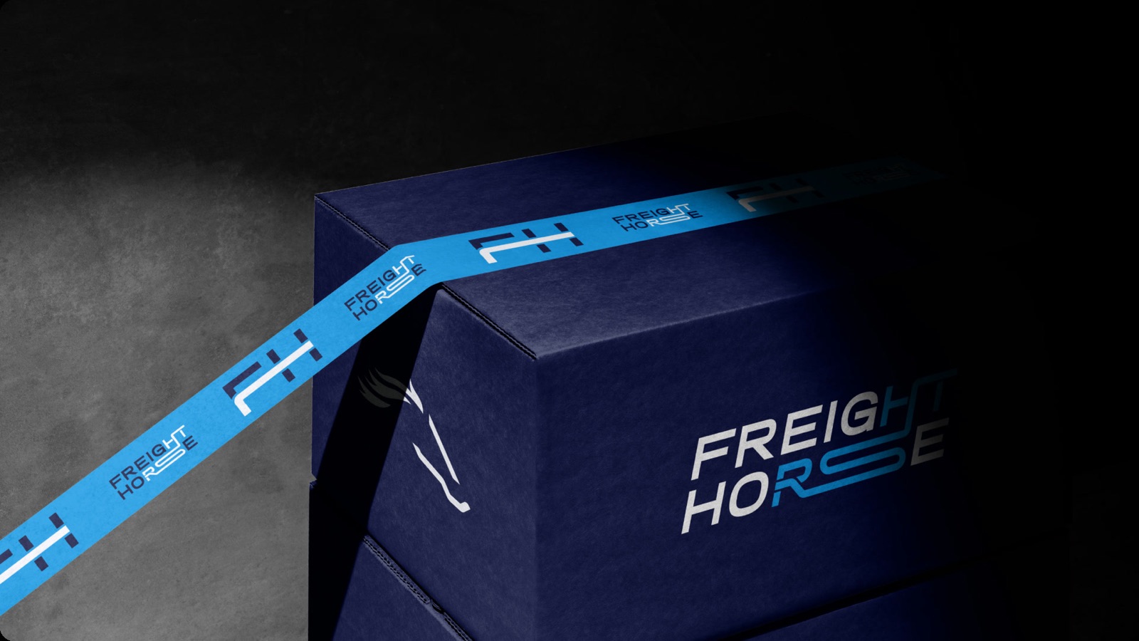
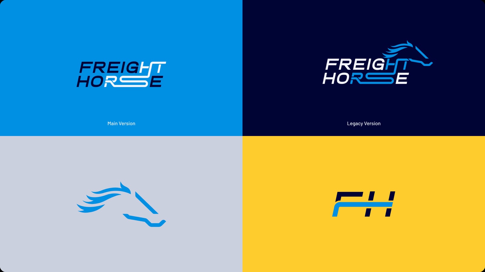
The central core of our brand identity lies in the Freight Horse logo, which serves as the fundamental cornerstone of our brand system.
Try to use this application as the first option in all sorts of digital materials and formats; it should be used with the brand’s emblem.
Mainly tailored for corporate materials, i.e., letterheads, deck templates, and other brand collateral. The only rule to follow is to use it as a standalone lockup without any other versions of the brand.
An element with a wide range of purposes. It can be used as an avatar for social media handles or the website's Favicon.
Mainly focused on digital applications; it should never be used as a stand-alone application.
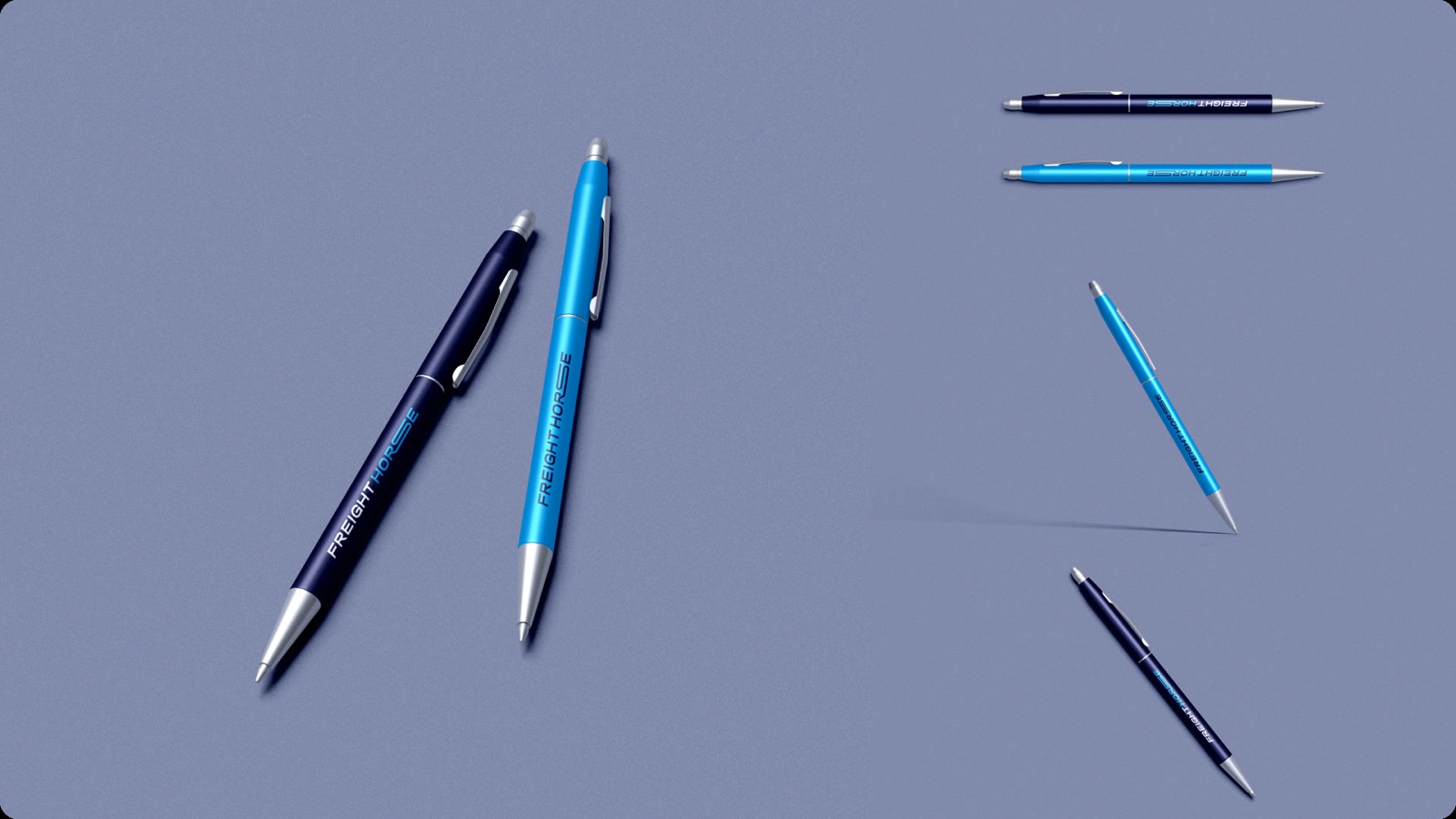
A brand version for the most extreme formats, such as pens, vertical flags, ultra-wide signage, website navigation, etc.
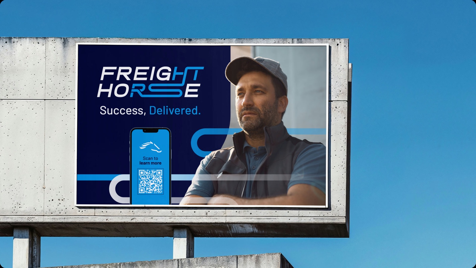
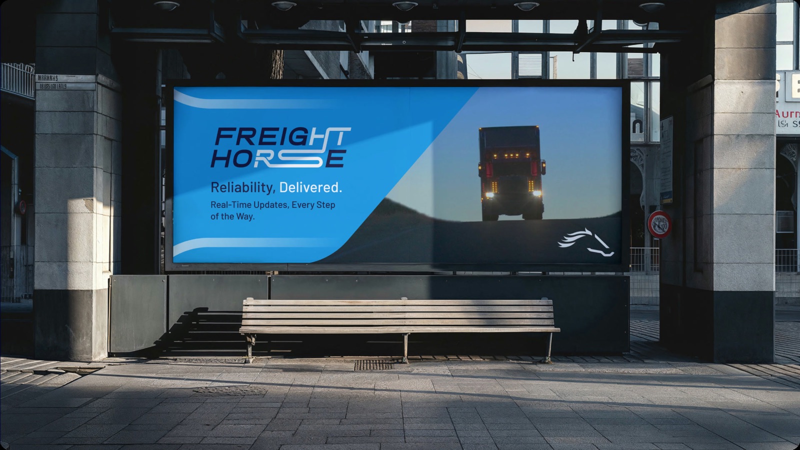
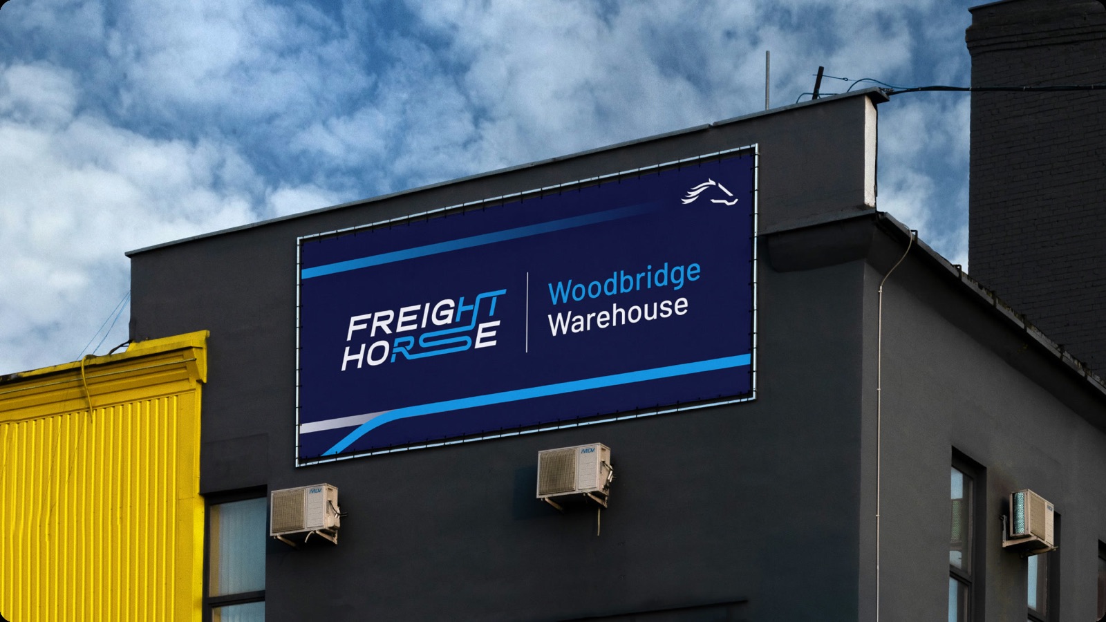
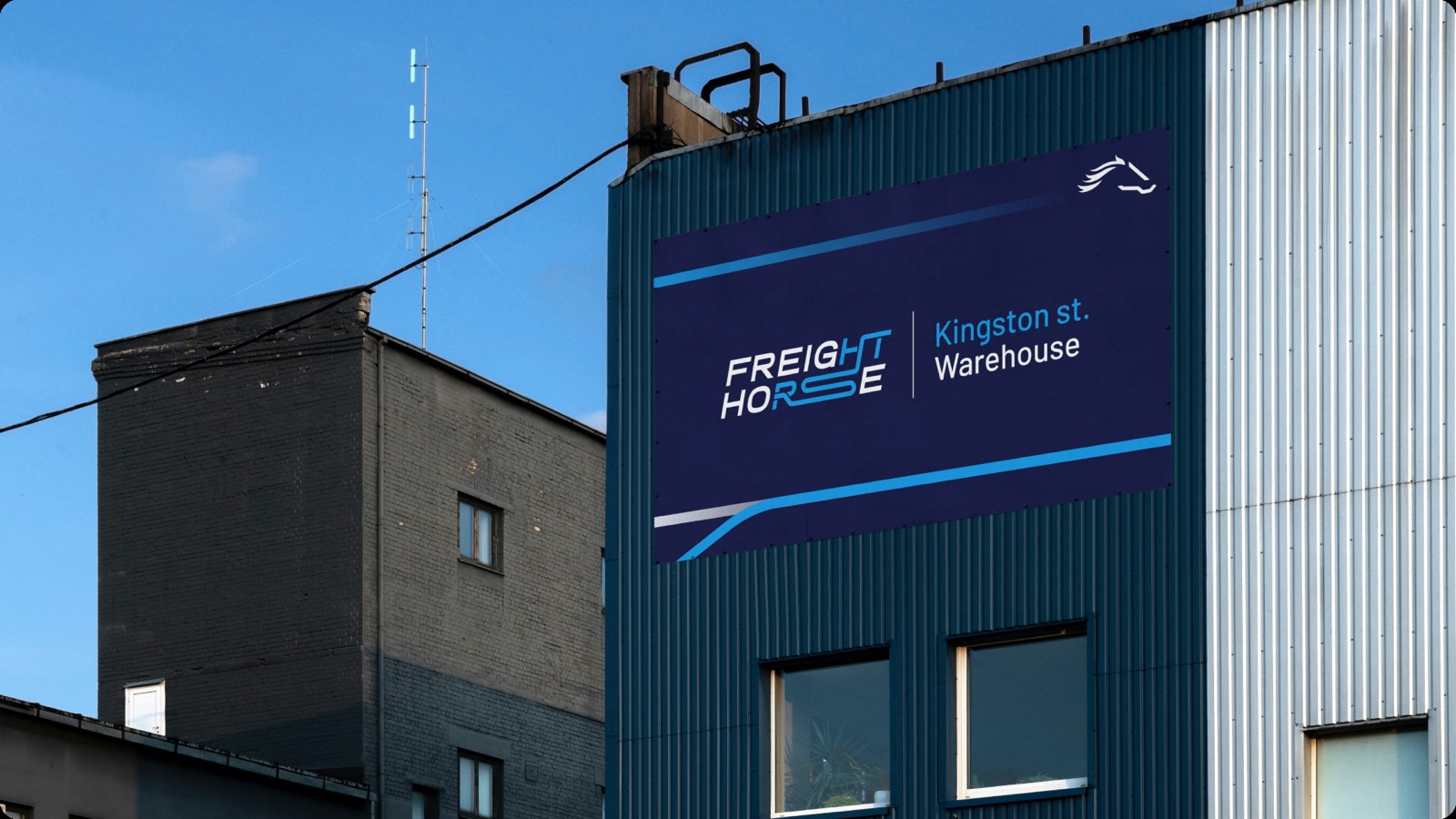
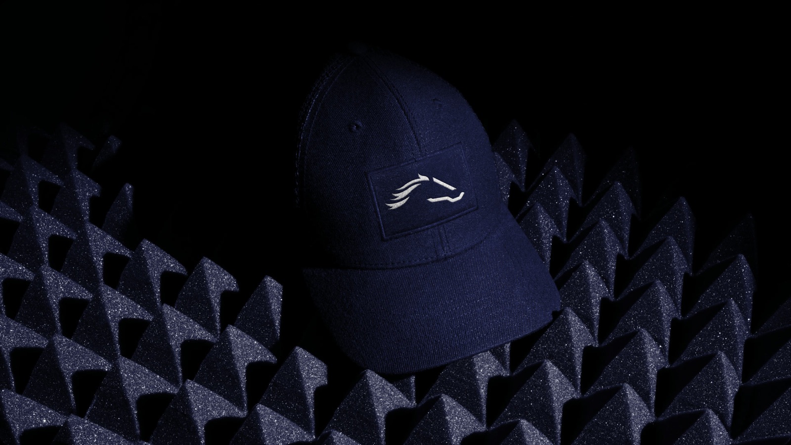
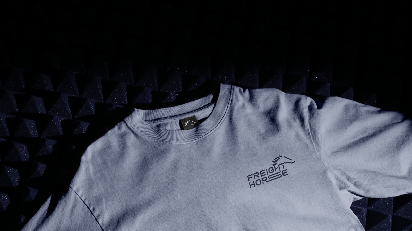
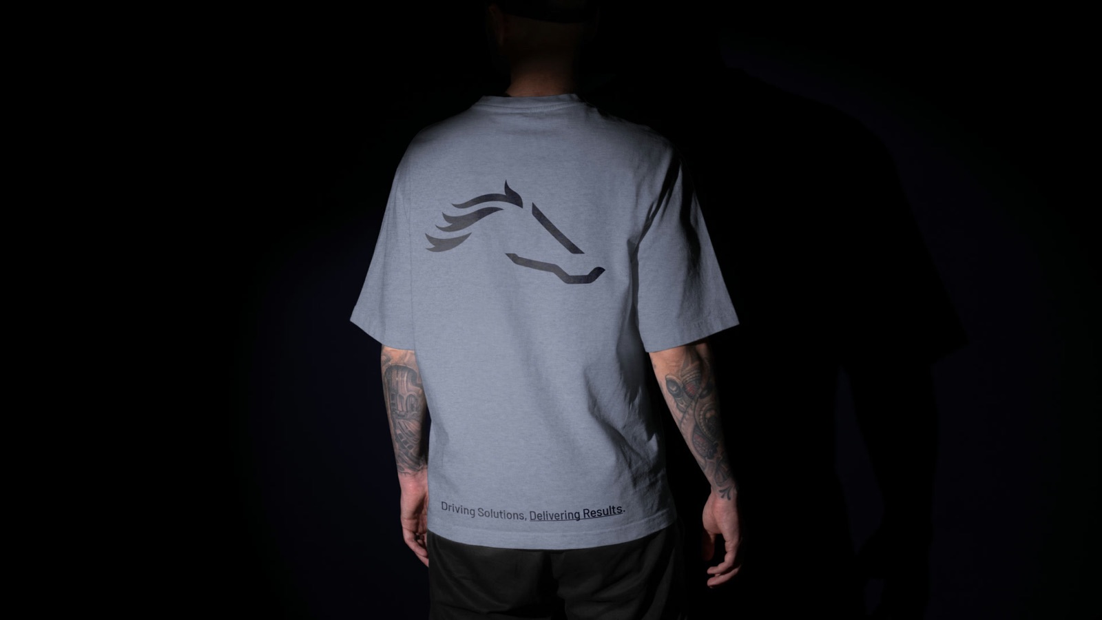
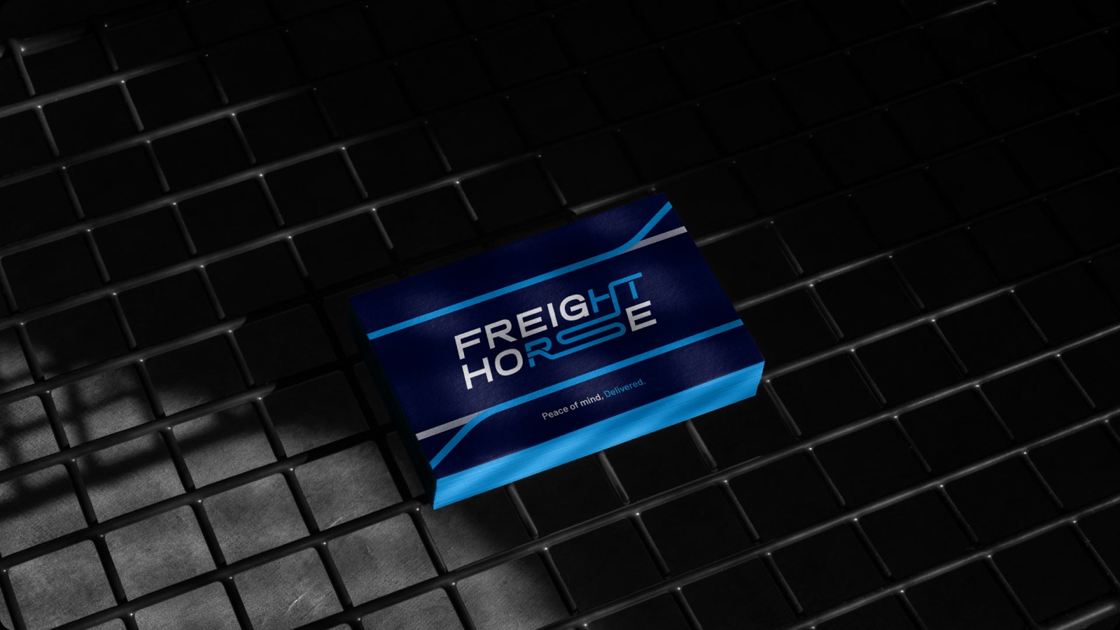
Success, Delivered.
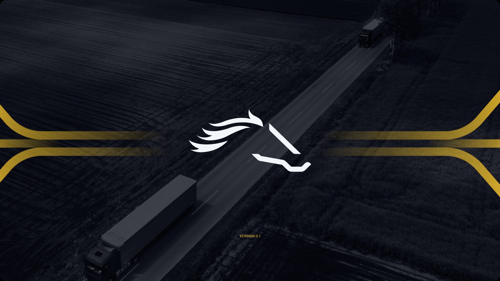
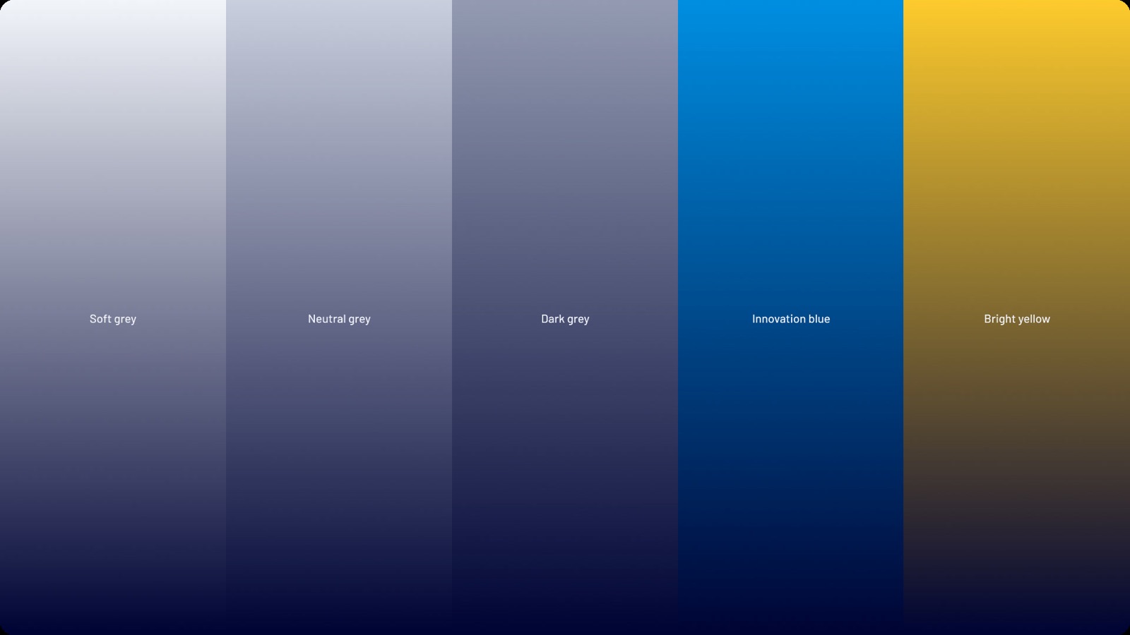
The gradient usages are only for the graphic universe LightSpeed®.
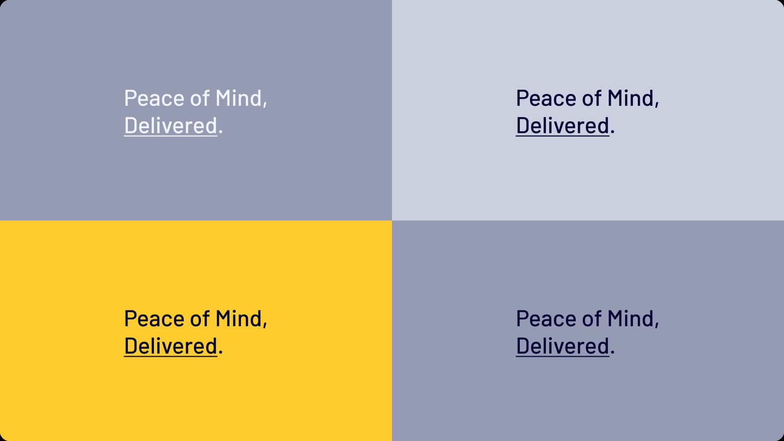
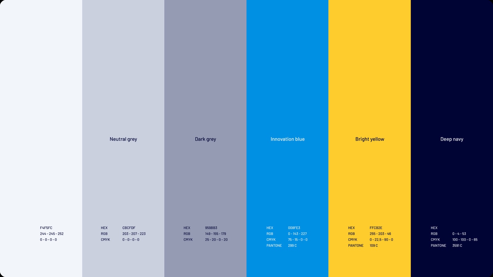
#F4F5FC
#CBCFDF
#959BB3
#008FE3
#FFCB2E
#000435


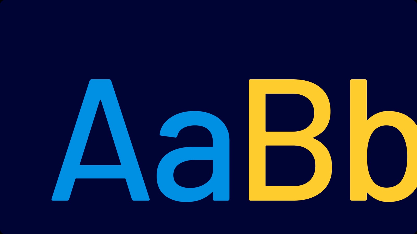
Barlow
Barlow is a slightly rounded, low-contrast, grotesk type family. Drawing from the visual style of the California public, Barlow shares qualities with the state's car plates, highway signs, busses, and trains.
We set Barlow as our primary font for different scenarios, huge display headlines, and long copy bodies.


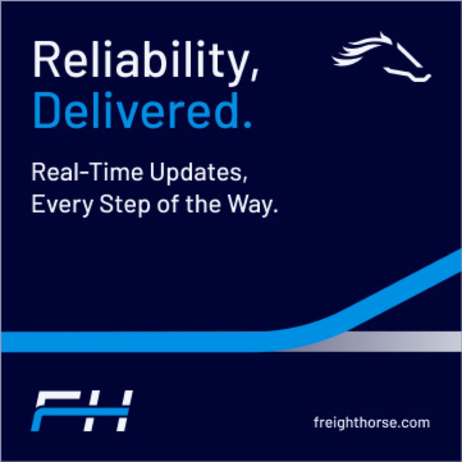
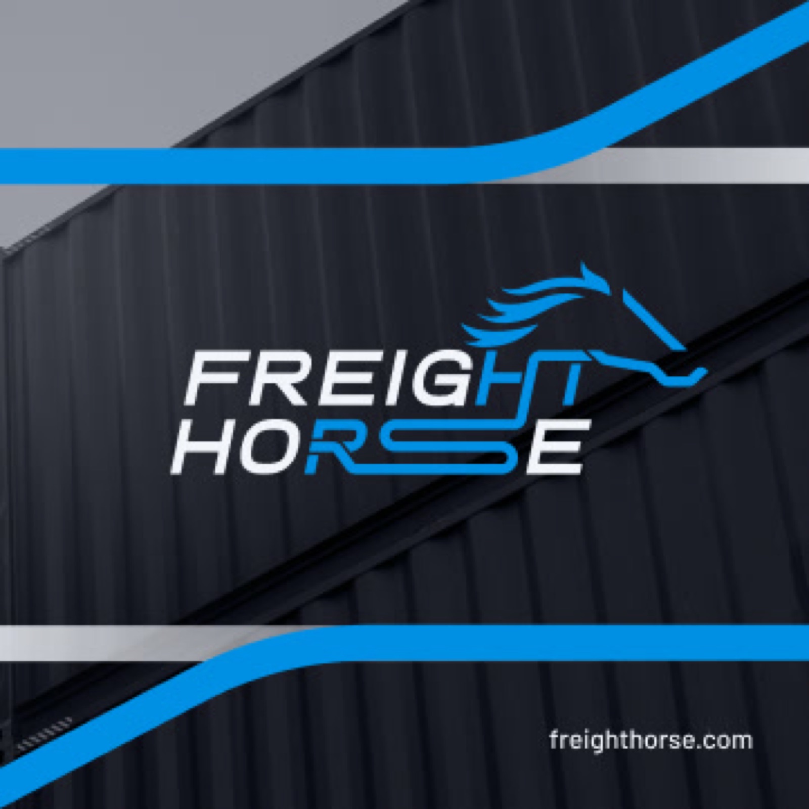
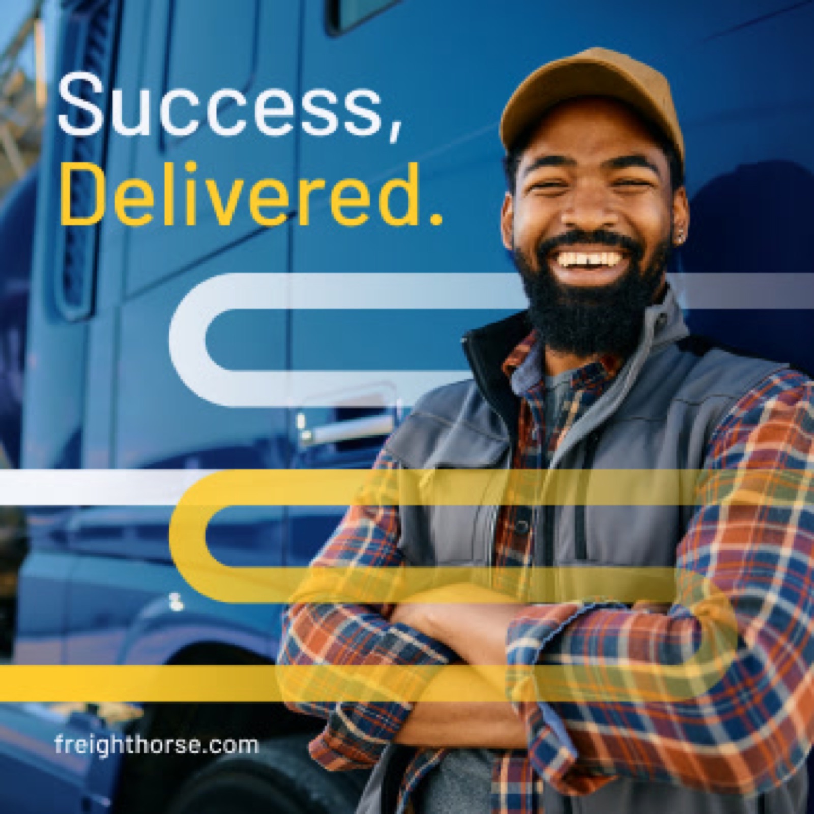
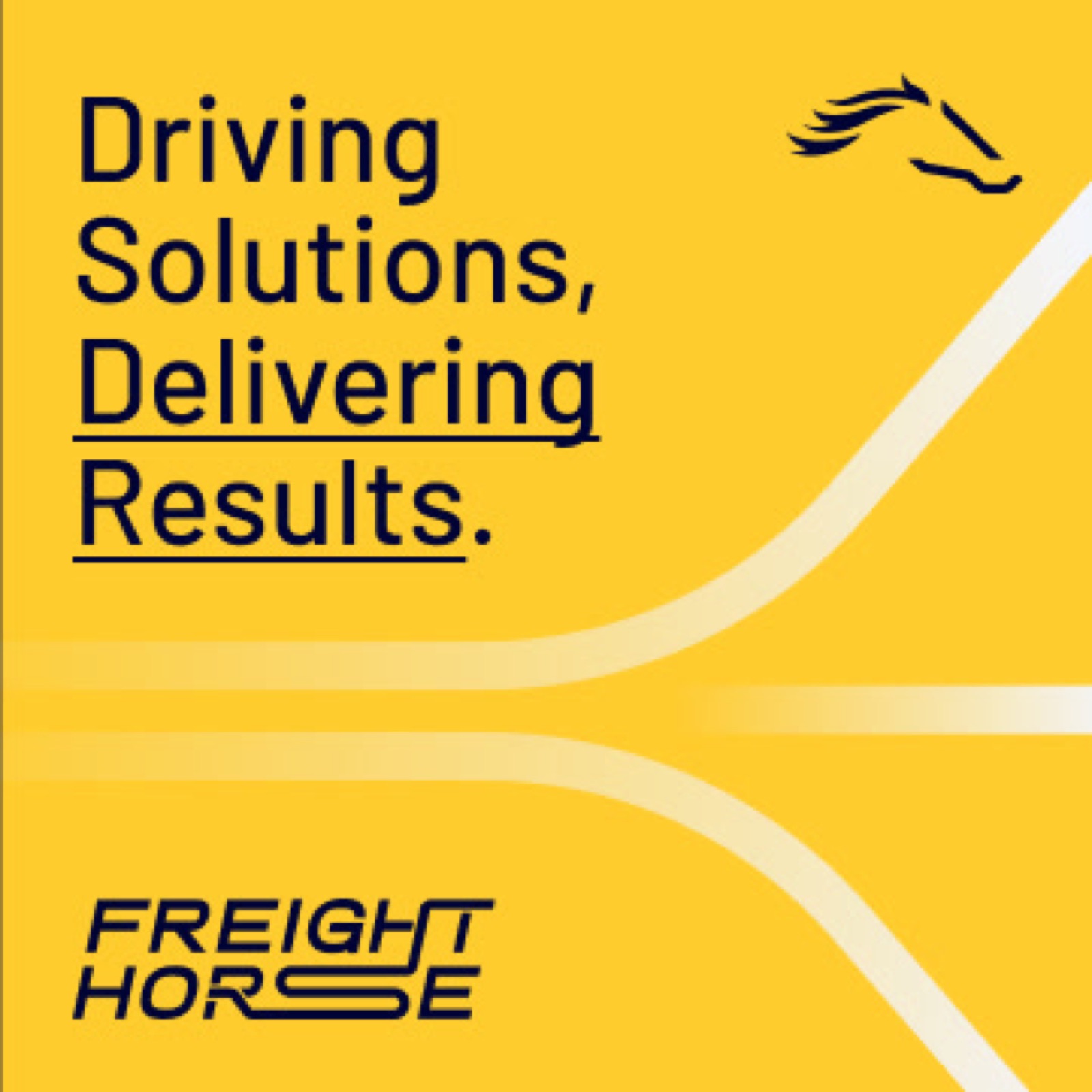
Lightspeed®
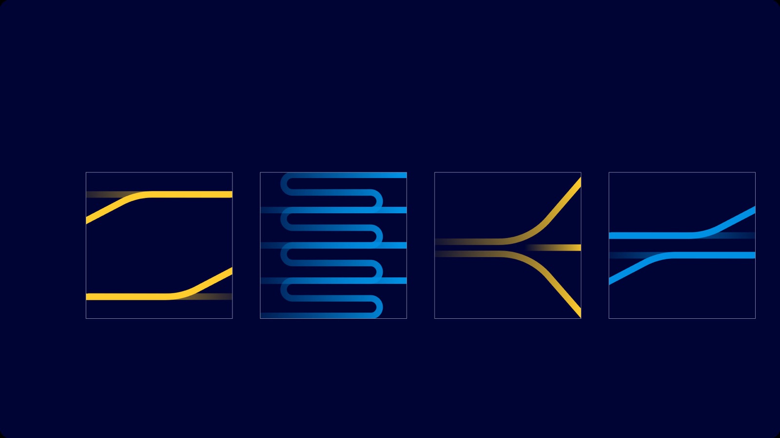
The Lightspeed® graphic universe draws inspiration from the road-like lines in the Freight Horse® logo, symbolizing speed, movement, and seamless logistics. These dynamic lines create a visual device that complements every creative output, maintaining the same fluid style as the logo. Lightspeed® unifies our brand’s visuals, embodying the energy and efficiency that Freight Horse® delivers on every mile.
In some cases, we will need containers to separate the text content from images; that is where these devices come into place to serve as content holders.


Shipments, Delivered.
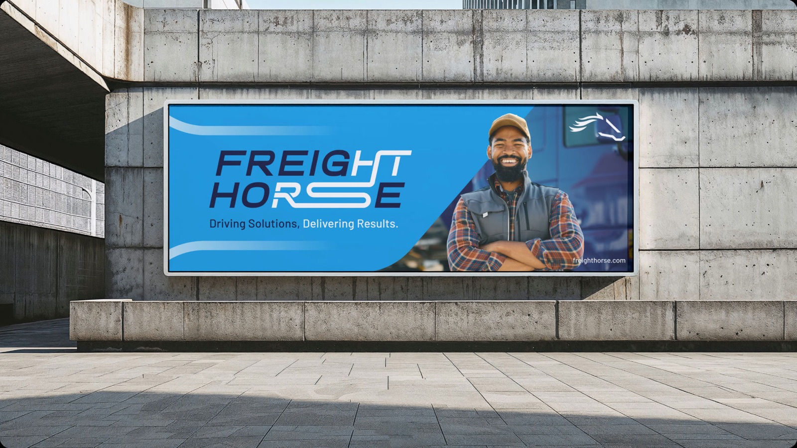
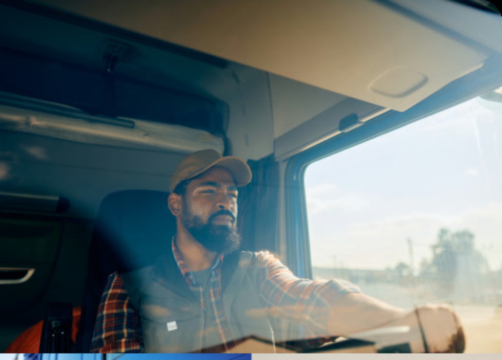
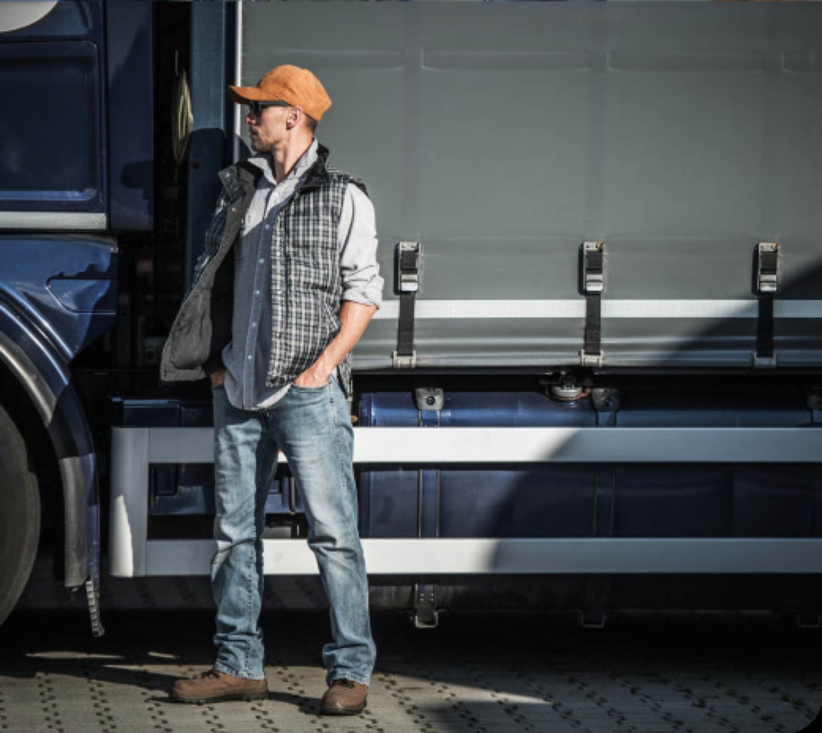
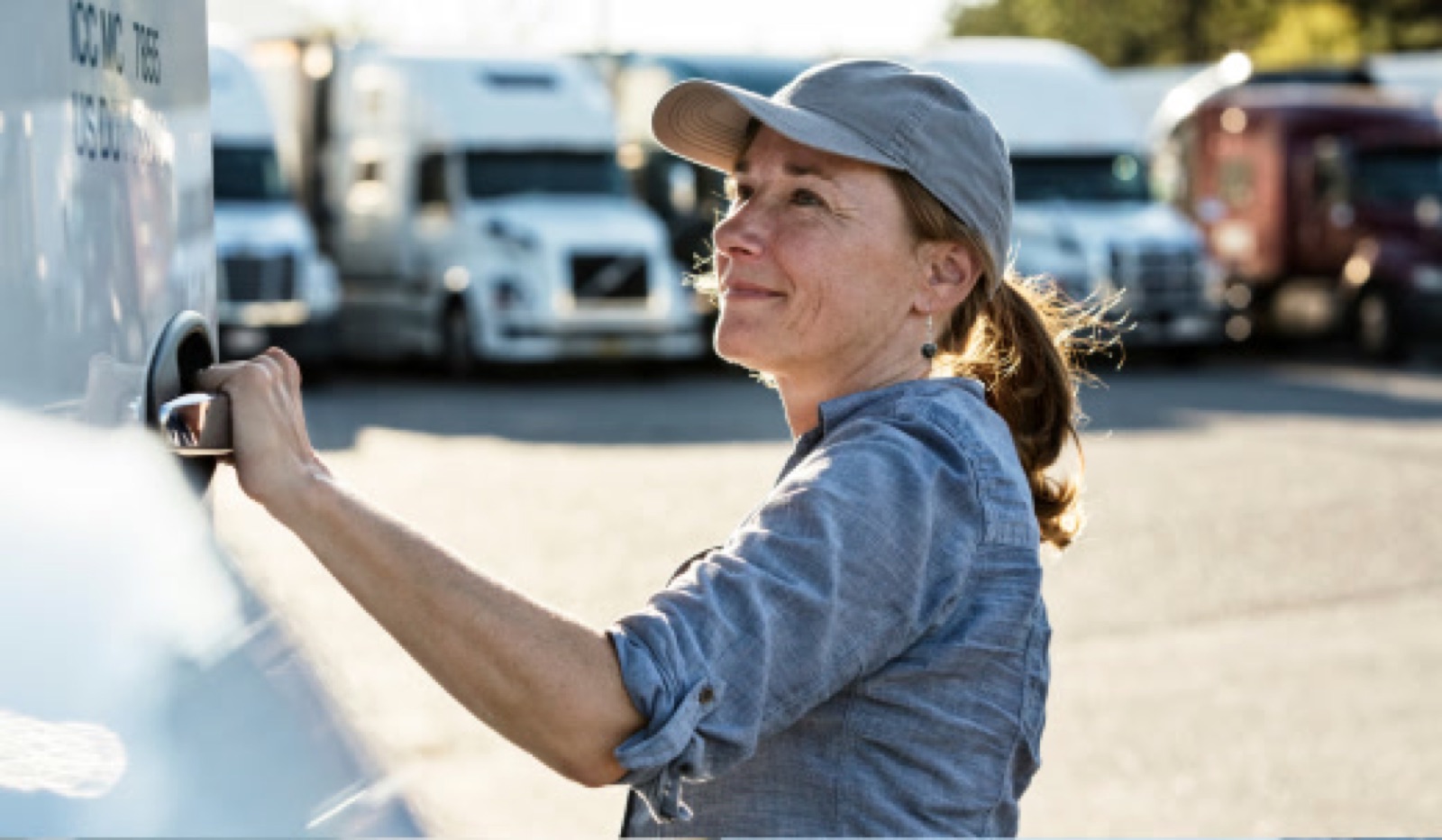
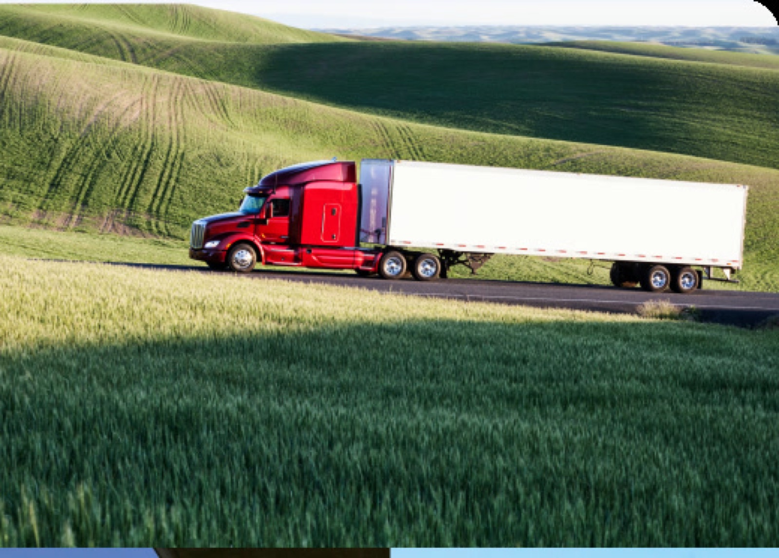
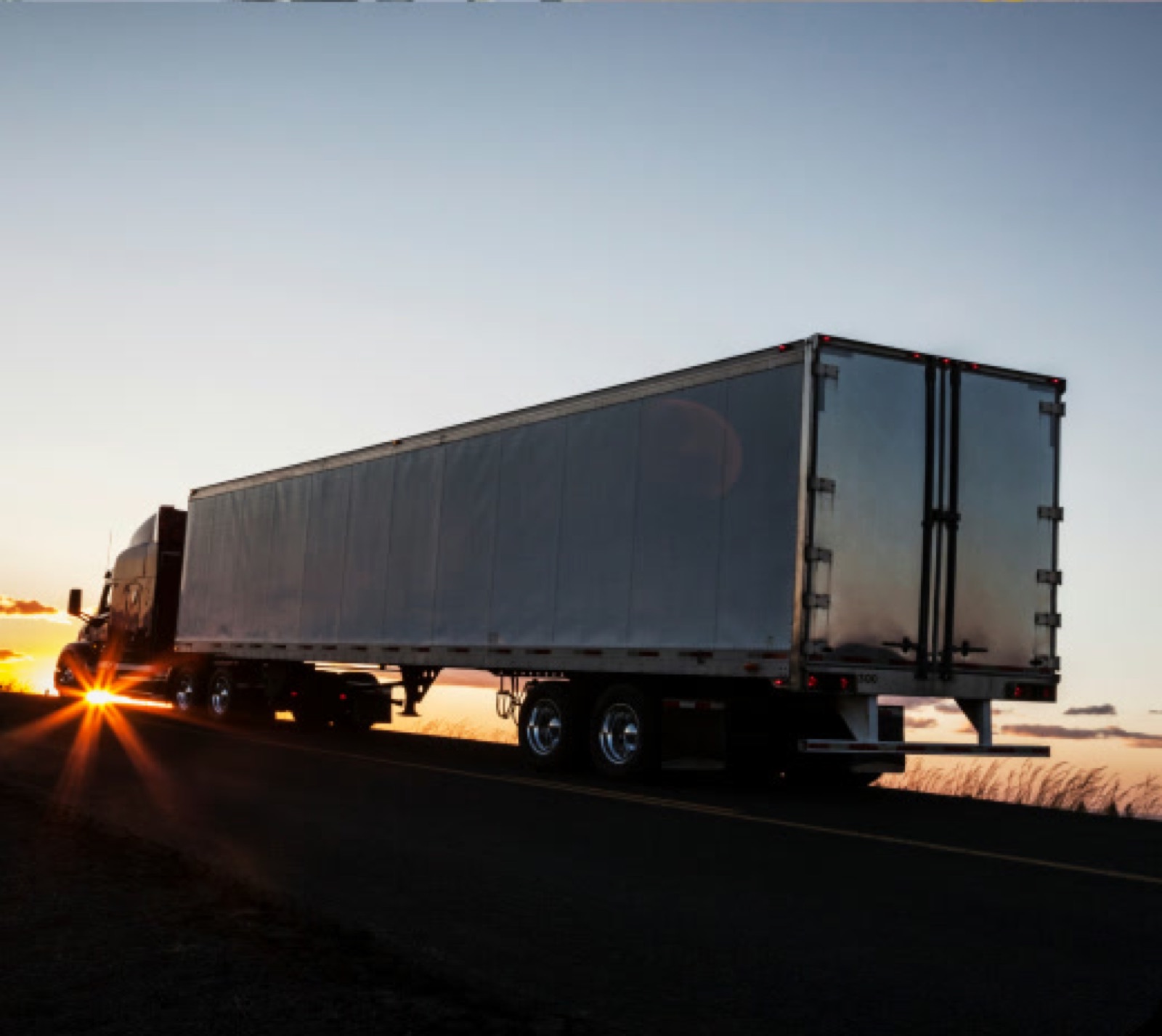
Freight Horse imagery captures the full scope of our logistics expertise—from streamlined warehousing and efficient deliveries to the vital role our dedicated drivers play.
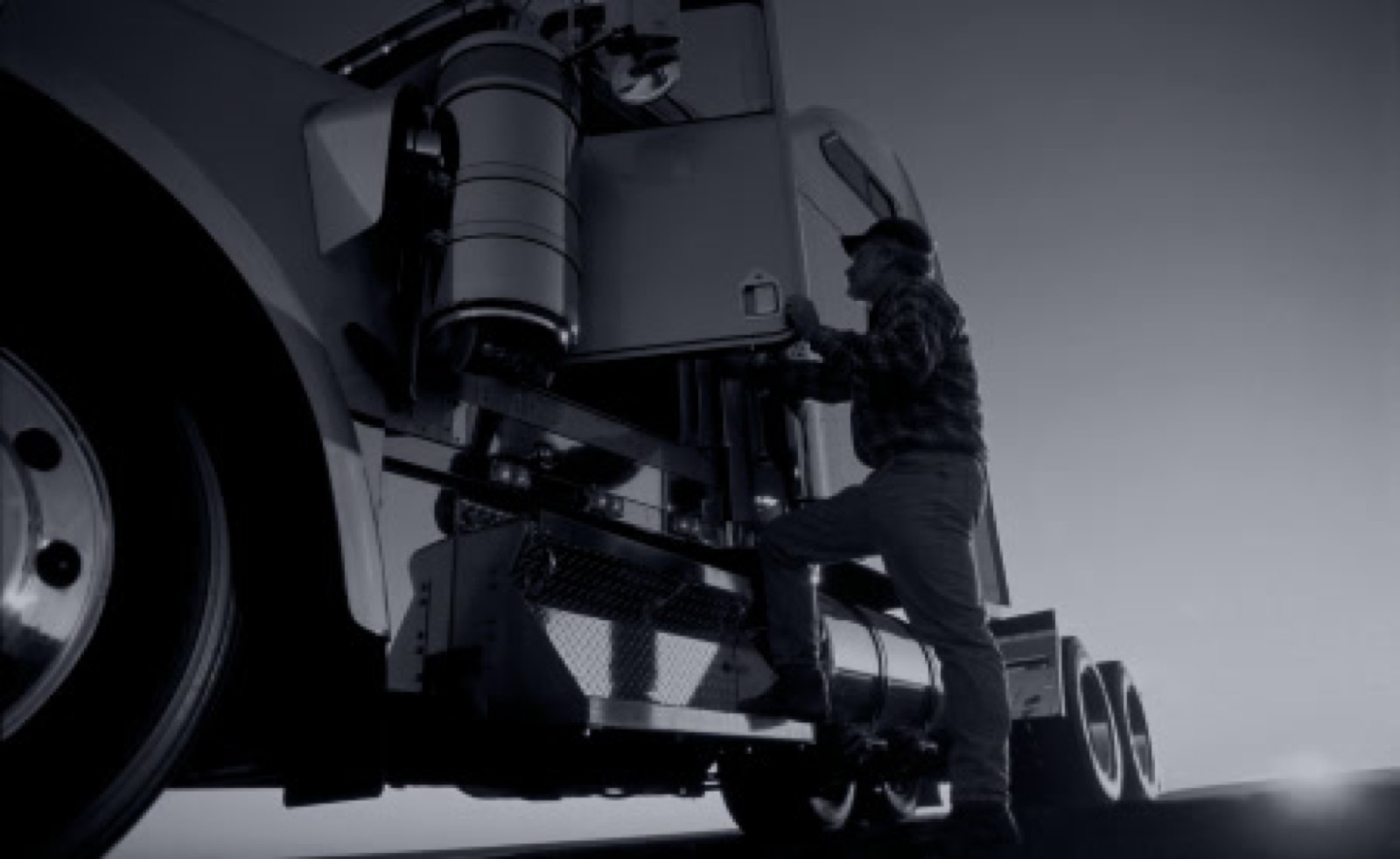
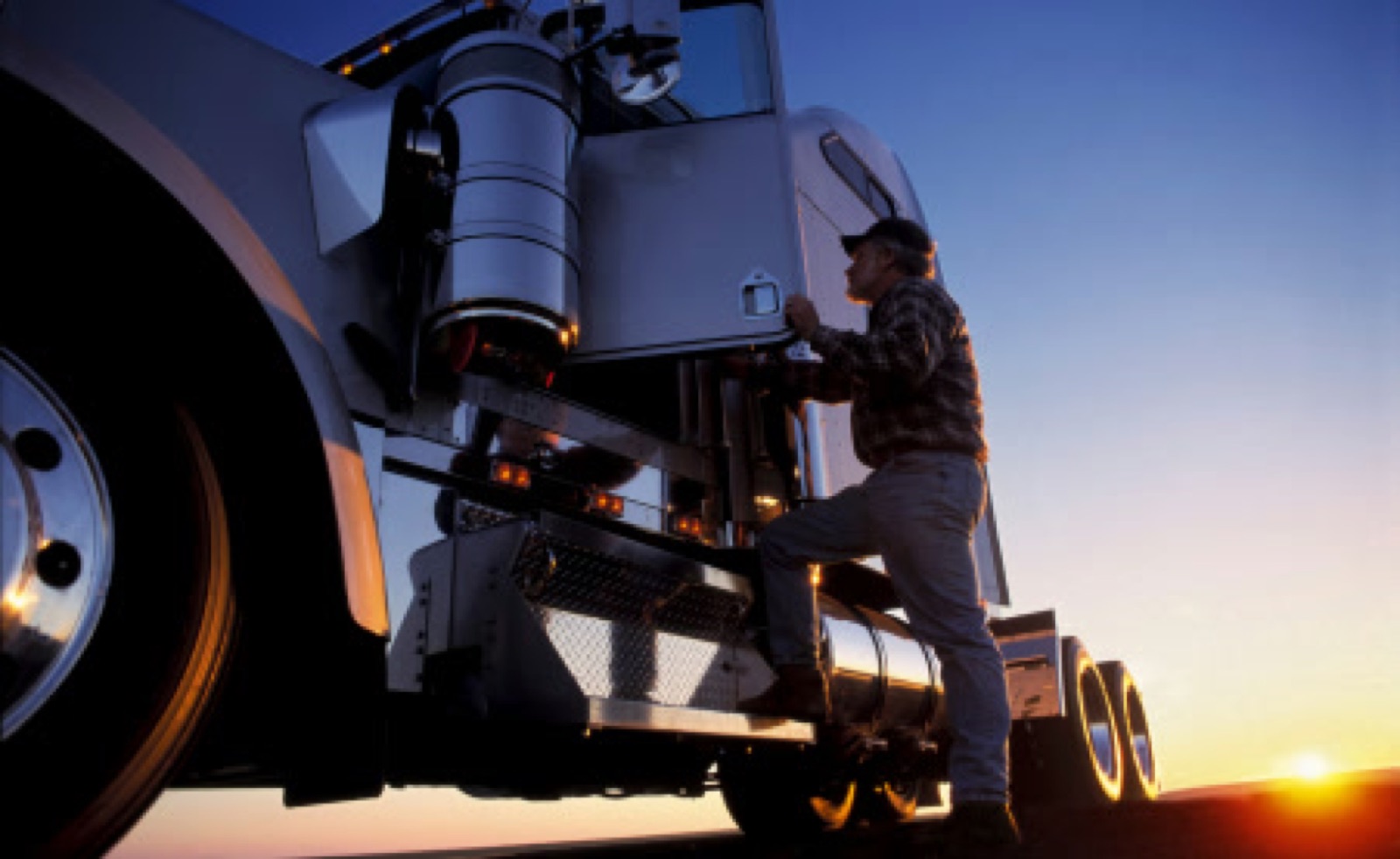
Capturing the journey of our truck drivers is one of our core principles as a freight company. Our imagery should showcase the genuine aspect of these individuals, portraying authentic emotions, empowerment, and collaboration.
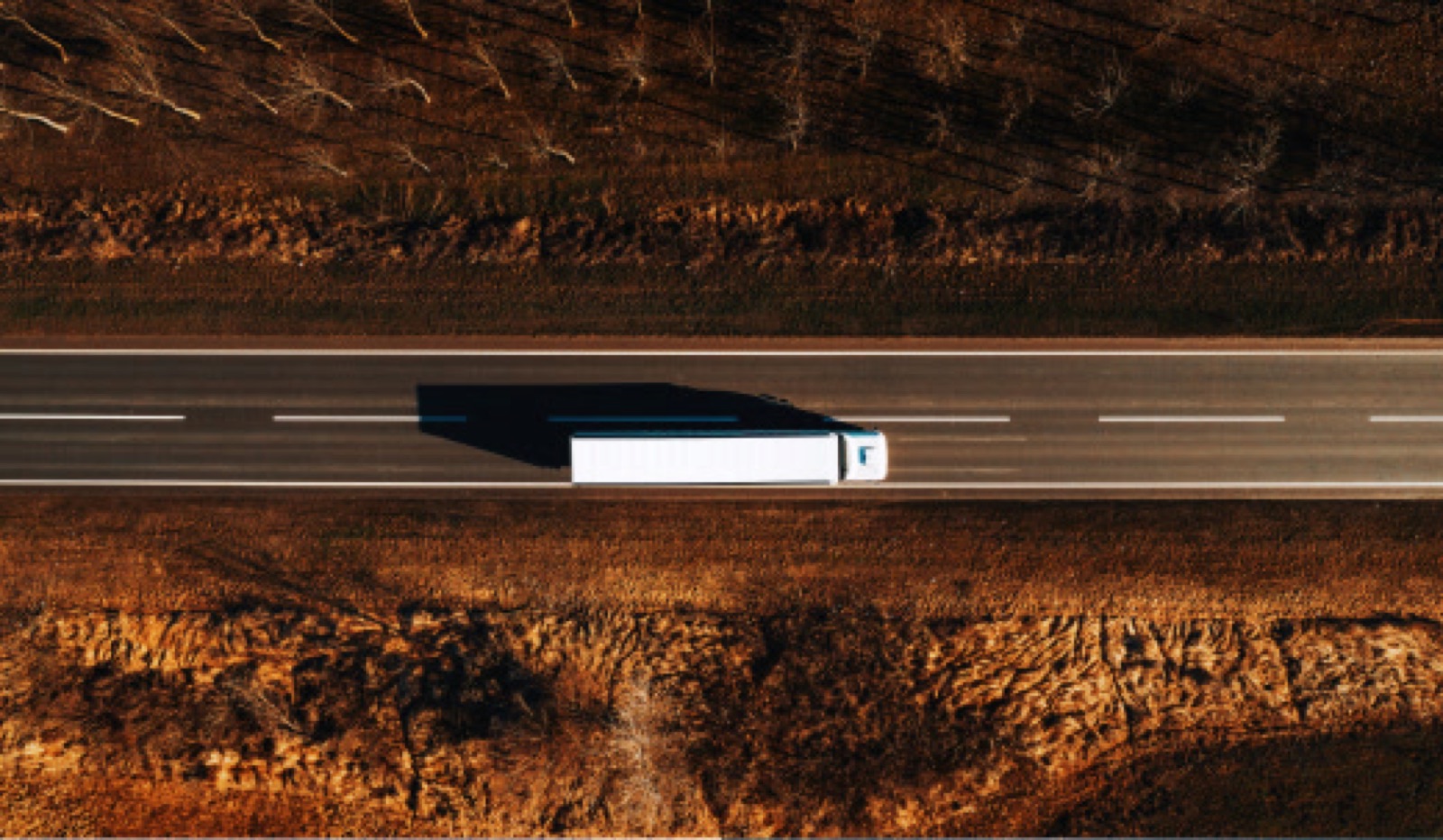
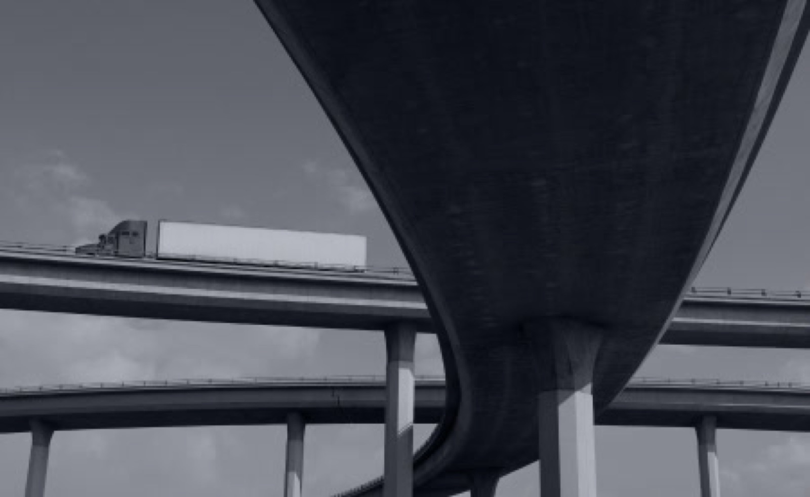
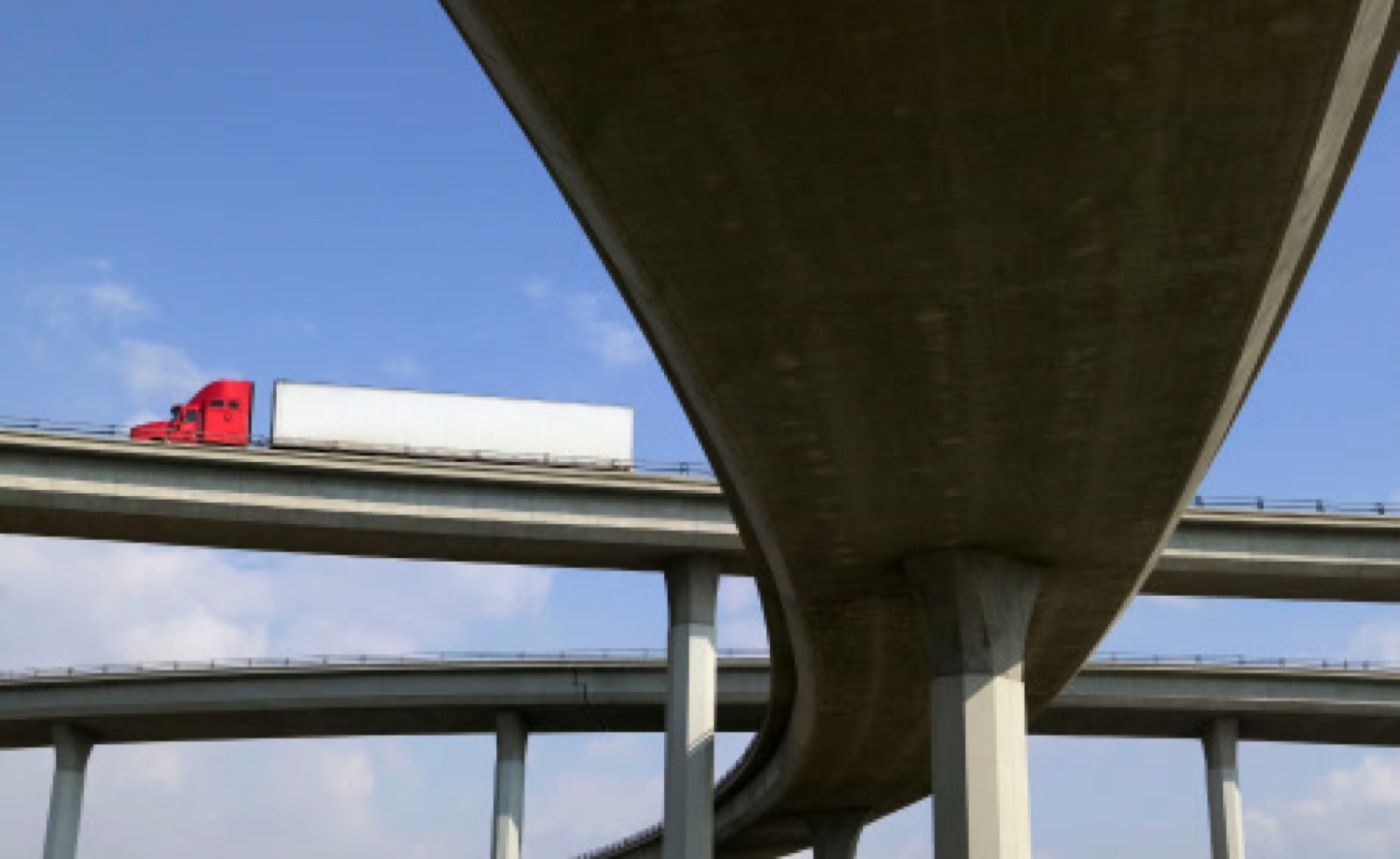
Images that capture the horsepower of our fleet, performing at its best on the roads, represent the essence of Freight Horse.
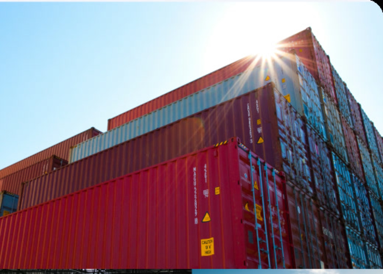
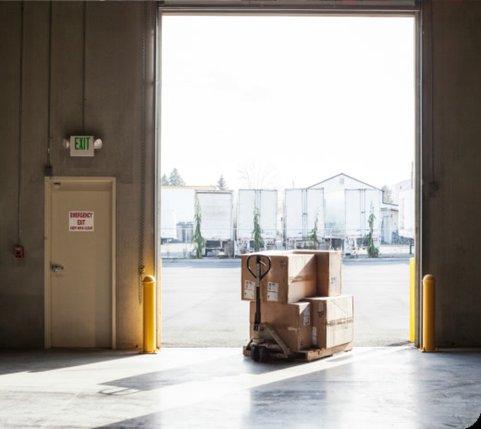
Our logistics services imagery highlights the efficiency and precision of our solutions, showcasing how we streamline supply chains and ensure timely deliveries.
To showcase cohesive visual communication, we should ensure all our imagery maintains the same look and feel regarding color temperature and light intensity.