Rol·In
Fields Center
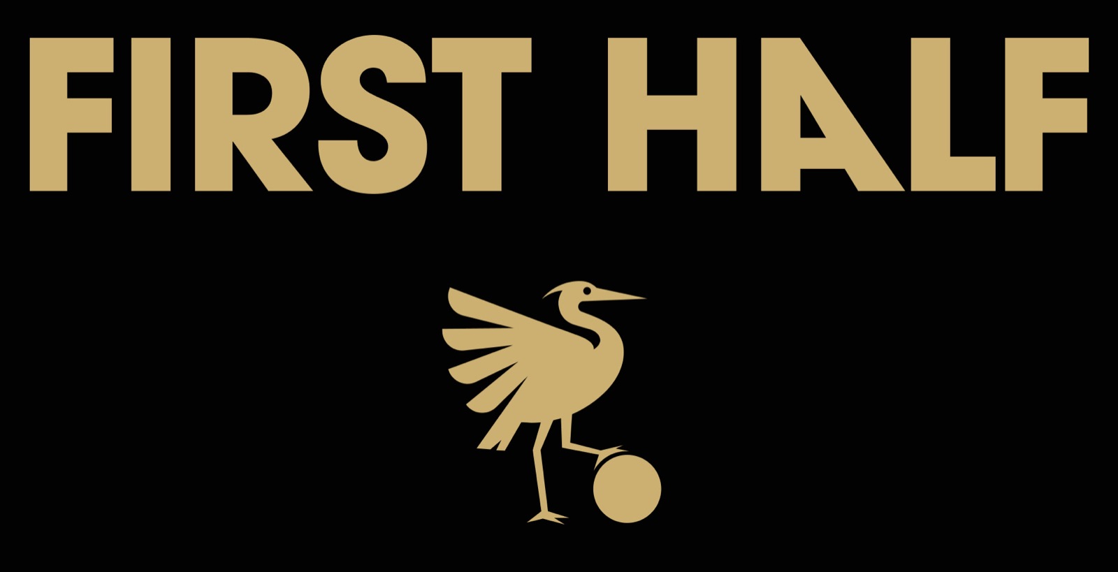
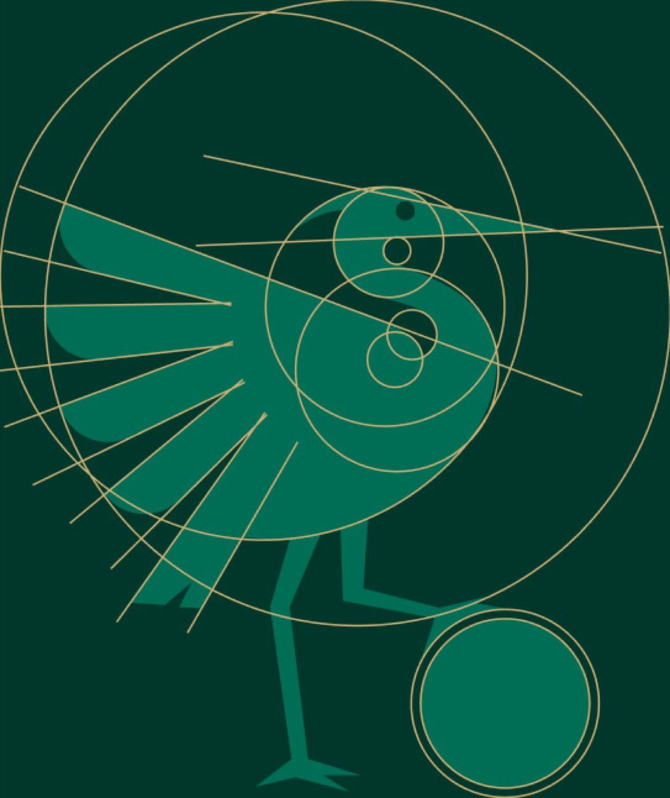
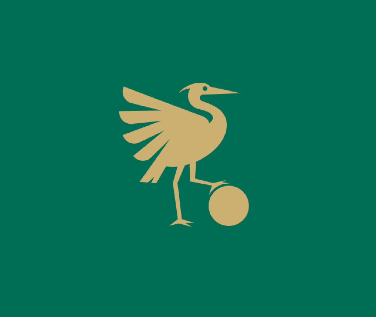
The symbol draws inspiration from four meaningful references that give it character.
The football crest evokes a sense of tradition and belonging, much like classic club emblems, while the soccer ball root the design in the sport’s core. The idea of flight and wings symbolizes ambition and progress—shown in the raised wing of the Heron, a gesture of reaching for higher goals.
These elements come together to create a visual identity that blends tradition, movement, and a sense of community.
The Guardian of the Field
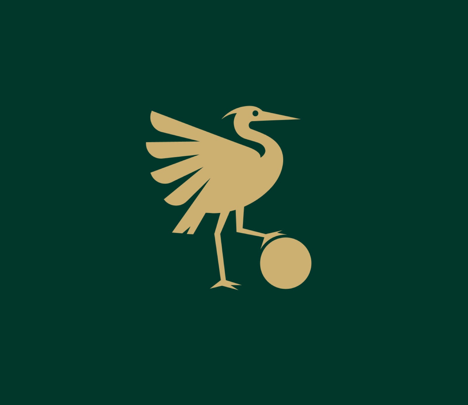
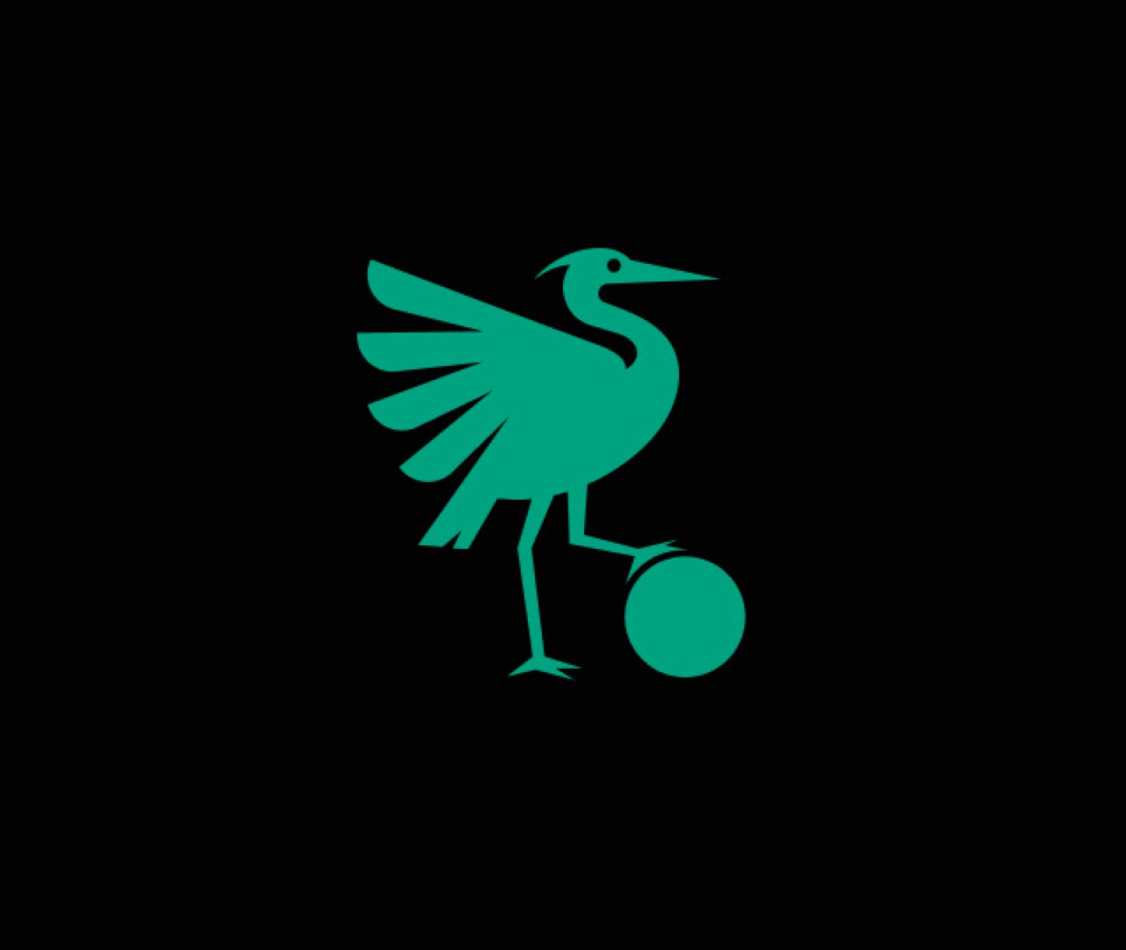
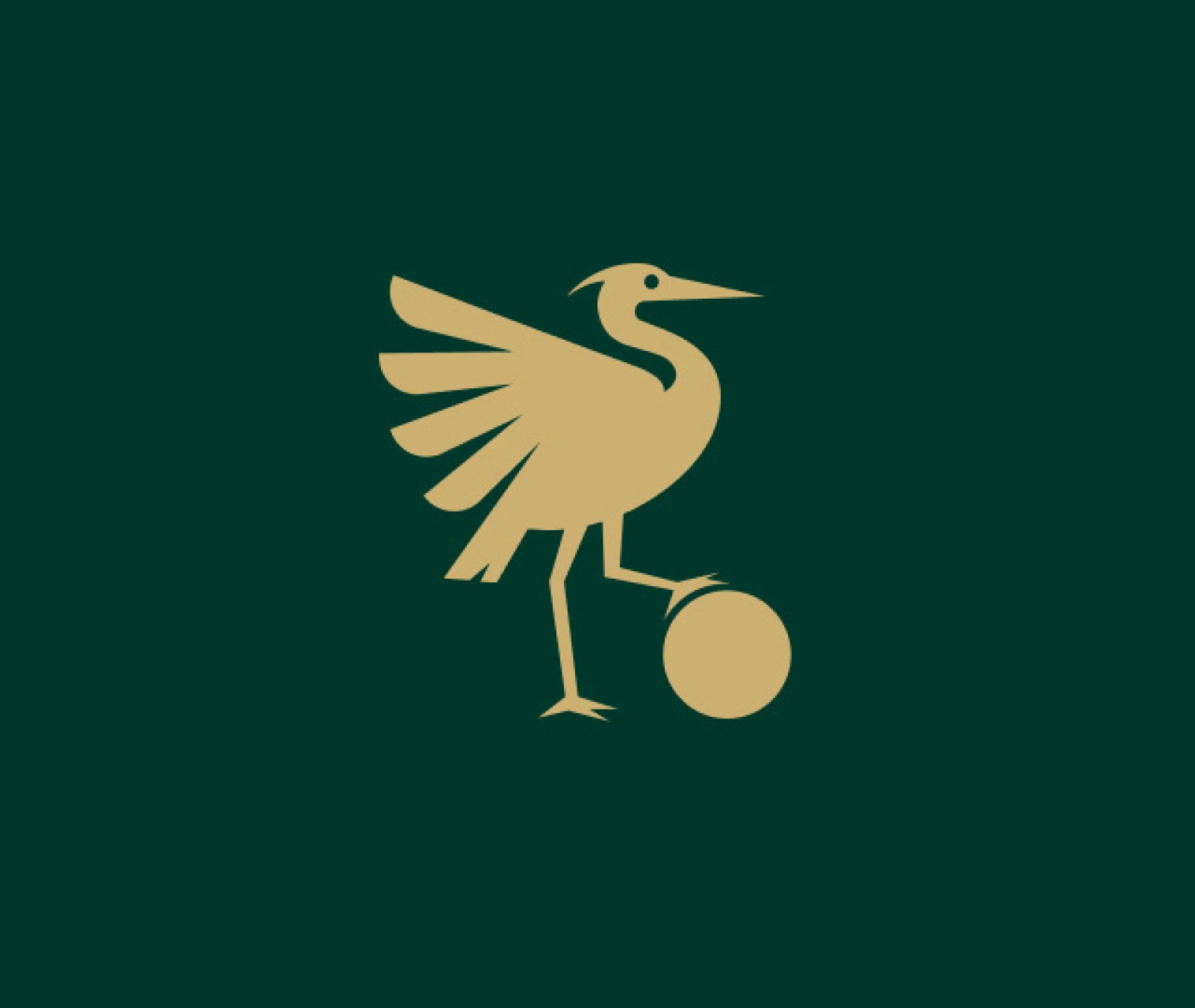
This symbol shows the Heron at its most competitive form, acting as a guardian of the field and standing for balance, determination, and sporting spirit. Its raised wing suggests movement, ambition, and a steady drive to rise, fly higher, and go further.
Made from geometric shapes and clean lines, the Heron uses the style of classic football crests, where animals stand for values, identity, and the competitive spirit.
A System That Adapts
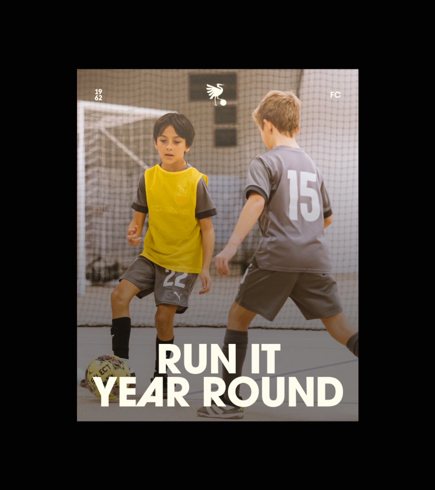
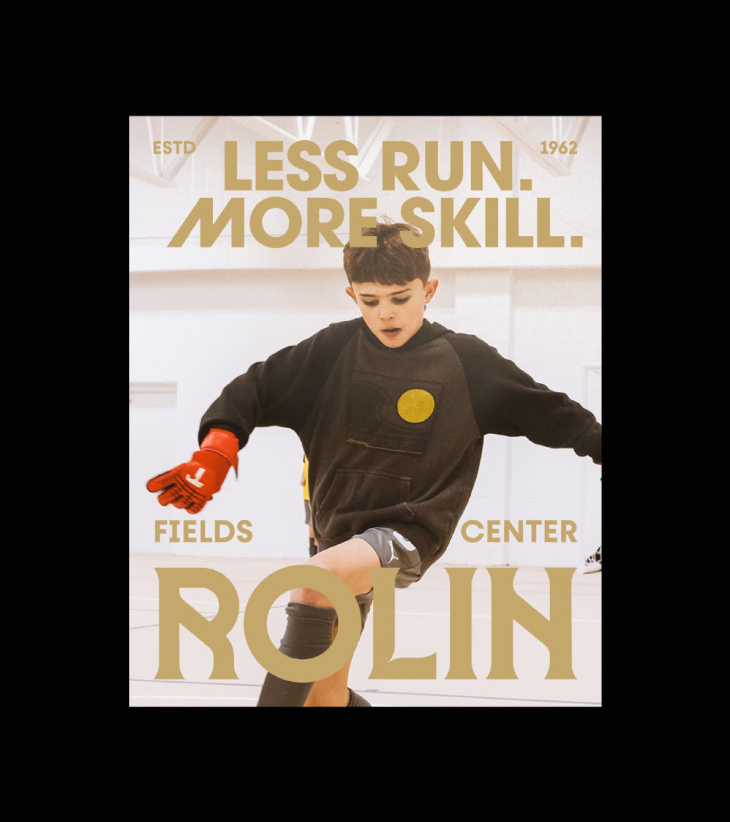
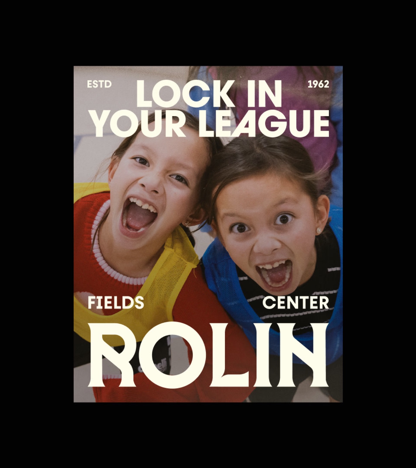
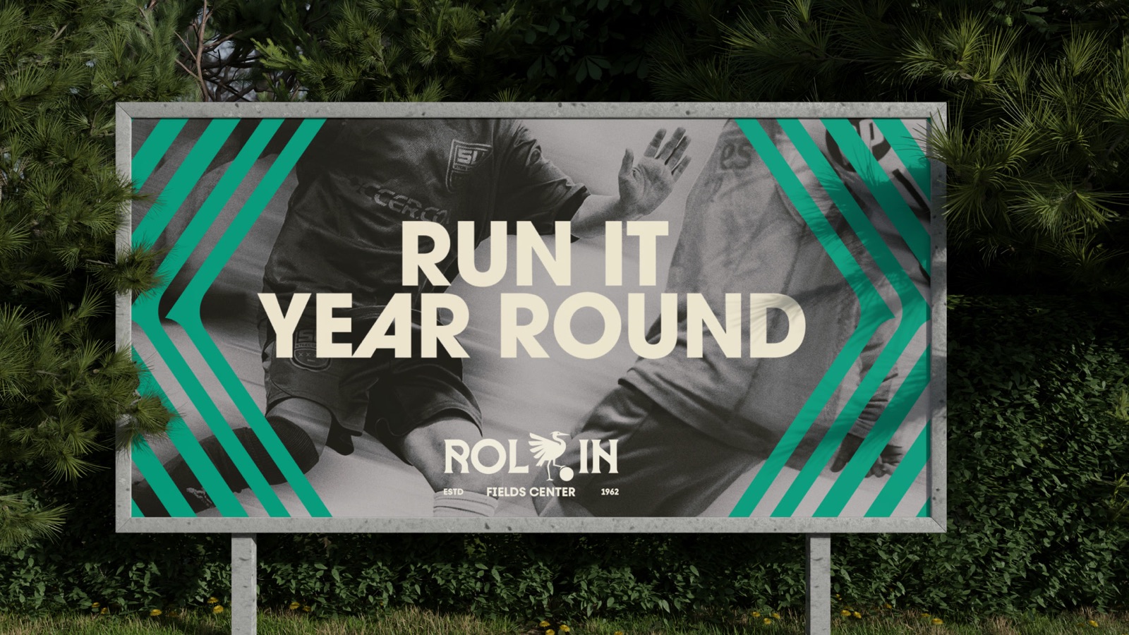
Rol·In Fields Center has a flexible and unique identity that works well in different layouts without losing its impact. In the main version, the Heron symbol is part of the wordmark, making it an important part of the design and giving the brand its own style.
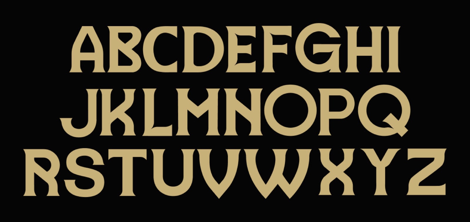
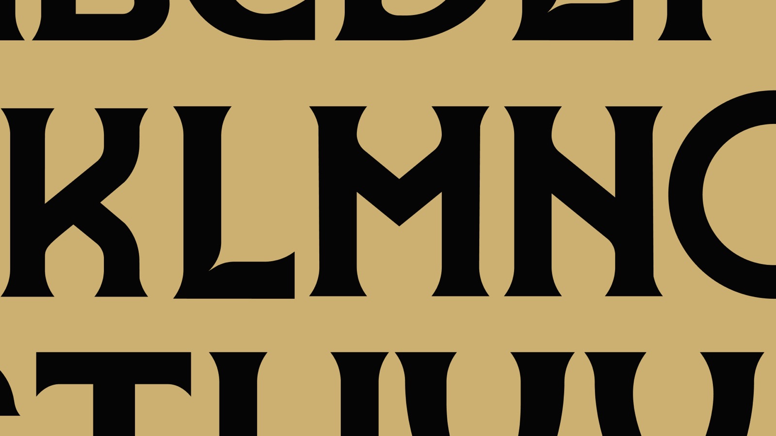
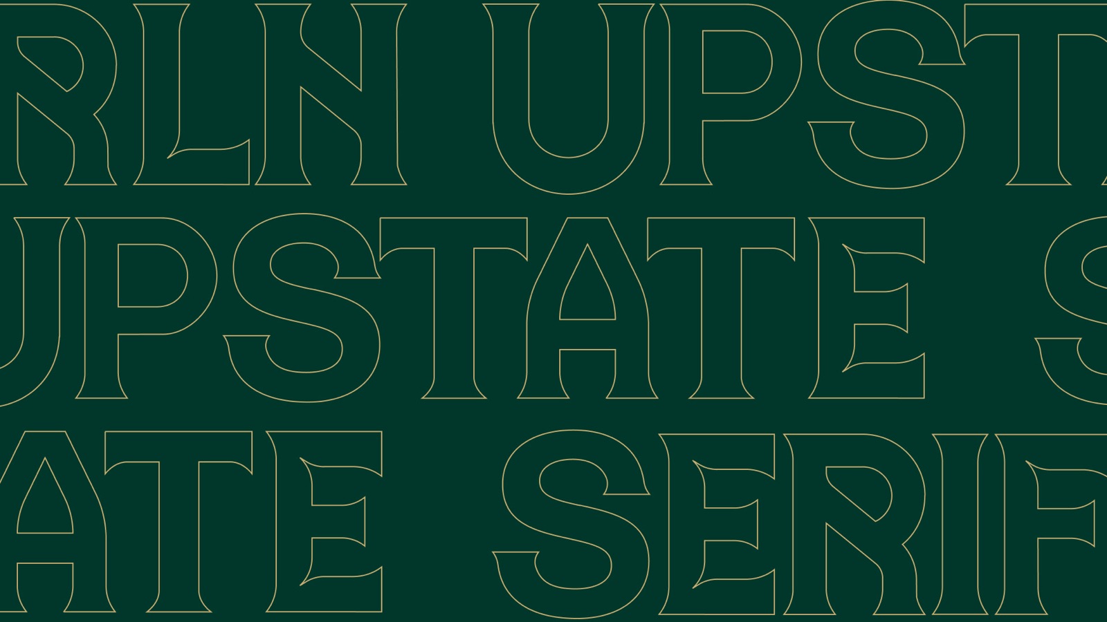
The serif typeface stands out and adds a classic football look, giving the design a solid feel. No matter how it is used, the identity stays flexible and consistent, making sure it is always easy to recognize.
Brand expressions
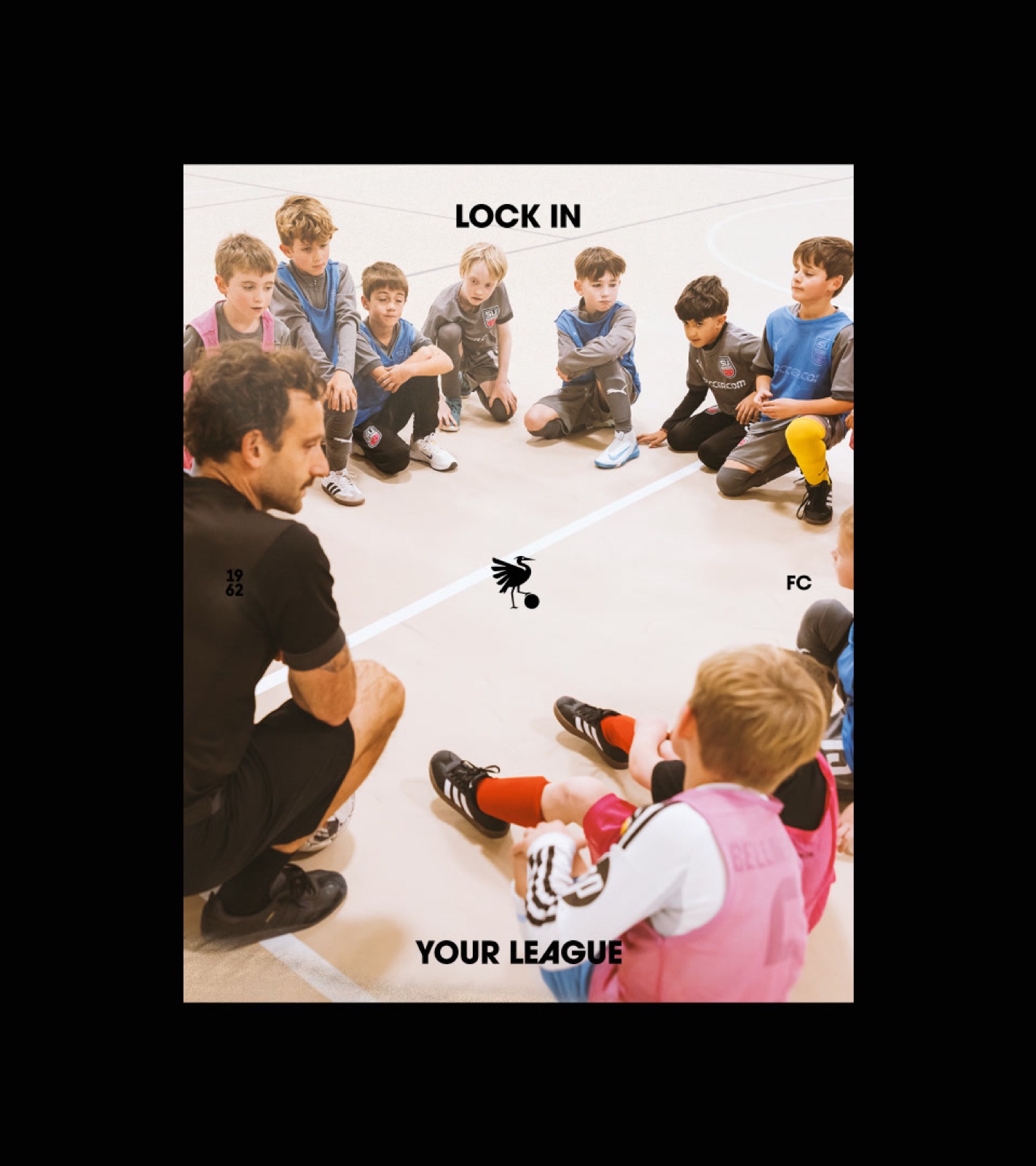
By defining multiple expressions for our brand, we can ensure greater flexibility across the various outputs where this identity will be implemented.
Built on Dual Foundations
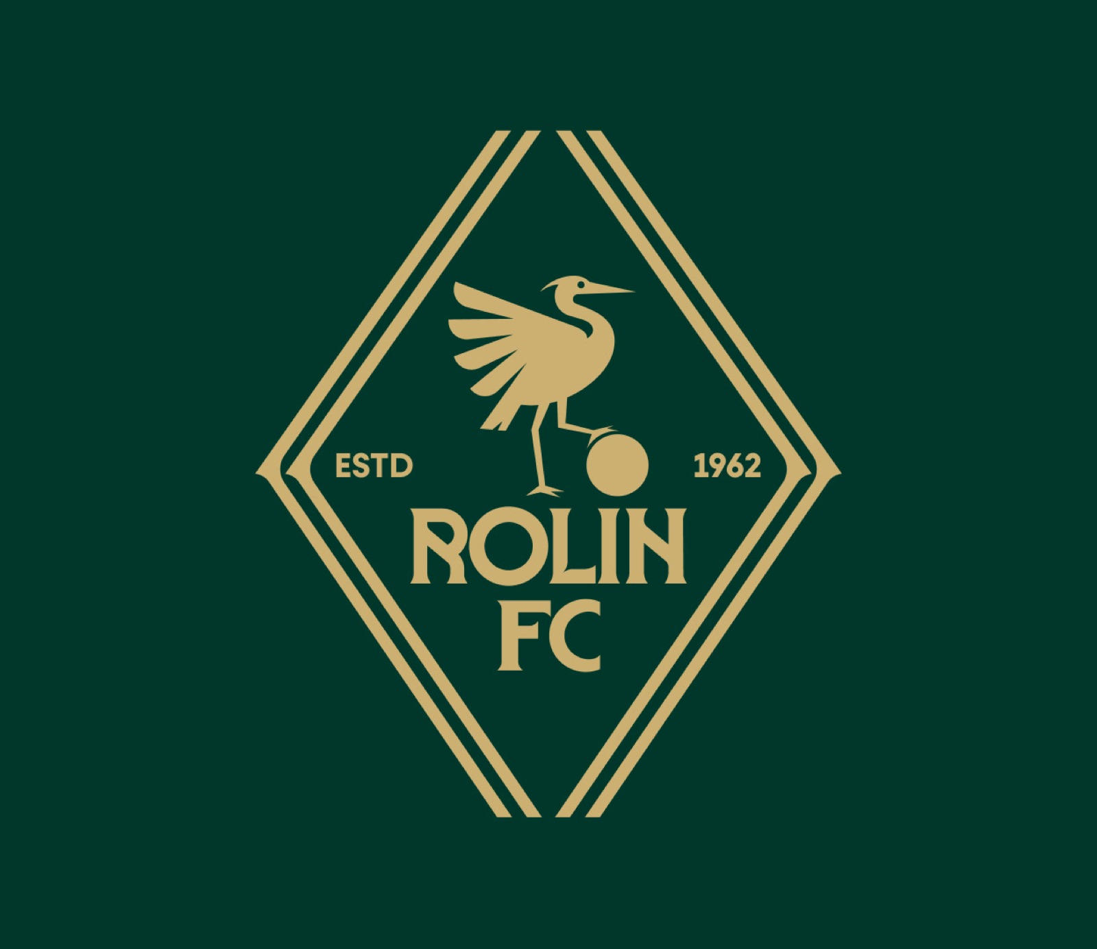
The RoLin crest merges the expressive Heron with the structural clarity of the rhombus. The central figure brings movement and personality, while the surrounding diamond geometry anchors the mark in a strong, ownable visual language.
Together, they create a crest that elevates heritage through modern form—a symbol built for distinction on and off the field.
We Bring the Flair
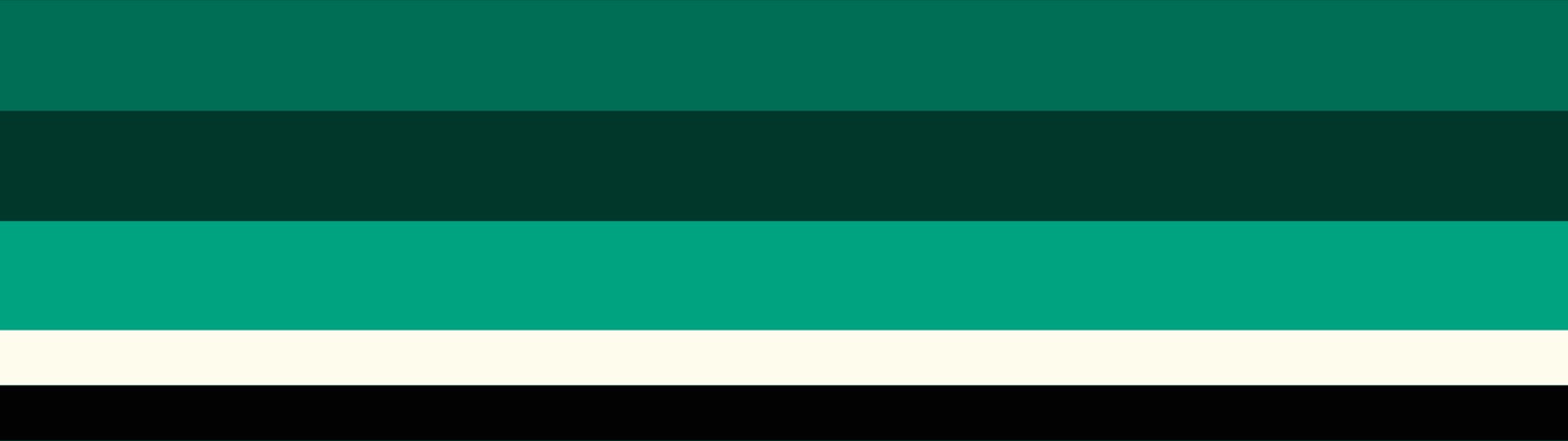
The colors of the Rol-in brand speak the language of football at all times, bringing forward hues that make sense across different aspects of the game.
These color combinations are just a starting point for what’s possible with our color scheme. We are here to bend rules, and that’s why the only consistent rule for creating a new combination is to ensure good accessibility and contrast between the colors in the pairing.
#020202
#00372C
#006D56
#00A281
#CCB072
#FFFCEE


Speed in Every Detail
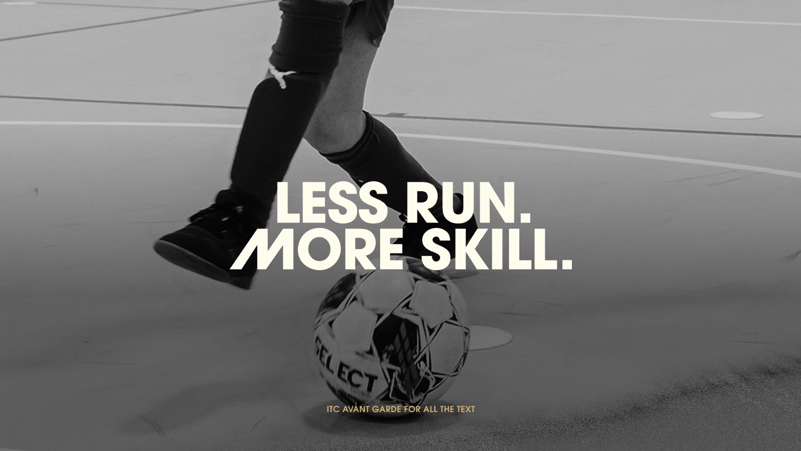
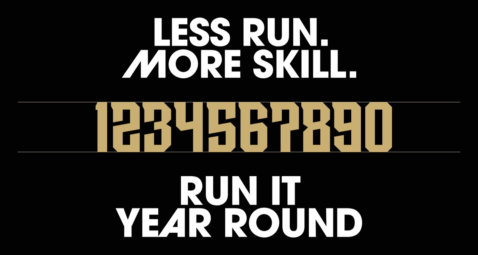
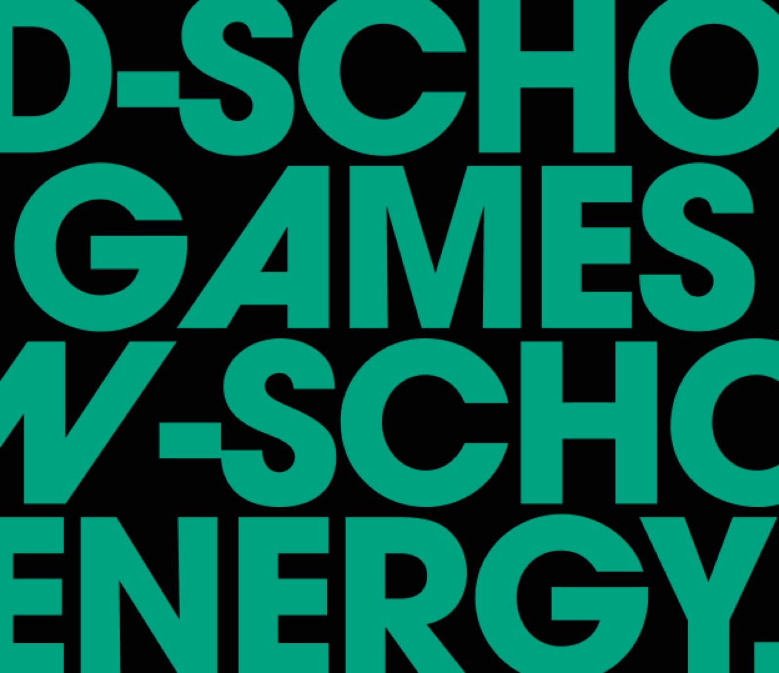
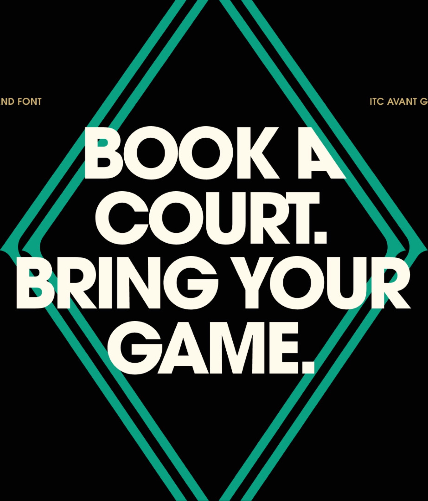
We chose ITC Avant Garde as the primary typeface for the Ro-Lin project because its strength aligns perfectly with the brand’s sense of speed.
The typeface’s OTF features allow us to introduce diagonal letterforms across brand communications, visually reinforcing motion, agility, and forward momentum.

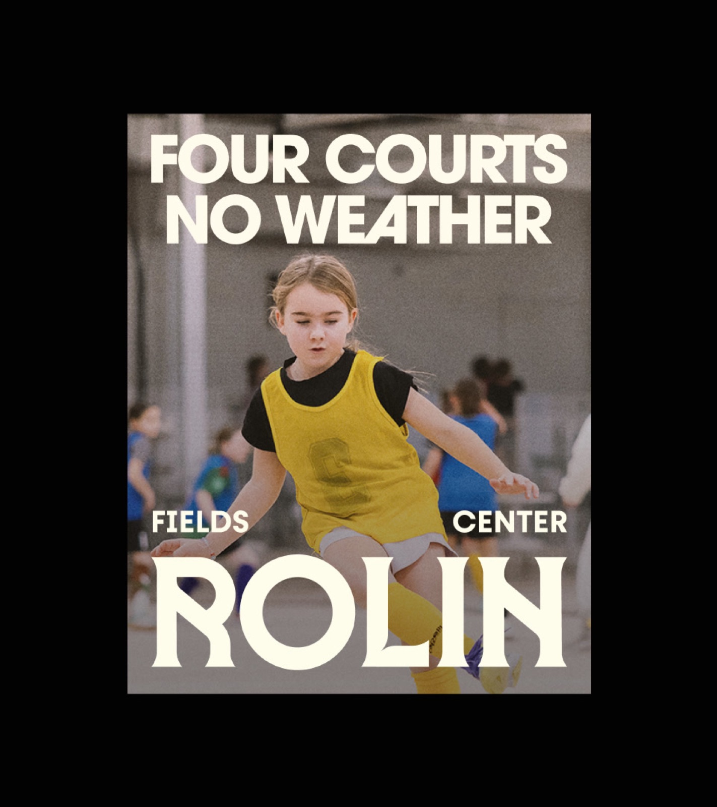
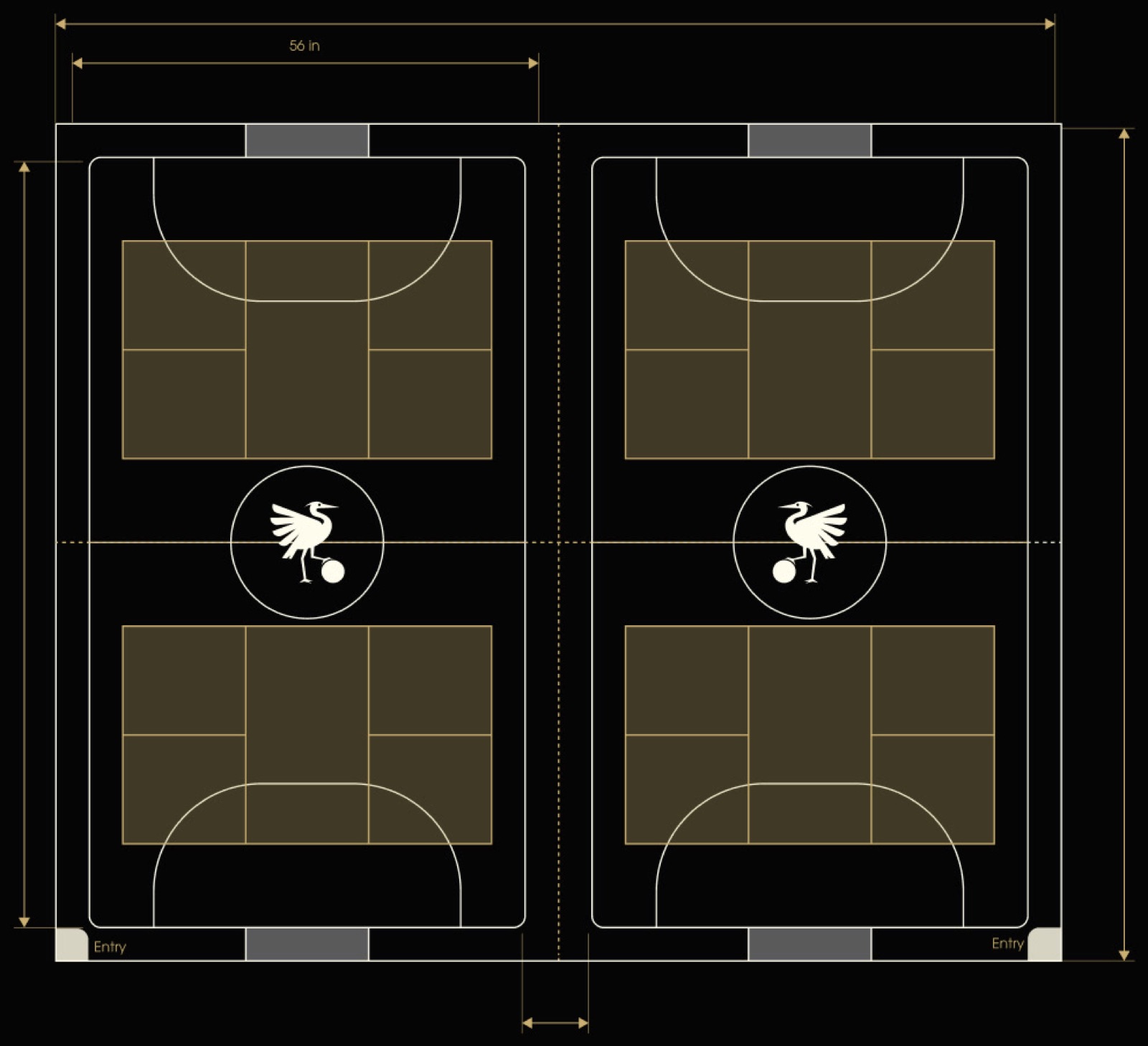
Four Courts, No Weather
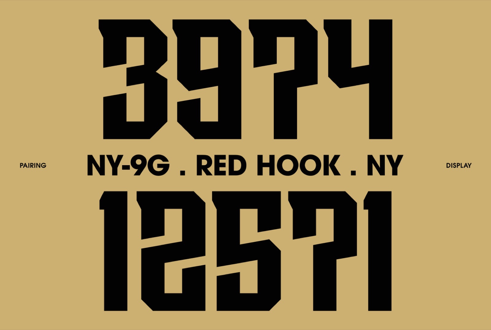
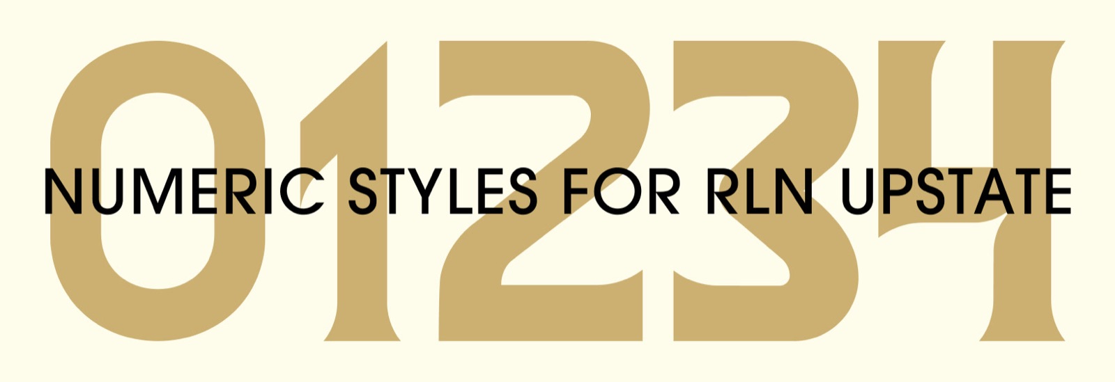
Pattern, brand applications, court blueprint, court design, map, and the RLN Upstate Serif typeface with numeric styles.