
Alexis Sarandon
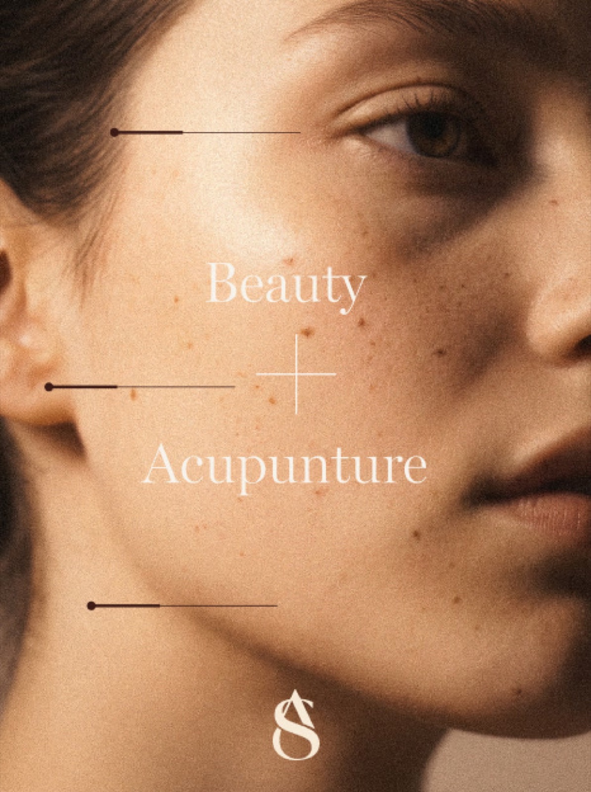
Beauty + Acupuncture
Our visual inspiration draws from the natural rhythms of the body and the earth, finding beauty in the seamless connection between inner balance and outer radiance.
Just as the body heals in cycles, our aesthetic embraces the concept of infinite restoration. We are inspired by the tactile warmth of skin and the precision of ancestral healing arts. This is where Fluidity meets structure.
We look to the soft gradients of natural light and the delicate curves of anatomy to build a visual world that feels deeply human, grounded, and alive with purpose.
The Infinite Path
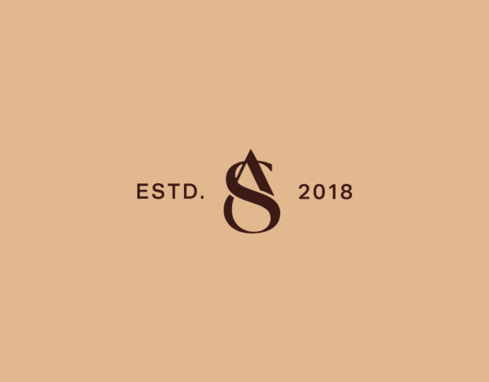
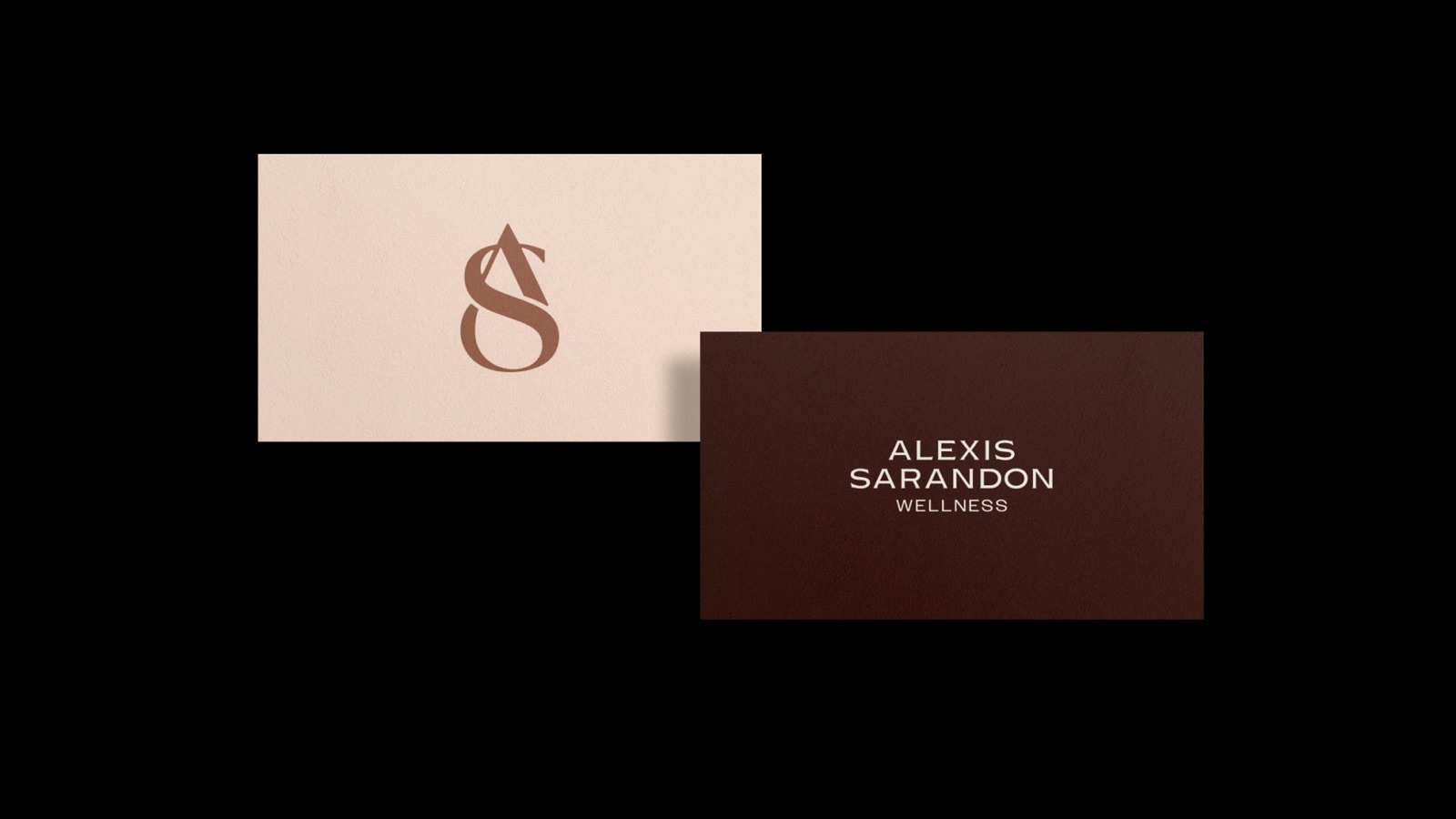
At the center of our identity is a monogram that transcends simple geometry. The intertwining of the letters A and S creates a fluid, continuous path with three distinct points of connection.
This form represents the Journey of restoration. It acts as a visual metaphor for the connection between practitioner and patient, capturing the moment where energy shifts and the Self begins to heal. It is a modern, organic emblem of lasting equilibrium.
Structure & Soul
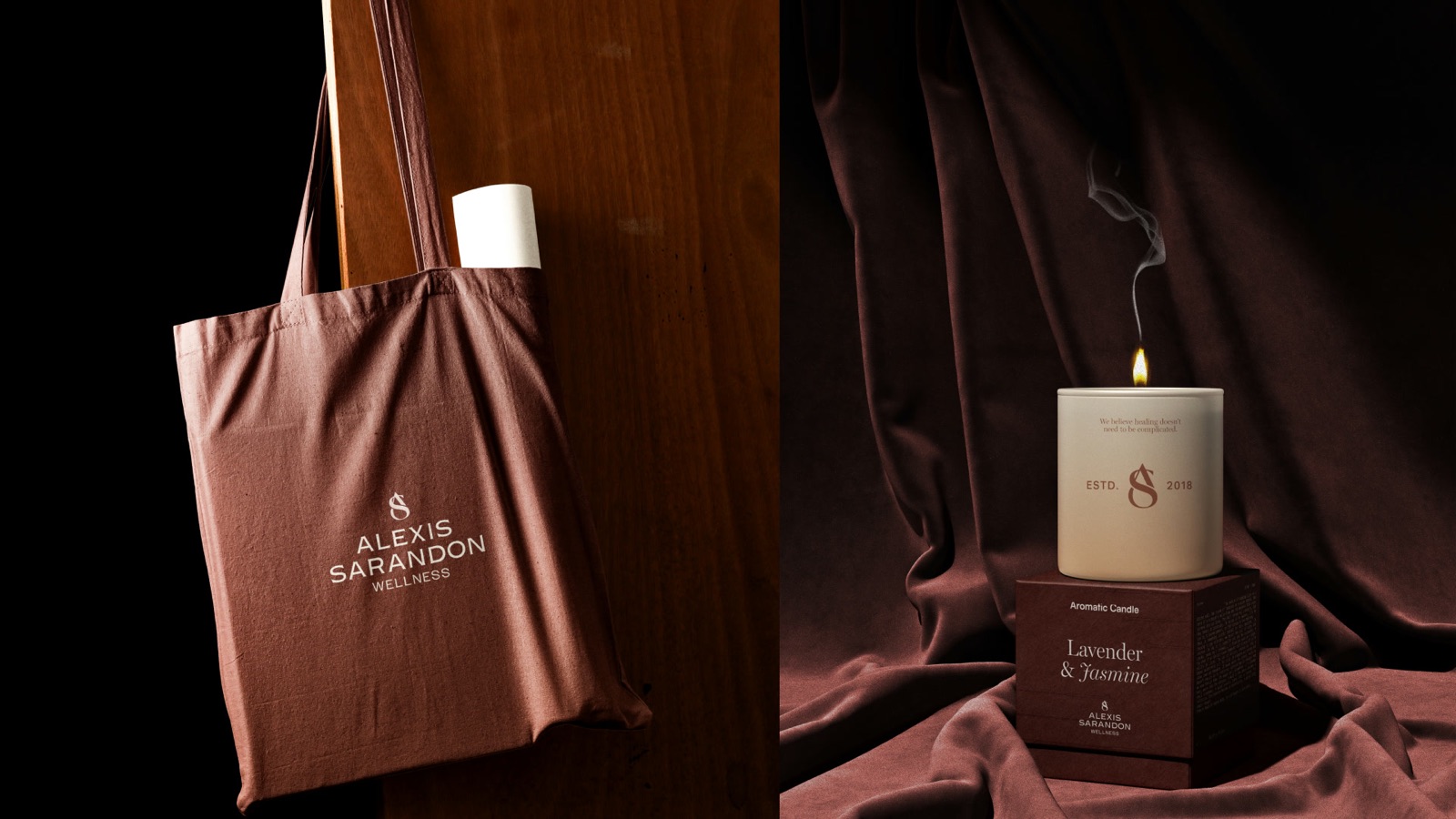
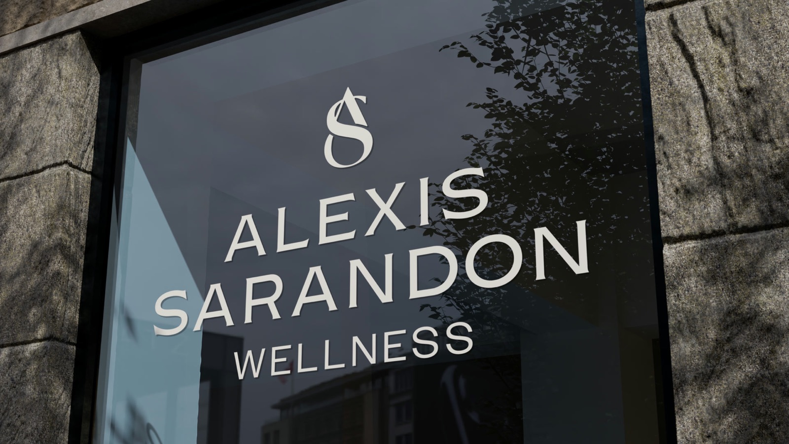
The relationship between our symbol and our logotype is a study in balance. While the monogram captures the Fluidity and organic movement of energy, the wordmark provides the necessary stability.
We utilize a semi-serif typeface that carries a tone of authority and heritage, grounding the brand in professionalism.
Radiance From Within
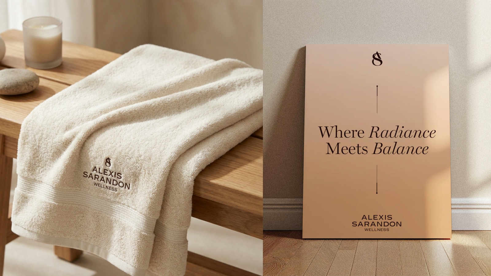
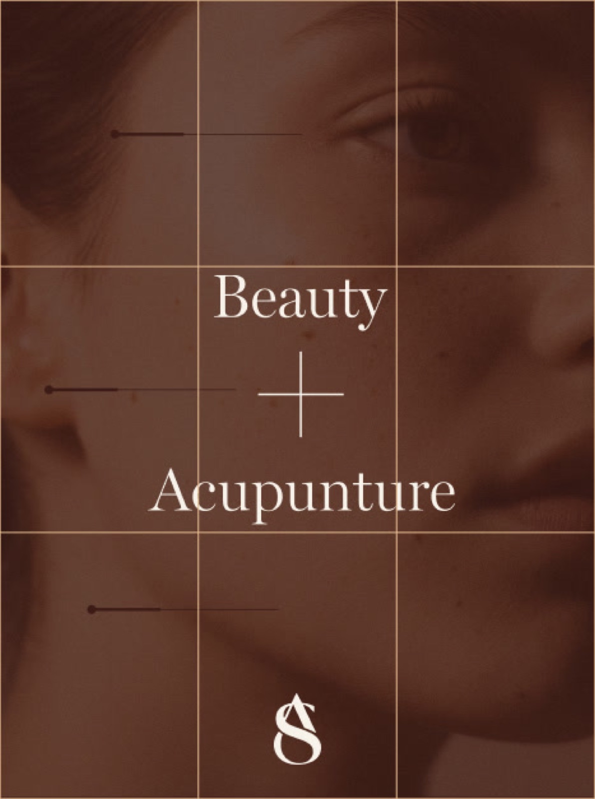
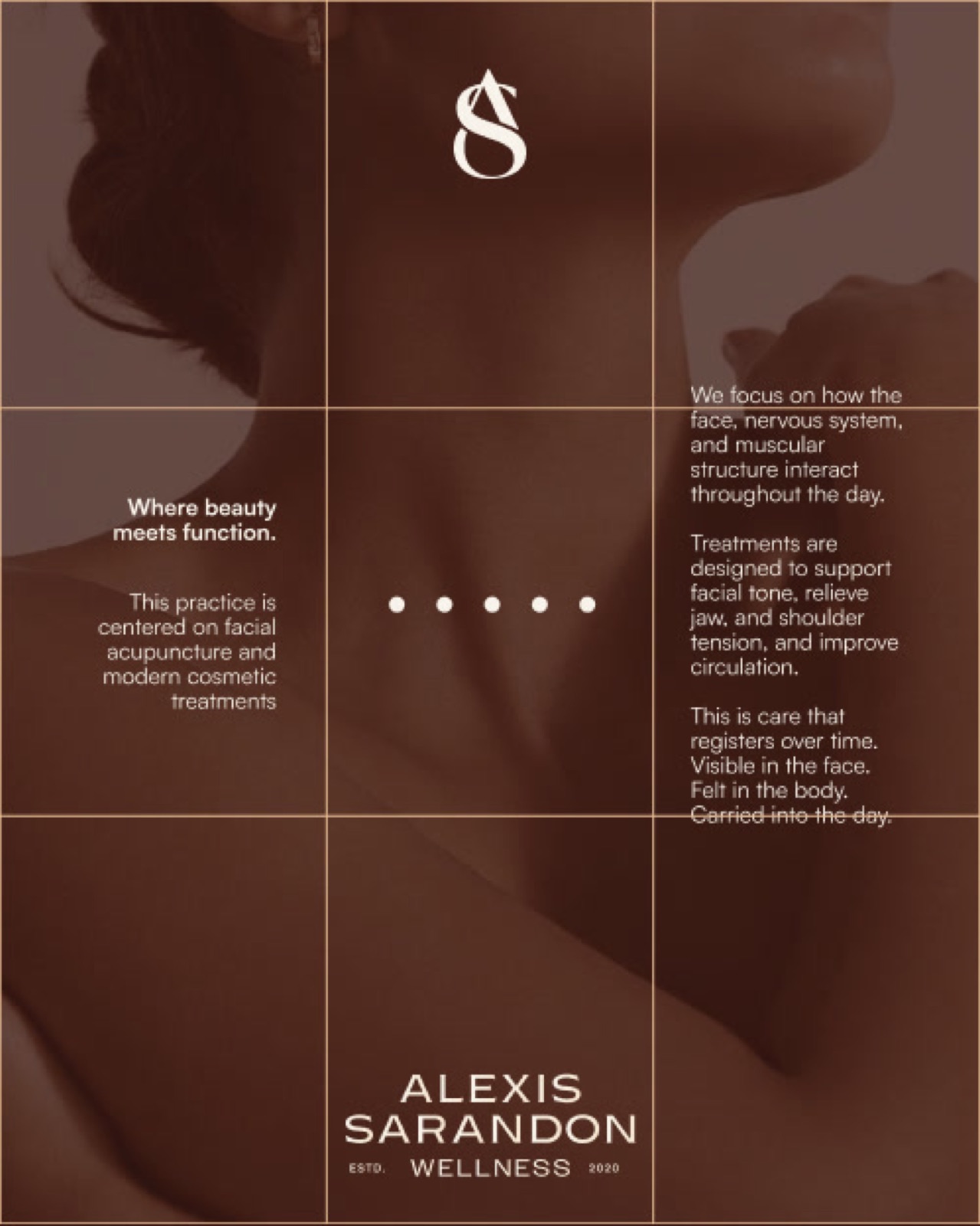
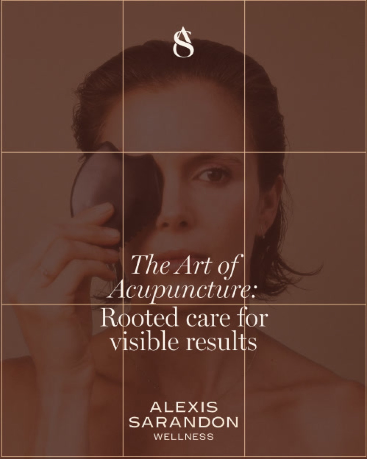
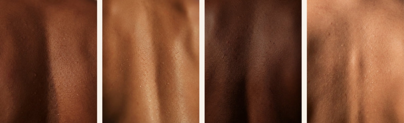
Derived directly from our skin-tone palette, our textures are a visual expression of Fluidity. We utilize soft, radiant gradients that mimic the way light travels across the curvature of the back or the face.
These backgrounds are a abstraction of the skins.
Elemental Precision
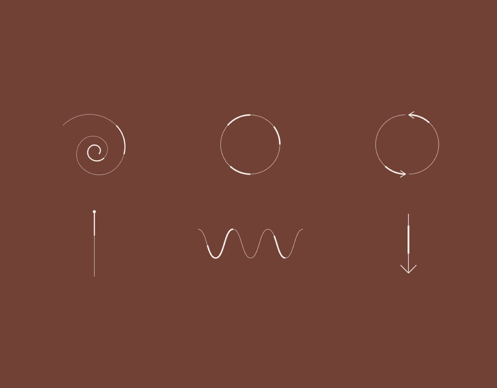
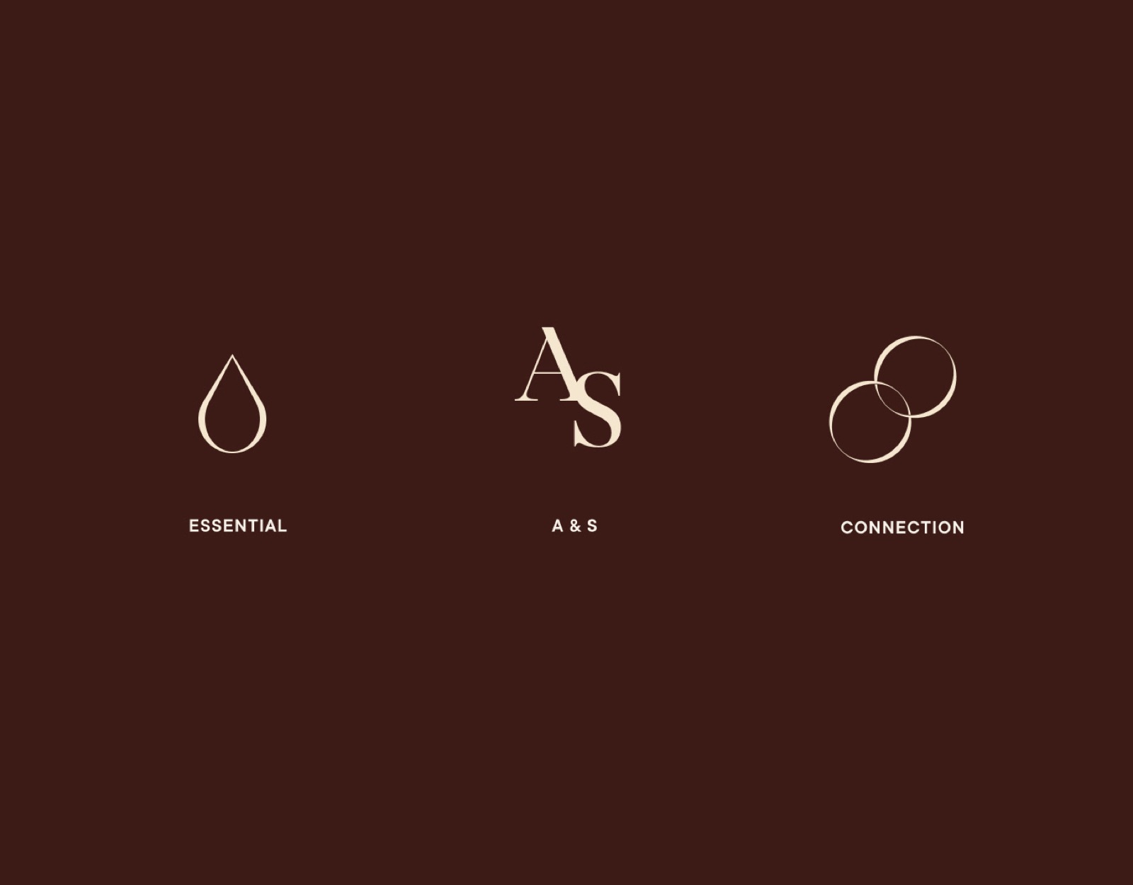
These icons serve as visual anchors for our methodology. They translate complex treatments into simple, elegant forms that speak of focus and restoration.
Whether representing a specific tool or the abstract concept of connection, each icon is drawn with a lightness that reflects the gentle power of our practice.
An Ode to the Body
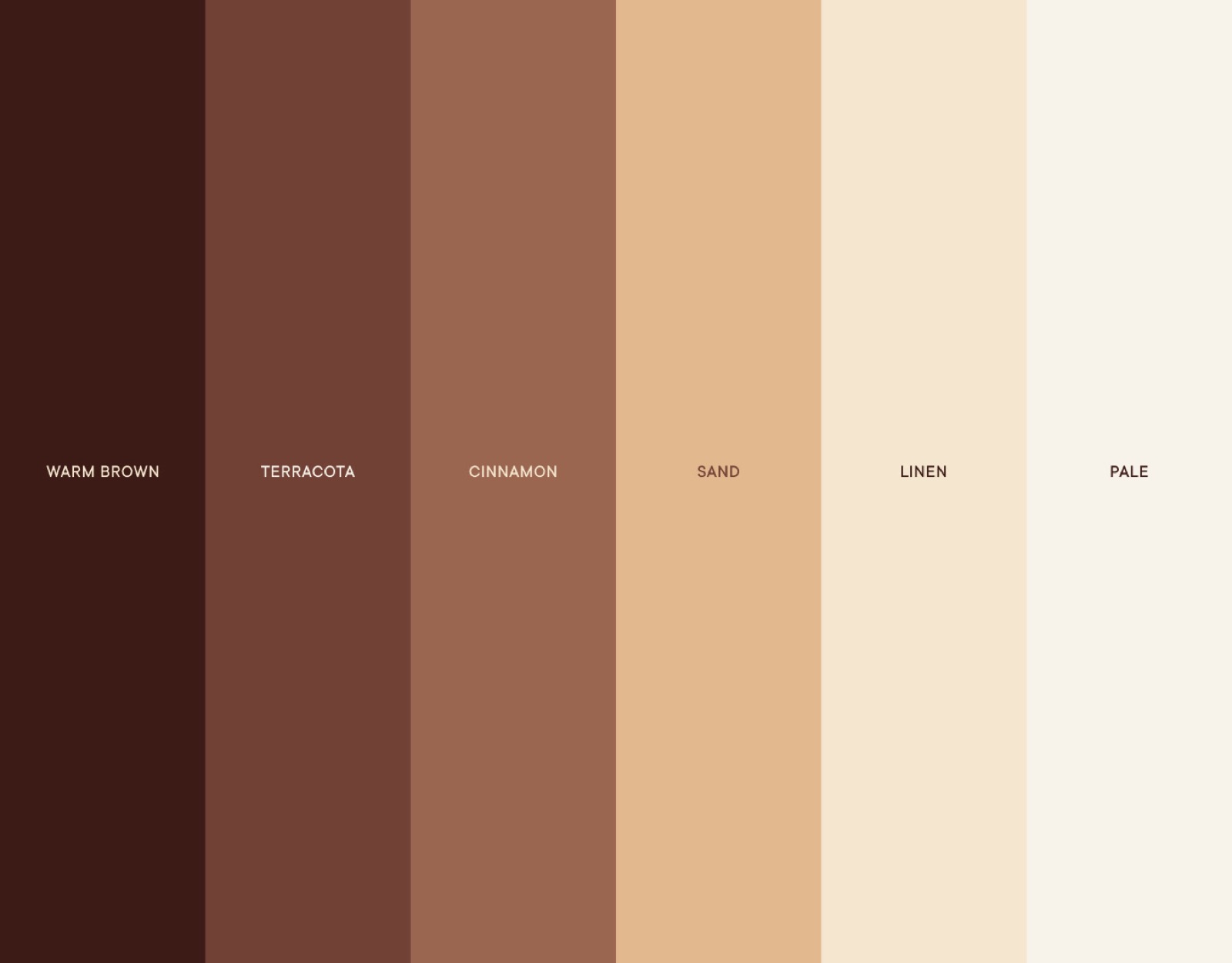
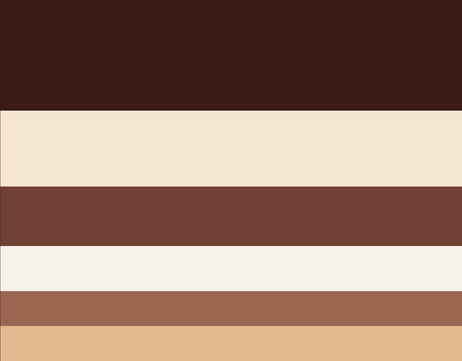
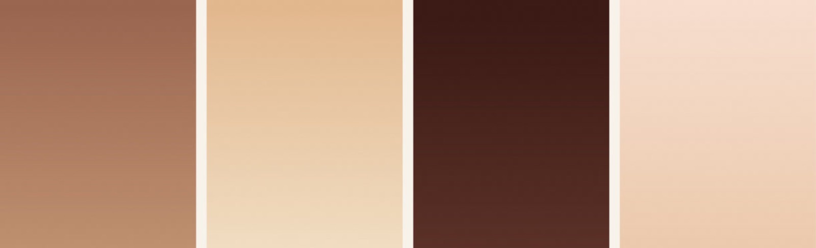
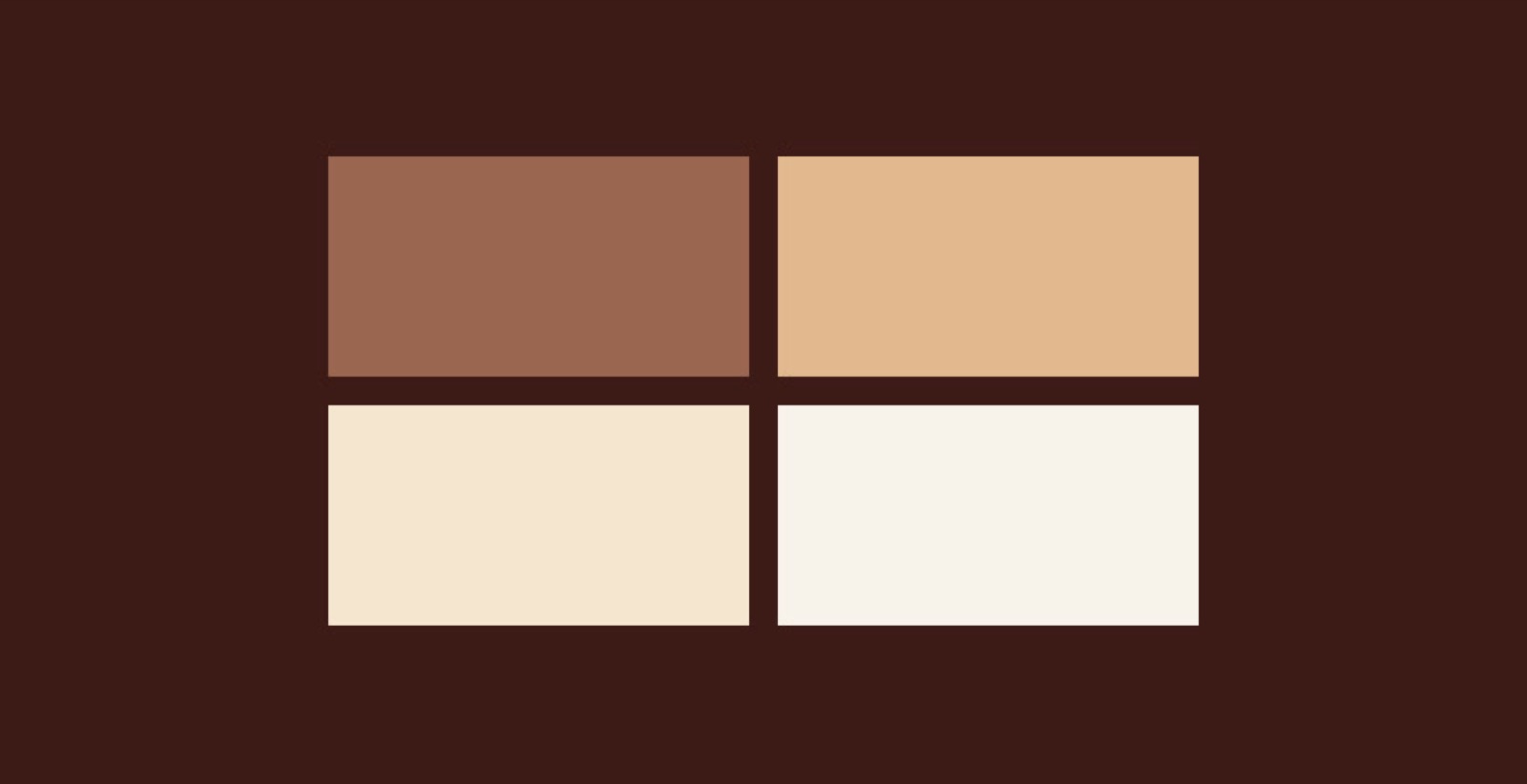
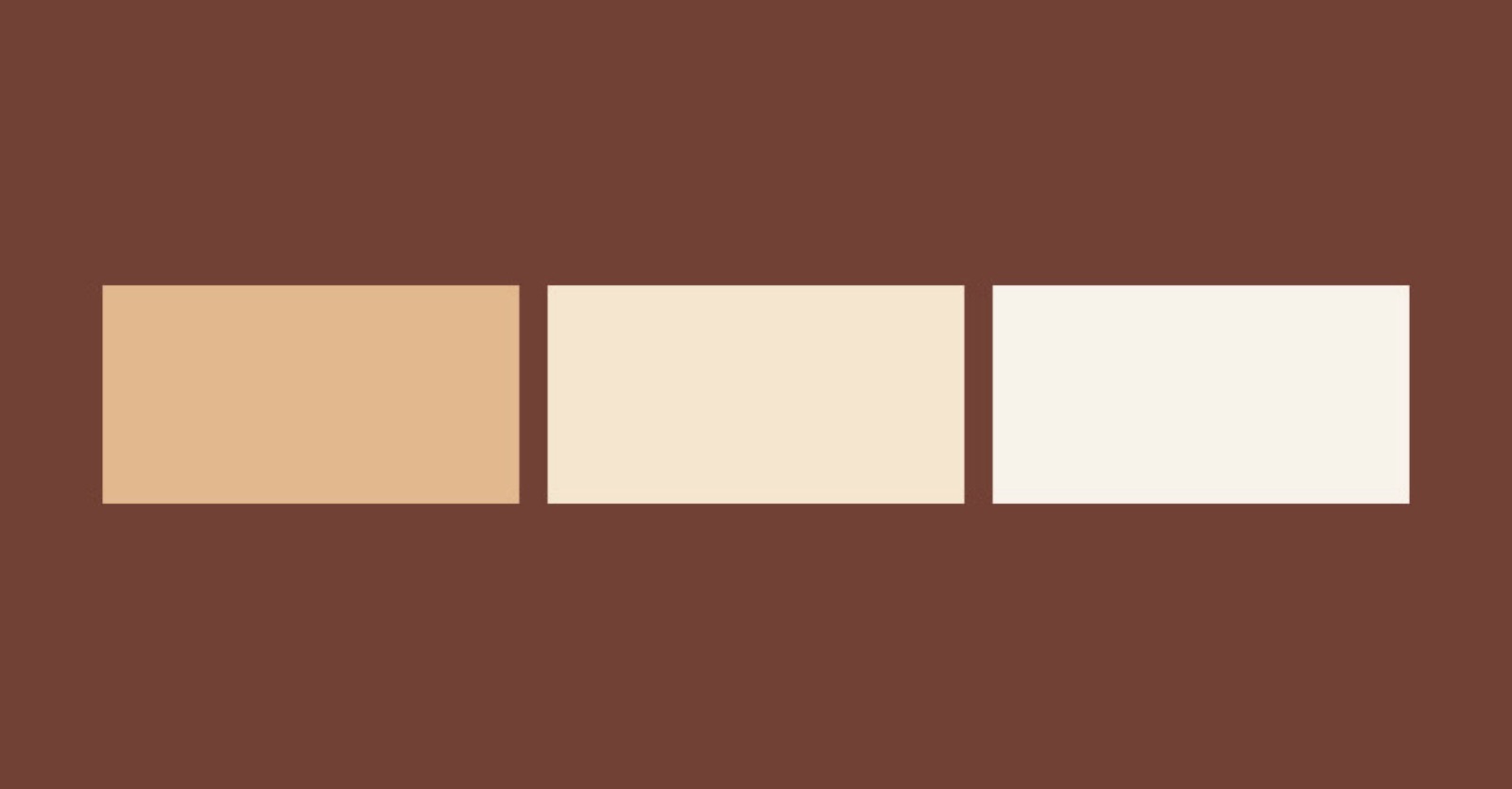
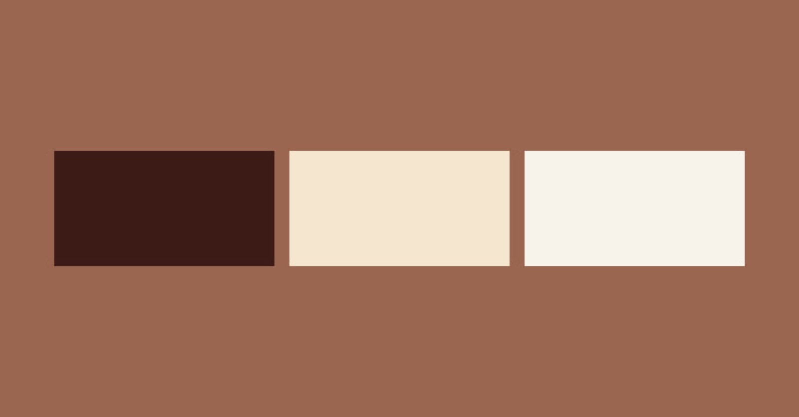
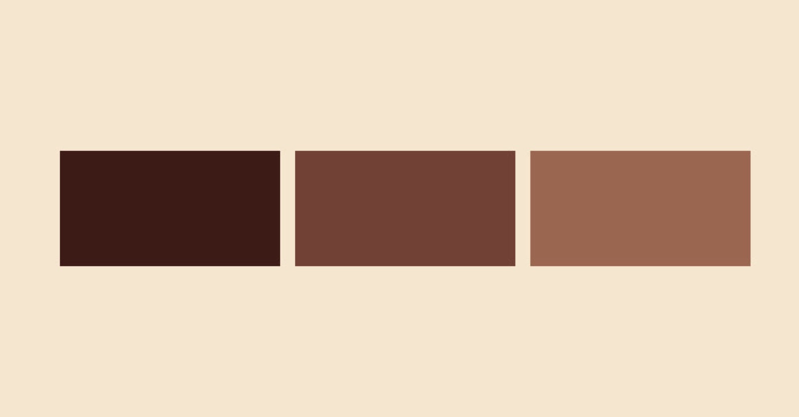
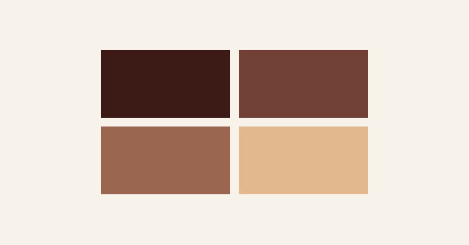
Our color palette steps away from the clinical to embrace the warmth of the living. These colors represent the diversity and beauty of skin tones, a collection of hues representing safety and warmth, inviting the patient to connect with their own nature from the moment they engage with the brand.
These color combinations are just a starting point for what’s possible with our color scheme. We are here to bend rules, and that’s why the only consistent rule for creating a new combination is to ensure good accessibility and contrast between the colors in the pairing.

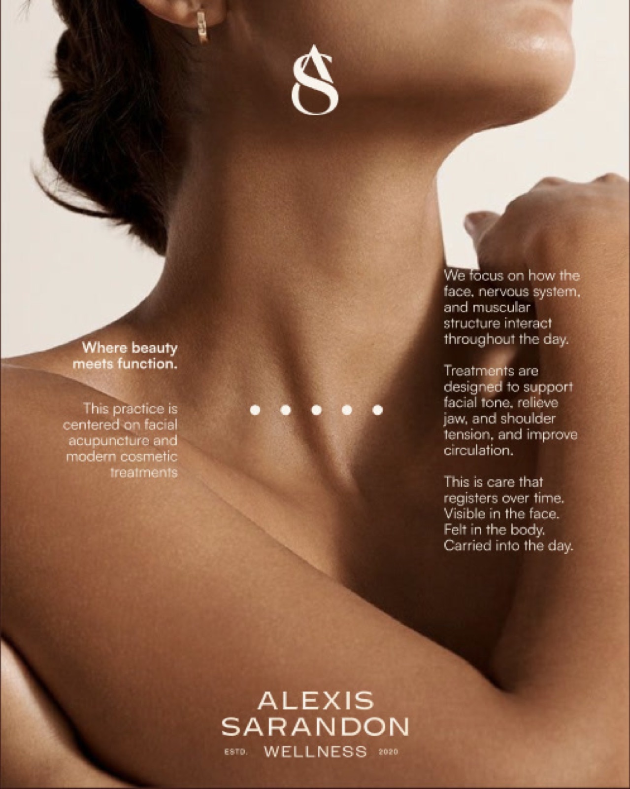
Where beauty meets function.
This practice is centered on facial acupuncture and modern cosmetic treatments. We focus on how the face, nervous system, and muscular structure interact throughout the day.
Treatments are designed to support facial tone, relieve jaw, and shoulder tension, and improve circulation.
This is care that registers over time. Visible in the face. Felt in the body. Carried into the day.
A Sophisticated Dialogue
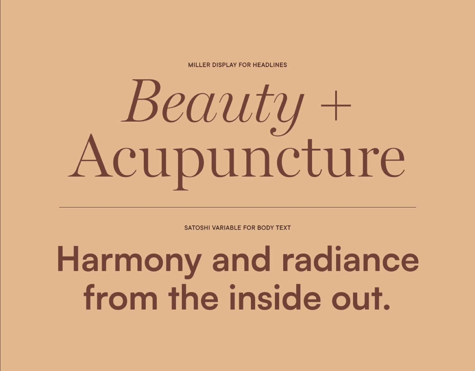
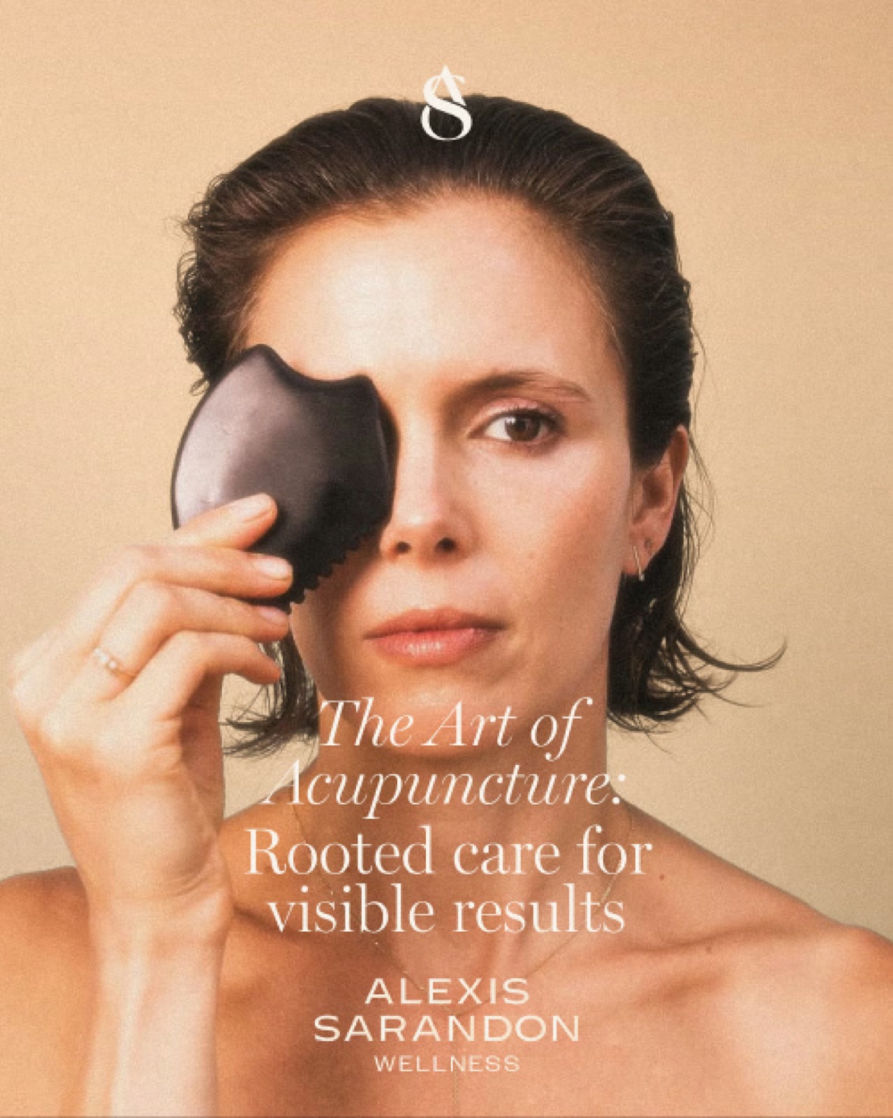
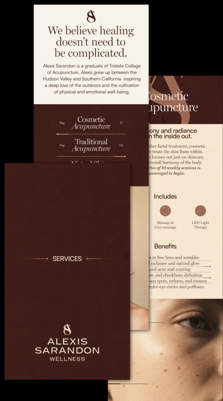
We have curated a typographic pairing that speaks to both the history of healing and the modern pursuit of beauty. Miller Display serves as our primary voice, bringing an editorial, refined elegance to our headlines. Its serif curves echo the fluidity of the body, evoking a sense of grace and timelessness.
Supporting this is Satoshi, a variable sans-serif that offers clarity and modern function. This pairing creates a harmony between the expressive and the practical.